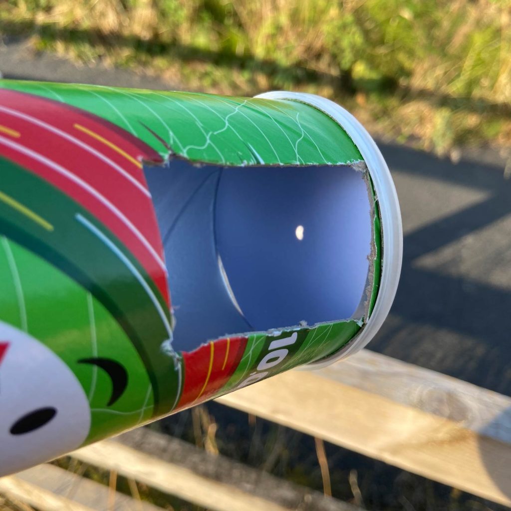
There’s something quite nice about watching a solar eclipse through a Pringles tube.
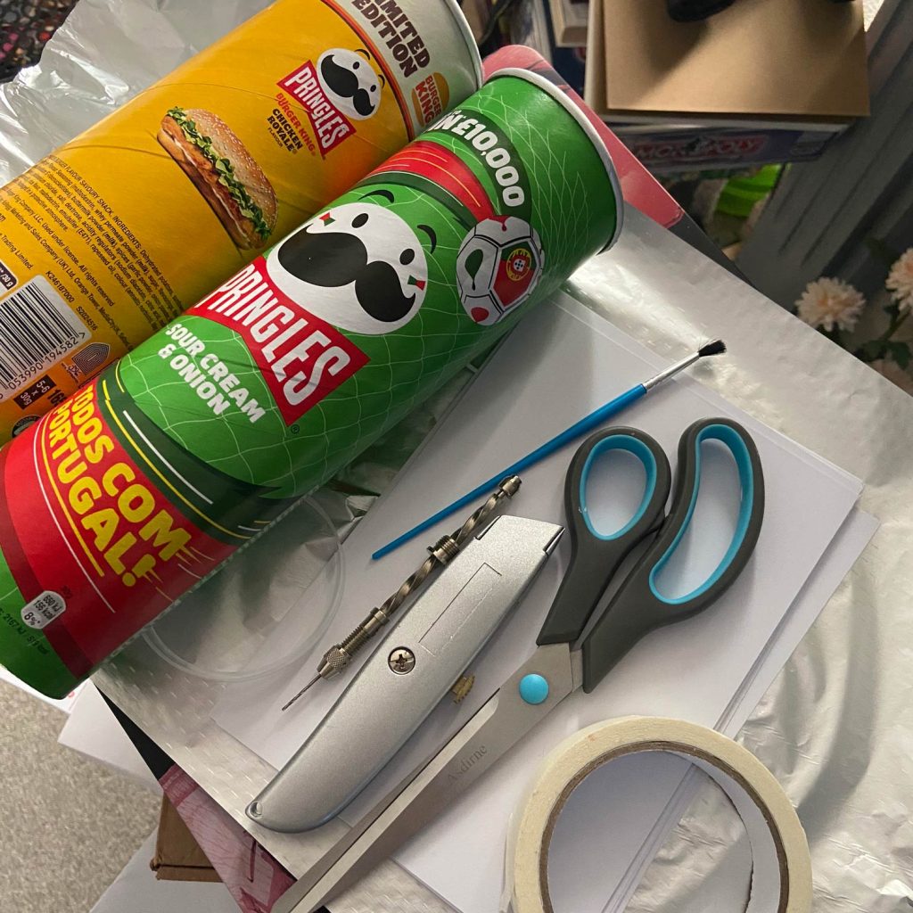
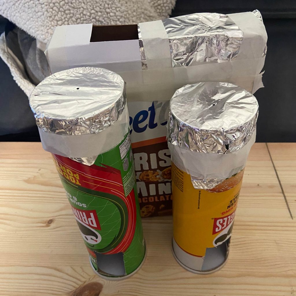
For all the technology we have around us, our preparations for the eclipse involved raiding the recycling and making pinhole viewers from cereal boxes and Pringles tubes. Very similar, really, to the sort of thing I remember doing at school in the 90s.
We’d planned a fairly secluded spot to watch it from, only to discover that a few other people had apparently had exactly the same idea.
That actually made the evening better.
We met some like-minded people, compared our slightly questionable homemade viewing contraptions and then stood around together waiting for the Moon to move across the Sun.
It got me thinking afterwards about the experience of an eclipse beyond simply seeing it.
What if you could see how people reacted?
The eclipse is obviously a huge visual event, but there’s another part of it that you can’t see.
Anticipation.
Excitement.
The strange change in light.
Waiting for the right moment.
And, potentially, the physiological response to all of that.
That led to another little generative art experiment.
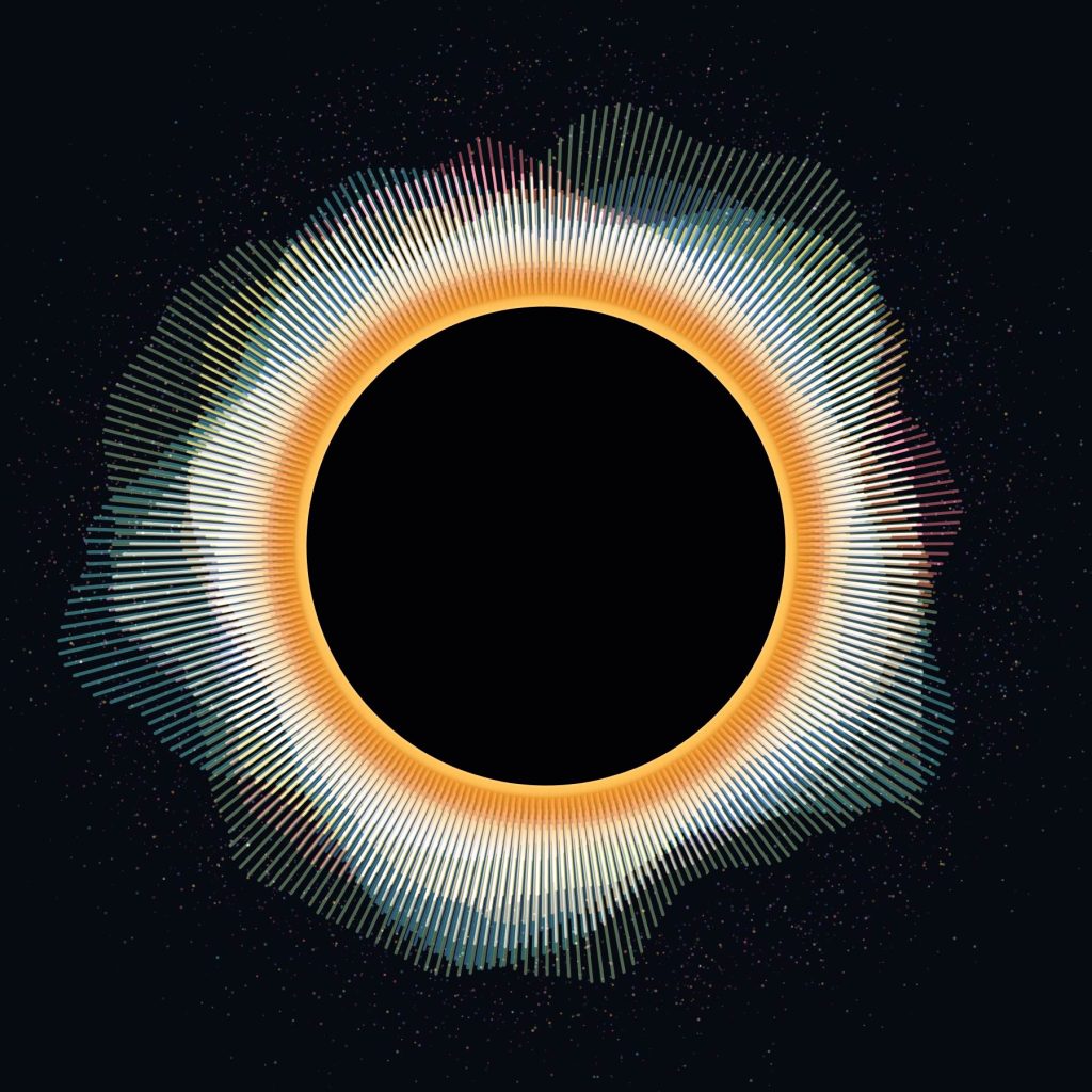
What if ten people watching an eclipse recorded their heart rates, and those heartbeats became the eclipse’s corona?
Rather than creating a conventional graph showing beats per minute over time, I wanted the data to become part of the artwork itself.
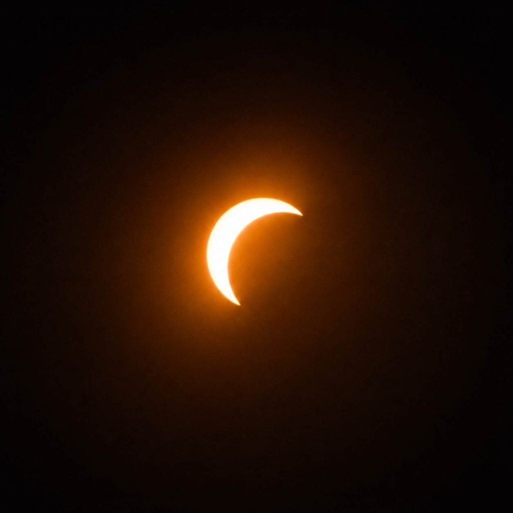
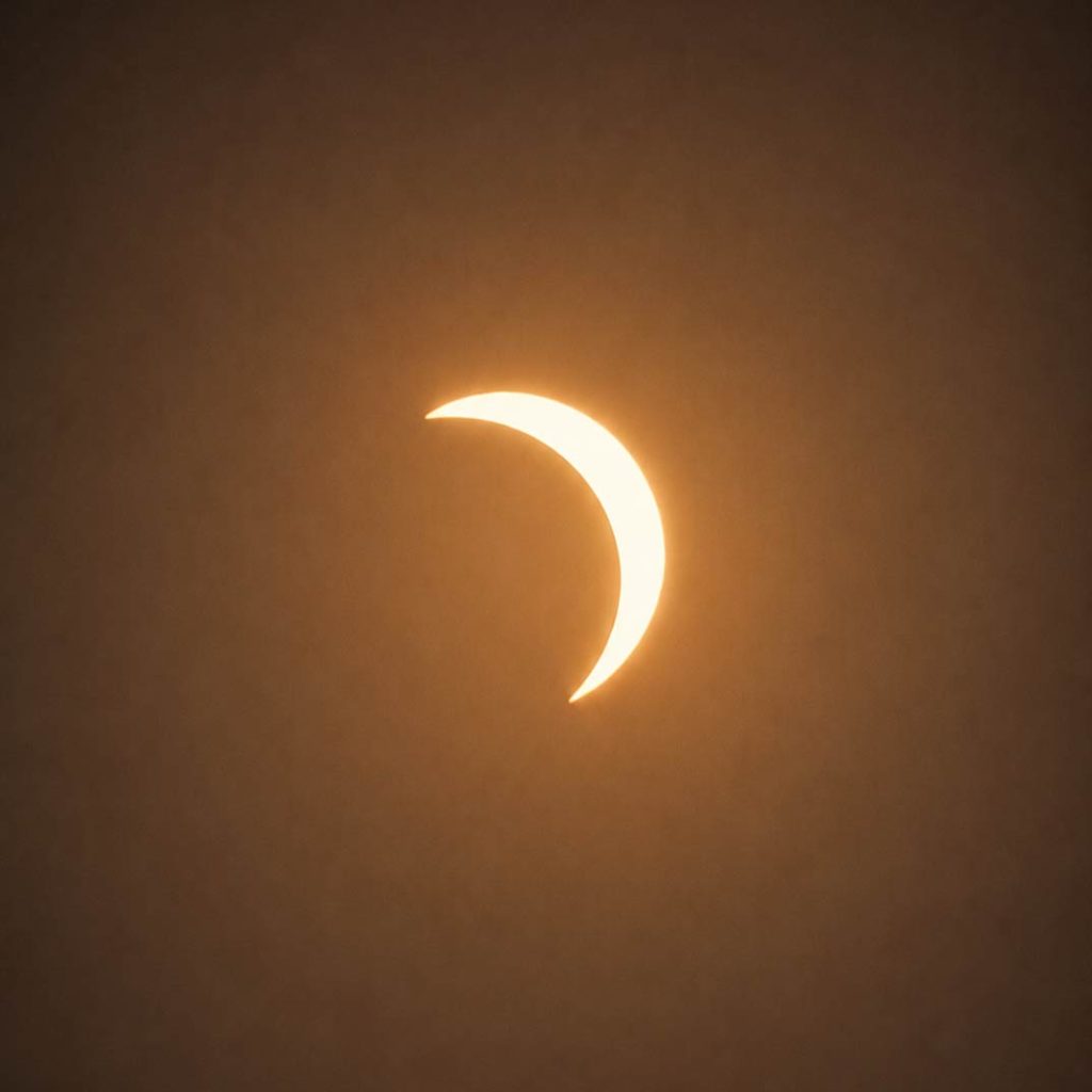
Ten people. Ten heart rates. One Eclipse.
The piece is being developed in Processing.
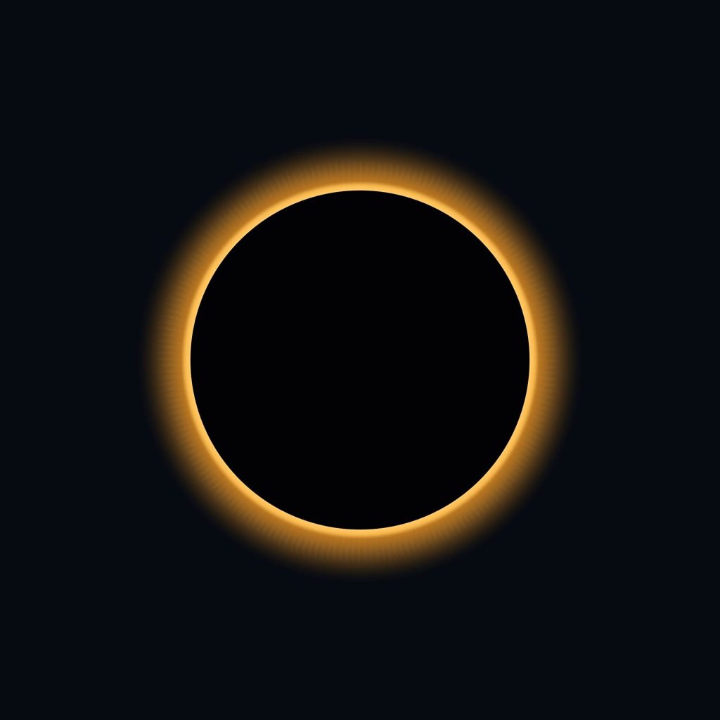
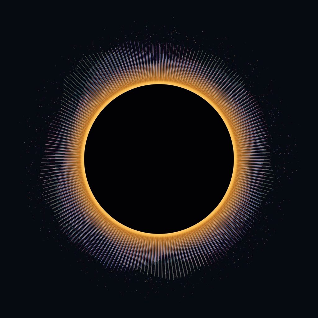
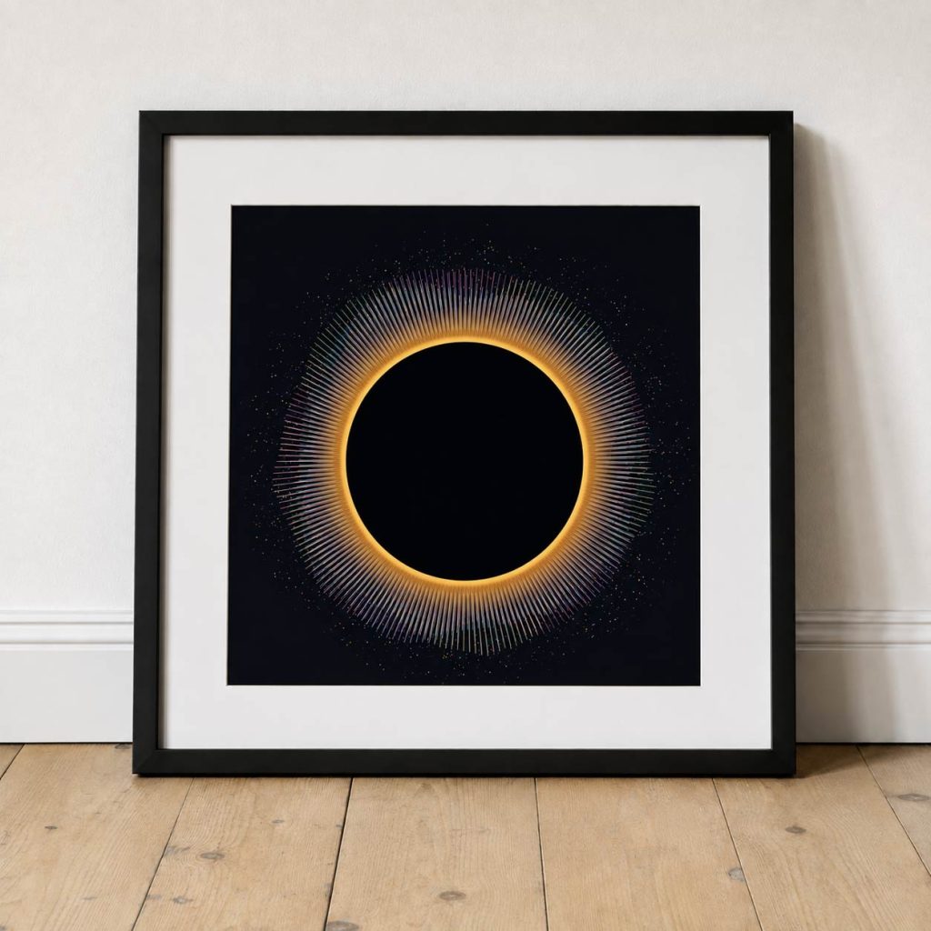
At the centre is a simple representation of the eclipse: a black disc surrounded by a thin, warm edge of light.
Behind it are ten separate circular systems.
Each person gets their own complete 360-degree layer made from hundreds of fine radial lines. Every layer has its own colour, pattern and heart rate, but they’re all positioned around exactly the same point.
So you don’t immediately see ten separate data visualisations.
You see one.
The layers overlap, interfere with each other and occasionally align, creating something resembling a colourful solar corona.
The important difference is that the corona is being generated by people.
Turning a heartbeat into movement
I didn’t want the heart-rate data to simply control the height of the lines.
That felt too much like an audio equaliser.
Instead, each heartbeat creates an event.
The radial lines slowly push away from the eclipse, reach their maximum extension and then ease back towards it.
I’ve deliberately exaggerated and slowed this movement. A literal visual representation of a heartbeat becomes incredibly frantic when ten people are running simultaneously.
The data determines when something happens, but the artwork determines how that event feels.
So each beat becomes more of a swell:
rest → expansion → peak → decay
At the peak of a pulse, fragments also begin to escape from the ends of the lines.
These become tiny particles travelling away from the centre before slowly disappearing.
I like the idea that the lines represent the immediate physical response, while the particles leave behind a temporary memory of what has already happened.
Stacked, not divided
One decision that became important quite early was how to represent the ten participants.
The obvious solution would be to divide the circle into ten sections, giving everyone a 36-degree slice.
But that would turn the artwork into a diagram.
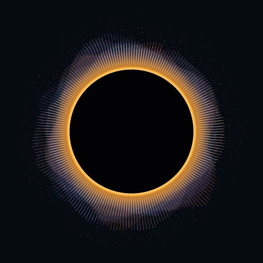
Instead, all ten people occupy the entire circle.
Their layers are stacked.
Person one can pulse across all 360 degrees. So can person two, person three and everyone else.
Their heartbeats are also staggered, so the layers continually move in and out of phase with one another.
Every so often several beats might happen at almost the same moment and create a much larger burst.
Those moments aren’t specifically animated or programmed.
They’re coincidences in the data.
And that’s probably one of my favourite parts of the idea.
Compressing an eclipse into sixty seconds
I don’t want the final piece to run for the actual duration of the eclipse.
Instead, the recorded heart-rate data would be compressed into roughly one minute.
The beginning of the observation becomes the beginning of the animation. Maximum eclipse sits somewhere within that timeline, followed by the gradual return towards normality.
That gives the finished piece its own beginning, middle and end.
It also raises an interesting question.
Will anything actually happen at maximum eclipse?
It would be very easy to artificially make that moment enormous — more particles, longer lines, brighter colours.
But that would defeat the point.
If everyone’s heart rate increases as the eclipse approaches maximum, the artwork should naturally become more energetic.
If everyone’s heart rate remains relatively unchanged, then that’s what the artwork should show.
The interesting bit is finding out.
Building an instrument rather than a fixed animation
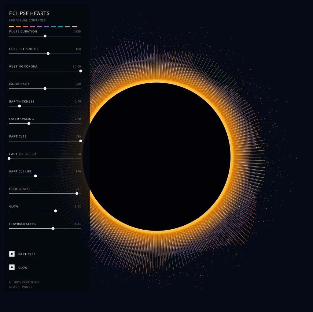
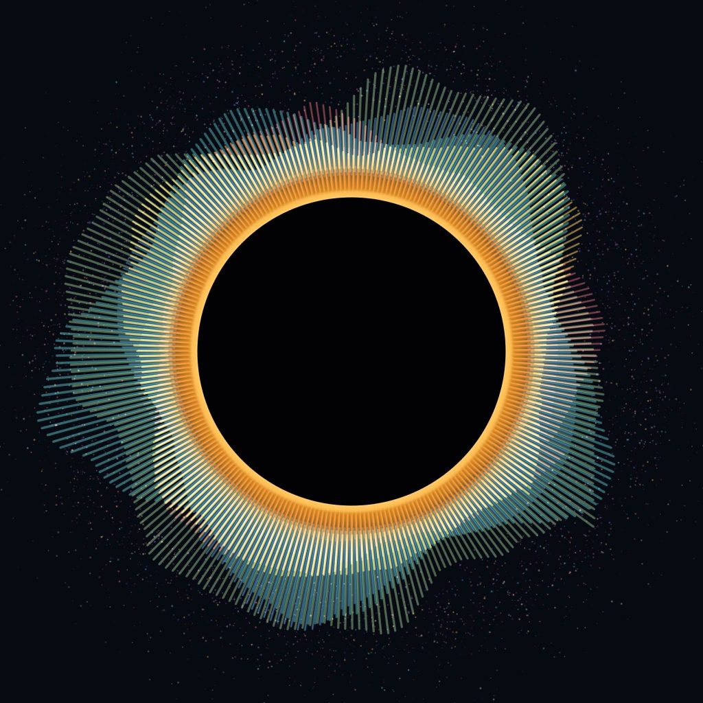
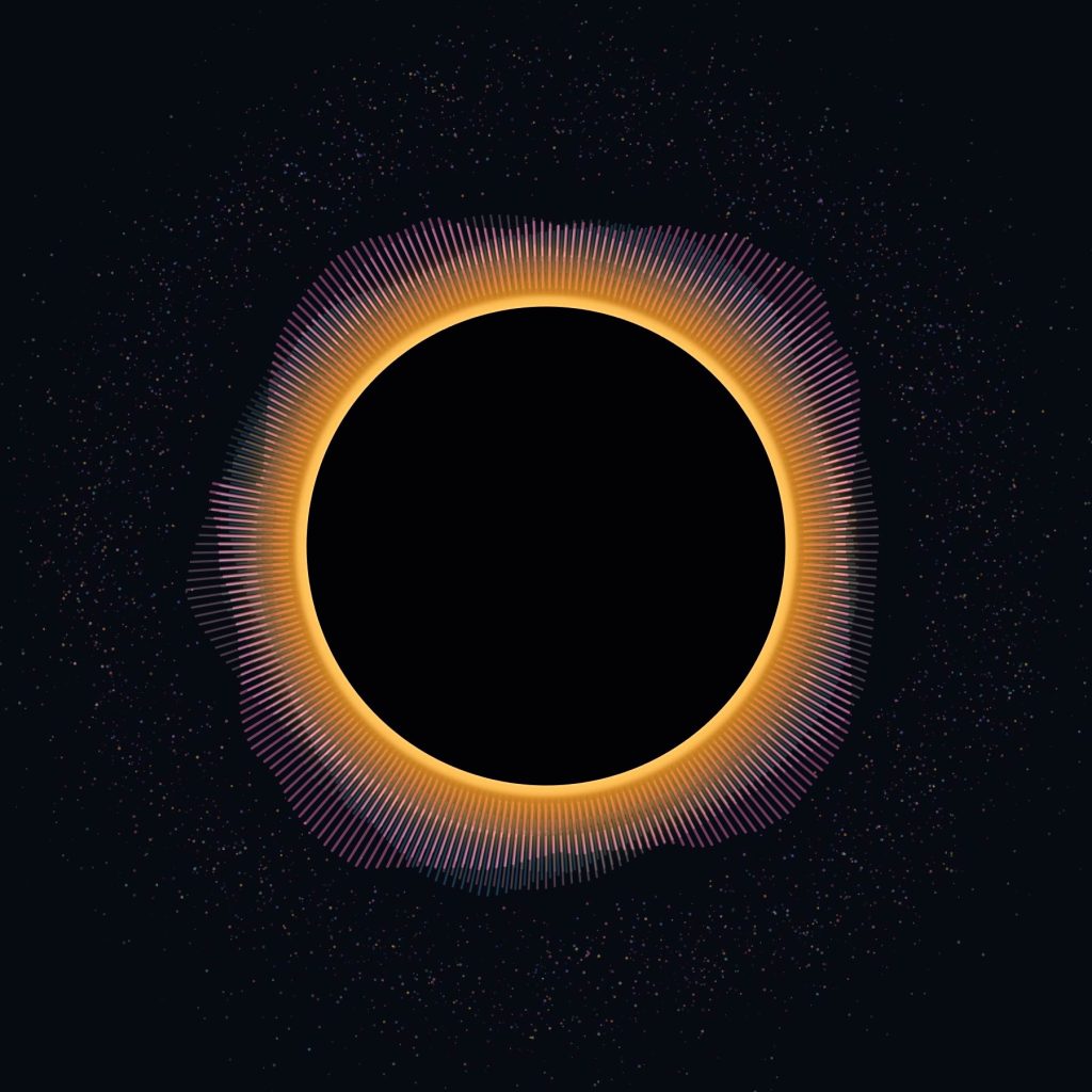
While developing it, I’ve also added a control panel to the Processing sketch.
I can adjust the pulse duration, strength, radial density, line thickness, particle speed, particle lifetime, eclipse size, glow, layer spacing and overall playback speed while the artwork is running.
This has become quite important.
There isn’t really a calculation that tells me a heartbeat should produce a line exactly 126 pixels long or that a particle should survive for precisely 140 frames.
Those are visual decisions.
The data provides the structure, but there’s still a process of designing how that data is interpreted.
Being able to move a slider and watch all ten systems respond immediately makes the Processing sketch feel less like a finished animation and more like an instrument for exploring the idea.
From a Pringles tube to Processing
That’s probably what I like most about this little project.
It started with something incredibly analogue.
A cardboard tube. A cereal box. A tiny hole. Sunlight projected onto a piece of card.
The same basic method of observing an eclipse that I remember from being younger.
Then there we were, years later, standing outside with our homemade viewers and a few people we’d only just met, all looking at the same event.
Now I’m taking that experience back to the computer and asking what else could have been recorded.
Not just what did the eclipse look like?
But:
What did it feel like to be there?
And could ten tiny streams of biological data turn that feeling into something we can see?
That’s what I want to find out next.