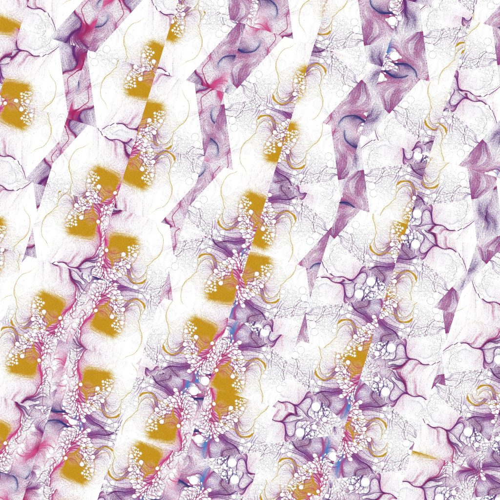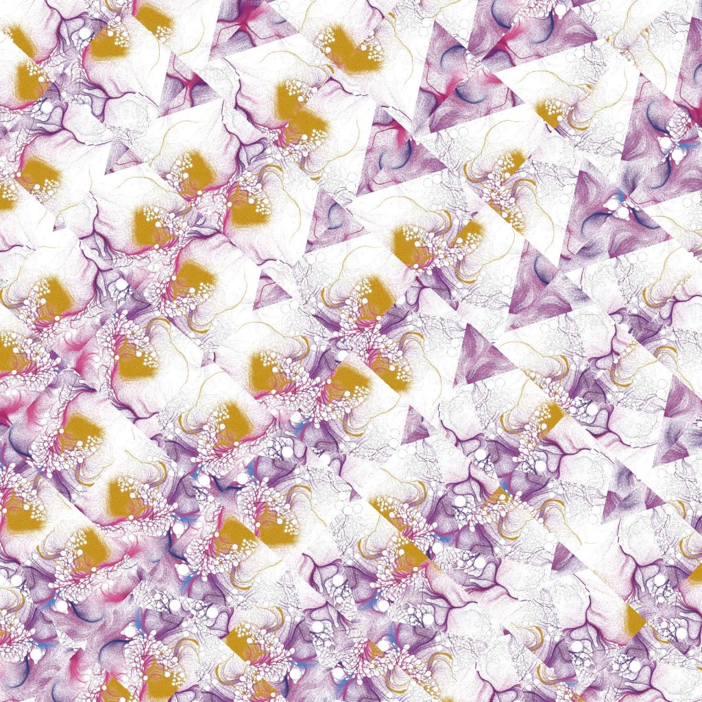
For Study 003, I wanted to move away from using code to create the finished image.
Instead, the computer would simply tell me what to do.
The Processing sketch creates an invisible square grid. Each position in the grid is randomly assigned one of seven possible instructions:
.↓ Colour 1 / down
..↓ Colour 2 / down
...↓ Colour 3 / down
.→ Colour 1 / right
..→ Colour 2 / right
...→ Colour 3 / right
blank No mark
The number of dots tells me which of three brush pen colours to use, while the arrow tells me whether to make the mark horizontally or vertically.
That’s all the computer decides.
Random within rules
Unlike the previous two studies, there isn’t a mathematical relationship between one grid position and the next.
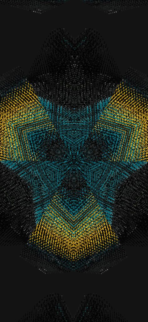
Processing randomly chooses from the seven possible outcomes:
int outcome = int(random(7));
This means every generated sheet is different, but the randomness is still tightly controlled. The computer can only choose from the rules I’ve given it.
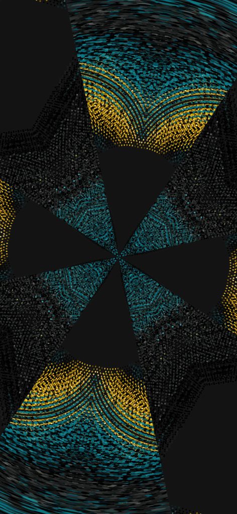
Adding the blank or null instruction turned out to be particularly important. Without it, every position had to contain a mark and the results became very dense. Empty cells introduce gaps and allow irregular areas of white space to form naturally.
From code to paper
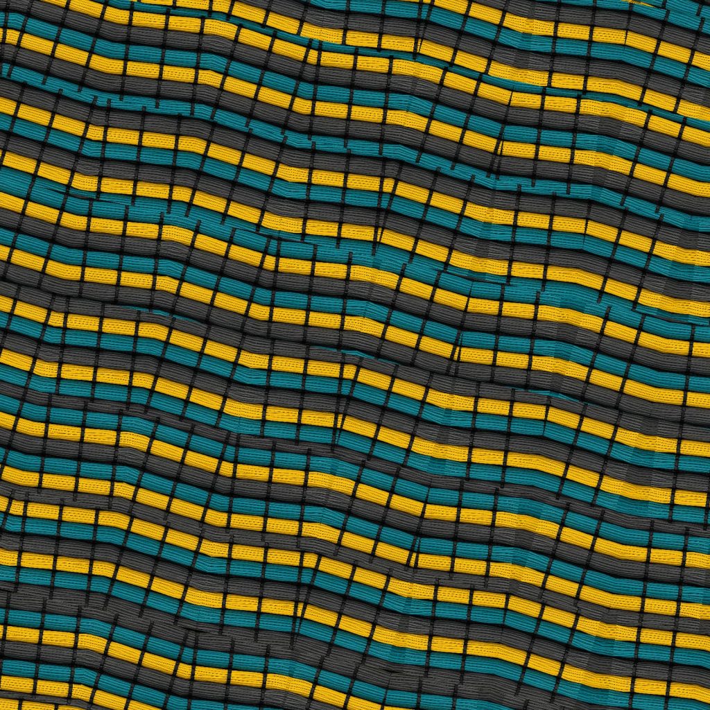
I printed the generated instructions onto A4 paper in a very light grey and then worked through the grid by hand with three brush pens.
This is where the computer loses control.
The algorithm determines the colour, position and direction, but it can’t determine exactly how I make the mark. Pressure changes. Lines aren’t perfectly straight. Some strokes are wider than others. Colours behave differently on the paper.
Repeating the same generated process with different sets of three colours also produces surprisingly different results.
What starts as a rigid grid of random computer instructions becomes something much less precise once it’s interpreted by hand.
For me, that’s the interesting part of this study: the code creates the rules, randomness creates the composition, and the hand creates the final image.
For the second experiment in this series, I wanted to keep the rules almost identical to the first project and change just one thing.
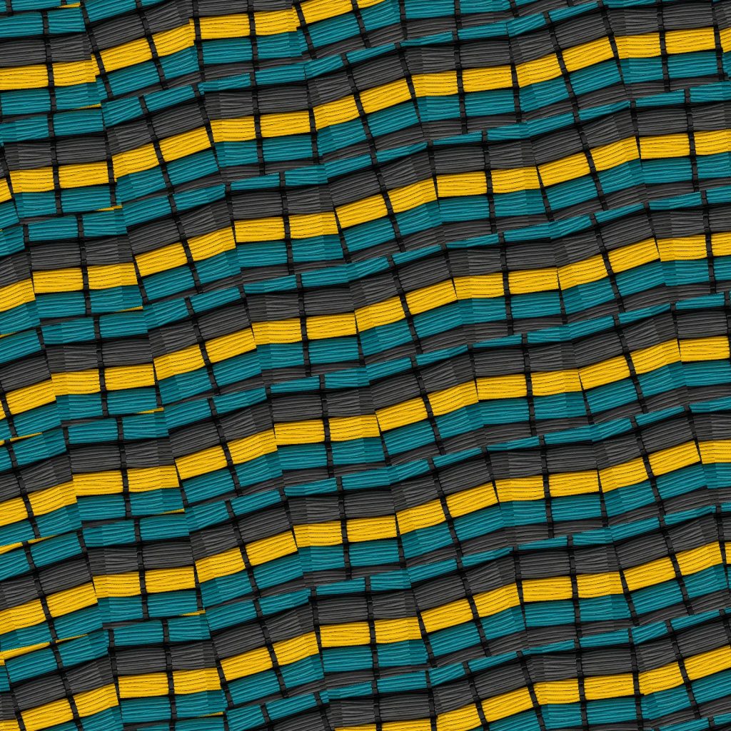
Study 01 used multiplication to determine the rotation of each line. This time, I’ve replaced the lines with outlined squares and changed the mathematics from multiplication to addition.
The question became:
What if every square knew where it was?
Each square sits within a regular grid. Its position is described by two values: its column and its row. Instead of multiplying those values together, I simply add them.
float angle = radians(column + row);
Every square is then rotated by the angle produced from that calculation.
The result is surprisingly different. Squares that share the same column + row value also share the same rotation, creating gentle diagonal bands that flow across the composition. Where the multiplication project felt more complex and unpredictable, this one feels calmer and much more structured.
Nothing else changes.
The grid remains fixed.
Every square is the same size.
Every outline has the same weight.
Only the mathematical relationship has changed.
This is what fascinates me about working in code. A tiny adjustment to a single formula can completely alter the visual language of the piece.
Like the first project, this isn’t about creating a finished artwork. It’s about asking a simple question, changing one variable, and observing what happens.
Sometimes the smallest mathematical change produces the biggest visual surprise.
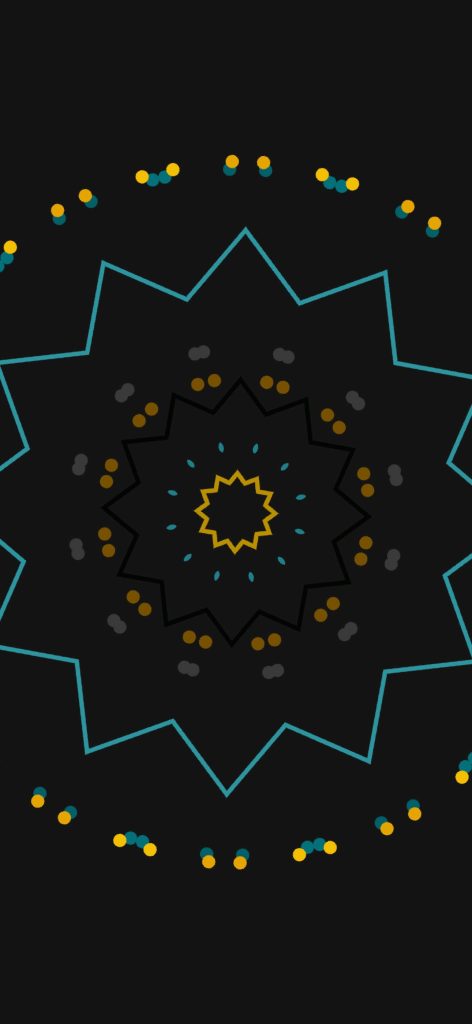
What if every line could remember the moment it was created?
This project explores that thought by treating every line as its own little life. Each one is born with a timestamp, a unique set of characteristics and its own colourful identity. Some grow quickly, some take their time. Some live long lives, while others disappear much sooner.
As each line ages, it slowly grows, changing direction as it travels. Every twist and turn becomes part of its story. Although the movement appears random, each line is confined to its own invisible space, giving every life a set of boundaries it can never leave.
When a line reaches the end of its lifespan, it doesn’t simply vanish. It fades to a soft grey and remains on the canvas as a memory of where it has been, while a new generation begins its own journey.
Watching the artwork over time reveals hundreds of small, individual stories unfolding at once. Some areas become dense with memories, while others remain surprisingly sparse. No two runs are ever the same.
Like many of my projects, this started with a simple question. It isn’t trying to represent anything literally; it’s more about exploring how a few straightforward rules can create something that feels surprisingly human.
I’ve always felt like I’ve had one foot in two different worlds.
I’ve been creating art for as long as I can remember, and I’ve worked as a developer for years. The strange thing is that those two passions rarely overlapped as much as I wanted them to.
When you’re learning to code professionally, your focus is very different. You’re learning how to solve problems, build websites, create applications and deliver reliable products. It’s practical, structured and driven by deadlines. There isn’t always much room to explore creativity through code.
That meant there was always a gap between the ideas I could imagine as an artist and the code I was capable of writing.
A few years ago I took some fantastic courses by one of my biggest inspirations, Joshua Davis. They introduced me to Processing and the HYPE Framework, opening my eyes to generative art and what was possible when design and programming came together.
It completely changed how I thought about code.
Even so, I still felt limited. I understood the concepts, but many of the ideas in my sketchbook felt just out of reach. I knew what I wanted to create, but I didn’t always know how to translate those thoughts into algorithms.
Then came ChatGPT.
For me, AI hasn’t replaced the creative process—it has unlocked it.
Instead of staring at a blank editor wondering where to begin, I can now describe an image that’s only ever existed in my head. We can discuss the mathematics behind it, break down the logic, experiment with different approaches and iterate rapidly until the code starts producing something unexpected and exciting.
More importantly, the conversation doesn’t stop once the first version works.
What if the shapes reacted to sound?
What if the colours were driven by live data?
Could gravity affect typography?
What if every square behaved like its own tiny organism?
Those are the kinds of conversations that happen almost daily now. One idea naturally leads to another, and projects evolve far beyond where I originally imagined they would.
It’s also become an incredible learning tool. Rather than simply copying code, I can ask why something works, explore different mathematical approaches, simplify algorithms and understand concepts that would previously have taken days of research.
Every project teaches me something new.
The more I create, the more confident I become writing Processing sketches myself. AI isn’t writing my artwork—it has become a creative collaborator that helps me turn abstract ideas into working prototypes that I can refine, question and develop.
Looking back, the biggest barrier wasn’t a lack of imagination.
It was the distance between imagination and implementation.
AI has shortened that distance dramatically.
This blog is becoming a record of that journey—experimenting, learning, making mistakes and discovering new ways to combine art, mathematics and code. Every project starts with a simple question: “What if…?”
Now, for the first time, I feel like I have the tools to find the answer.
Most of my recent generative art projects have been built with Processing and Java. It’s a workflow I’ve really enjoyed because it keeps the focus on the code and the creative process.
Lately, I’ve started exploring p5.js. It takes many of the ideas from Processing and brings them into the browser using JavaScript, making it easy to create interactive sketches that anyone can experience without installing anything.
One of the main reasons I’m experimenting with p5.js is to make this blog more interactive and visual. Instead of only sharing finished images, I’ll be able to embed live sketches that visitors can explore and interact with directly on the page.
I’m not moving away from Processing—far from it. Processing will remain my main tool for creating high-resolution prints and posters, while p5.js opens up new possibilities for interactive experiences on the web.
It’s another creative tool to add to the collection, and I’m excited to see how it shapes future projects.
Learning from Vera Molnár — Study 01: Multiplication
When people look at early computer-generated art, it’s easy to focus on the finished image. What interests me is the thinking that produced it.
This project marks the beginning of a series inspired by the methods of Vera Molnár, one of the pioneers of computational art. Rather than attempting to recreate her work, I’m exploring the kinds of mathematical systems that shaped it. The aim isn’t imitation; it’s understanding.
To do that, I’ve imposed a number of deliberate constraints. Every study in this series will begin with a simple mathematical rule and a minimal visual language. The artwork should emerge from the logic of the system, not from decoration or visual effects.
Starting with the simplest possible system
For the first study I wanted to use the smallest possible set of ingredients.
A3 portrait format
A regular grid
One line positioned in the centre of every square
Black lines on an off-white background
No colour
No animation
No randomness
One mathematical operation
Nothing more.
The challenge was to discover whether something visually interesting could emerge from almost nothing.
Why multiplication?
Multiplication is one of the most fundamental operations in mathematics.
Unlike randomness or noise, multiplication is entirely deterministic. Given the same two numbers, it will always produce the same result. That predictability makes it an ideal starting point when exploring algorithmic drawing.
Every line in the composition is positioned according to its location within the grid.
Each square has two values:
its column number
its row number
Those two numbers are multiplied together.
Angle = Column × Row
That single calculation determines the orientation of every line on the page.
There are no exceptions.
No adjustments.
No artistic intervention once the rule has been defined.
Angle = Column × Row
From arithmetic to drawing
If we imagine the grid beginning in the top-left corner, the first few values are surprisingly simple.
Column
Row
Multiplication
0
0
0
1
0
0
2
0
0
1
1
1
2
2
4
4
3
12
8
6
48
11
15
165
Those results are then interpreted as rotation angles.
Small numbers produce only slight changes.
As the values increase, the lines rotate further.
Although the underlying calculation remains extremely simple, the visual complexity gradually increases across the page.
Nothing has been randomised.
The pattern is entirely generated by elementary arithmetic.
The invisible grid
One of the most important decisions was not what to draw, but what not to draw.
The square grid exists only as a mathematical structure.
It isn’t printed.
The viewer never sees it.
Instead, it acts as an invisible coordinate system that provides every line with two pieces of information: its row and its column.
Without the grid there is no calculation.
Without the calculation there is no composition.
The geometry exists before the drawing.
Thinking like an early computer
This project is written in Processing using Java, but the algorithm itself could be described without referring to any programming language.
Create a grid.
Number every row.
Number every column.
Multiply the row and column numbers.
Rotate a line by the resulting value.
Repeat for every square.
That’s the entire system.
Modern software makes it easy to implement, but the underlying idea doesn’t depend on modern computing power. It’s a sequence of instructions that could be described on paper before a single line is programmed.
Constraint as a design tool
One of the things I’m beginning to appreciate is that removing possibilities often leads to stronger ideas.
It’s tempting to add colour, texture or movement, but each additional decision moves the work away from the central question.
Can a single mathematical operation generate a compelling image?
For this study, I wanted the answer to depend entirely on multiplication.
Everything else was intentionally stripped away.
Reflections
Looking at the finished print, I find it interesting that the eye naturally begins to search for order.
Diagonal rhythms begin to appear.
Clusters seem to form.
Some areas feel calm while others become increasingly energetic.
None of those relationships were drawn manually.
They’re simply the visual consequence of applying one rule consistently across an entire system.
Perhaps that’s one of the enduring lessons of early computational art: complexity doesn’t always come from complicated algorithms.
Sometimes it begins with nothing more than a grid, a line, and a single mathematical operation.
Technical Notes
Software: Processing (Java)
Format: A3 portrait
Visual Language:
Off-white paper
Black lines
Invisible square grid
One centred line per cell
Mathematical Rule:
Angle = Column × Row
A bit of a “what if” idea…
Rather than using identical lines, I wondered what would happen if the basic element became a letter.
The mathematical rule remains unchanged — only the visual language evolves. Each position in the grid is still rotated according to the same calculation, but the line is replaced with a randomly selected alphabetical character.
It’s a small change, yet it introduces a new layer of controlled variation. The randomness only determines which character appears; the underlying system and composition are still governed entirely by the mathematical rule.
Next Study
The next experiment will replace multiplication with a different mathematical operation while keeping every other constraint the same.
Can you understand an artist by rebuilding their process?
Over the last few years I’ve been experimenting with Processing and Java to create generative artwork. Most projects have explored modern computing power, real-time animation and increasingly complex systems.
This project is different.
Rather than asking “What can today’s computers do?” I wanted to ask:
“What could have been achieved with the mathematical thinking available in the 1960s?”
That naturally led me to the pioneering work of Vera Molnár.
Looking backwards instead of forwards
Vera Molnár is recognised as one of the earliest artists to embrace computers as a creative partner. Long before generative art became fashionable, she was exploring systems, rules and controlled randomness.
What’s remarkable is that many of her ideas existed before she even had regular access to a computer.
She imagined what she called an “imaginary machine”—a conceptual computer capable of carrying out simple instructions repeatedly. When computers eventually became available, they simply became another tool for testing those ideas.
Looking through her work, it’s easy to become distracted by the finished images.
What interests me more is the thinking behind them.
This isn’t about copying
The intention isn’t to reproduce Vera Molnár’s artwork.
Instead, it’s an attempt to understand the constraints she worked within.
Today’s software makes almost everything effortless:
millions of calculations every second
unlimited colours
complex animation
advanced rendering
countless libraries
Removing those luxuries forces different decisions.
For this series I’ll deliberately restrict myself to:
Basic geometric shapes
Straight lines
Simple transformations
Repetition
Small amounts of controlled randomness
Elementary mathematics
Black and white compositions
A3 portrait layouts
Every project will be written in Processing using Java.
Not because it’s historically accurate, but because it allows me to think algorithmically without unnecessary complexity.
Designing with limitations
One thing that becomes obvious very quickly is that limitations are surprisingly creative.
Instead of asking:
“What should I draw?”
the question becomes
“What simple rule should I write?”
A square becomes interesting once it’s repeated.
A line becomes interesting once it’s rotated.
A grid becomes interesting once every element breaks the rules slightly.
Tiny mathematical changes produce surprisingly rich compositions.
Thinking like an early computer
Modern generative artists often build systems with noise functions, particle engines, physics simulations and GPU shaders.
For this project I’m intentionally avoiding most of that.
Instead I’ll explore ideas that feel closer to the computational mindset of the 1960s:
Regular grids
Rotation
Translation
Scaling
Sequential plotting
Iteration
Random number generation
Permutation
Probability
Simple geometric relationships
Almost every image should be explainable in a few lines of mathematics.
A study rather than a tribute
I’m treating this as a research project.
Each artwork will begin with a question.
What happens if every square rotates by one degree more than its neighbour?
What if a perfect grid slowly loses its precision?
How much randomness is enough before order disappears?
Those questions feel far more interesting than chasing a particular visual style.
Hopefully, by rebuilding these ideas from first principles, I’ll gain a deeper appreciation of why Vera Molnár’s work remains so influential today.
The series
Over the coming weeks I’ll be creating a collection of A3 portrait artworks, each exploring a single mathematical idea.
Every piece will be generated entirely in Processing using Java and deliberately limited to the simplest possible visual language.
No textures.
No gradients.
No effects.
Just mathematics, repetition and controlled variation.
Sometimes the simplest rules produce the richest results.
That’s a lesson Vera Molnár understood more than sixty years ago—and one that’s still worth exploring today.
Finding generative inspiration in an evening of sound, sea and code.
On a warm Saturday evening I found myself lying on the beach, listening to the sound of Tibetan singing bowls as the sun disappeared over the horizon. It’s not something I’d ever done before, and if you’d asked me a year ago if I’d spend an evening at a beach sound bath, I’d probably have said no. I’m glad I did.
There was something fascinating about hearing the bowls live. The tones didn’t feel like they travelled in perfect circles; they seemed to bend, overlap and interfere with one another as they drifted across the beach. Looking around, everyone was scattered naturally across the sand, each person having their own quiet experience while all sharing the same source of sound.
That stayed with me long after the evening had finished.
Turning a memory into code
Rather than recreating the event literally, I wanted to capture the feeling of it.
The piece starts from a simple aerial view. People become nothing more than small circles. The Tibetan bowls are reduced to three outlined rings. Everything else is generated procedurally.
Clicking and holding one of the bowls allows it to “charge”. Releasing the mouse sends a wave travelling outwards. As those waves reach people sitting around the bowls, they begin to emit their own smaller ripples, creating a constantly changing network of responses.
The result isn’t intended to be physically accurate. It’s more like a visual interpretation of shared resonance.
Inspired by the beach
The first colour palette came directly from photographs I took that evening.
Soft golden sand, fading evening blues and warm sunset yellows became the foundation of the artwork. Those colours appear only in the waves, while the people and bowls remain simple white forms. Keeping the geometry minimal lets the movement become the focus.
As the project developed, two additional modes emerged:
Beach – warm sand tones with colourful waves inspired by the evening sky.
Paper & Ink – reducing everything to black lines on textured paper, giving the piece the feel of a hand-drawn print.
Night – a dark background with softly glowing coloured waves, creating a more meditative atmosphere.
Each mode changes the mood of the same underlying simulation without changing the behaviour.
Building the interaction
The sketch is written in Processing (Java) and is entirely interactive.
Rather than looping through a fixed animation, the user creates the experience by interacting with the bowls. Holding a bowl increases its energy before releasing expanding waves that trigger reactions from nearby participants.
Those reactions then become part of the composition, with multiple wave systems overlapping and slowly fading away. Every interaction produces a slightly different arrangement.
What I enjoyed most
This project reminded me that inspiration doesn’t always come from galleries, books or websites.
Sometimes it’s simply being somewhere unfamiliar, experiencing something for the first time, and noticing the patterns your brain keeps replaying afterwards.
I never expected a Saturday evening listening to Tibetan singing bowls on a beach to become the basis for a generative artwork, but that’s exactly why I enjoy working with code. It gives me a way to translate memories and experiences into something visual, interactive and constantly evolving.
Using Java, live microphone input and three-dimensional forms to create a visual response to bird song.
I wanted to explore how bird calls could be translated into something visual using code.
The finished Processing sketch listens through the computer’s microphone, analyses the incoming frequencies and uses them to control a grid of transparent 3D boxes. As the sounds change, the depth, rotation and colour of the boxes change with them.
The idea
The starting point was a simple question: what might a bird call look like?
I did not want to draw the bird itself or display the sound as a conventional waveform. Instead, I wanted the audio to control a collection of geometric forms.
I chose transparent keyline boxes because they could respond in several ways without becoming too visually heavy. Each box can change its depth, position, rotation and colour, allowing the grid to develop into a constantly changing three-dimensional structure.
The inspiration
Bird calls contain a surprising amount of variation. Some are short and sharp, while others are slower, lower or more repetitive.
I wanted to use these differences as data rather than trying to recreate the sound literally. The code establishes a set of visual rules, but the bird calls determine what happens within them.
This creates a balance between a controlled system and the unpredictable nature of a live recording.
The process
The project was created in Processing using Java and the Processing Sound library.
The sketch accesses the computer’s default microphone and listens to the surrounding environment in real time. It separates the incoming sound into low, middle and high-frequency ranges before applying those values to the grid.
Middle frequencies control much of the general activity.
Higher frequencies respond to sharper calls and details.
Overall volume controls the strength of the reaction.
Frequency levels also influence the keyline colours.
The audio values are smoothed before they reach the visual system. Without this, every small change in the microphone signal would make the boxes jump too abruptly.
The microphone sensitivity is set for normal recording levels and can be adjusted while the sketch is running. The code also measures the general background noise, helping the visual response remain useful in different environments.
Development
Stage one: using recorded audio
The first version used a saved audio file.
This was helpful during development because I could replay the same sound while adjusting the frequency ranges and testing how the boxes responded.
It confirmed that the basic idea worked, but every result was tied to the same recording.
Stage two: using a live microphone
I replaced the audio file with live input from the computer’s microphone.
This made the project feel much more immediate. The visual structure now responds to whatever is happening around it at that particular moment.
A quiet environment creates a restrained arrangement of boxes. Bird calls produce sharper movements and changes in colour, while voices, music and other background sounds create entirely different results.
Stage three: refining the boxes
During development, I experimented with solid shapes and smaller blocks placed inside the main boxes.
These versions became visually heavy and distracted from the overlapping structure. I returned to transparent cuboids drawn entirely with coloured keylines.
Because the boxes have no filled surfaces, their edges remain visible through one another. This creates a more complex sense of depth while keeping the individual forms simple.
Stage four: tuning the response
One of the most difficult parts was finding the right microphone sensitivity.
If the response was too low, quieter calls produced very little movement. If it was too high, normal background noise caused the whole grid to react constantly.
I added adjustable sensitivity and background-noise detection so the sketch could respond more naturally in different recording conditions.
The outcome
The finished project is a live visual interpretation of bird calls and the surrounding soundscape.
Every result is created from the same grid and the same set of rules, but the composition changes depending on what the microphone hears.
The structure can also be rotated using the mouse, making it possible to explore the generated forms from different angles. The animation can be paused when an interesting arrangement appears.
What I learned
This project showed me that audio does not need to be represented as a waveform.
By dividing the microphone input into frequency ranges, I could use a single sound source to control several visual properties at once. Depth, rotation, movement and colour can all respond differently while remaining connected to the same recording.
I also found that simpler forms created the strongest results. Removing the solid surfaces made the overlapping lines and three-dimensional structure much easier to see.
Most importantly, the project demonstrated how code can translate something temporary, such as a bird call, into a visual experience.
What’s next?
I would like to test the project with different bird species and compare the visual results.
Each species has its own rhythm, pitch and pattern of calls, so it would be interesting to see whether these differences create recognisably different structures.
I would also like to experiment with recordings made in different habitats and at different times of day. A woodland at dawn should produce a very different response from a garden, wetland or urban environment.
Another possibility would be to improve the frequency detection so the sketch can react more precisely to individual calls while ignoring unrelated background noise.
Final thoughts
This began as an experiment in making bird song visible through code.
Java provides the rules, the microphone supplies the data and the surrounding sounds create the changing composition. Although the visual system remains consistent, the result is never quite the same twice.
I like that the project does not attempt to illustrate a bird or reproduce its call literally. Instead, it creates a visual response to the rhythm, frequency and energy of the sound.
Using real bird observations to create evolving digital flocks in Processing (Java).
Every year, thousands of bird sightings are submitted by birdwatchers across the UK. They usually end up as lists of species, dates and locations. They’re invaluable for conservation, but I wondered what they might look like if the data could move.
This project explores that idea by transforming bird sighting records into a living murmuration.
Rather than plotting observations on a map, every record becomes an individual bird within a simulation. As more sightings are added, the flock begins to organise itself using simple behavioural rules inspired by nature. Over time, scattered points become flowing shapes that continuously form and dissolve across the screen.
The result sits somewhere between data visualisation, simulation and generative art.
The Idea
The project takes recent bird sighting data and uses it as the starting point for a flocking simulation built in Processing.
Each observation creates a bird within the system. From there, the birds respond to one another using the classic flocking behaviours:
Separation – avoiding collisions with nearby birds.
Alignment – matching the direction of neighbouring birds.
Cohesion – moving towards the local flock.
To prevent the movement feeling too mechanical, Perlin noise is introduced to create subtle environmental forces. The flock constantly shifts, stretches and reforms in ways that feel closer to watching real starlings overhead.
The original data simply starts the conversation. The artwork takes over from there.
From Data to Movement
One aspect I particularly enjoyed was avoiding a literal representation of the data.
There are no maps, charts or graphs.
Instead, the information becomes behaviour.
A busy day of sightings naturally produces a larger, denser flock, while quieter datasets create more open formations. Different species could eventually influence colour, speed or movement characteristics, allowing each dataset to generate its own personality without ever needing labels or axes.
Building the Simulation
The project was written in Java using Processing.
Alongside the flocking algorithm, I added a number of features to make the artwork feel more alive:
Procedurally generated Perlin noise flow.
Species-based colour palettes.
Motion trails showing the history of each bird.
Pause and restart controls.
High-resolution image export.
Randomised initial formations.
One idea i’ve introduced is adding a peregrine falcon into the simulation. At random intervals it would pass through the flock, forcing the birds to scatter before gradually reforming into a new murmuration.
Why I Like This Project
I’ve always enjoyed projects that blur the boundary between science and art.
The underlying algorithms are relatively simple, but when hundreds of individual agents interact together, surprisingly natural behaviour emerges. Watching order appear from a collection of independent birds feels remarkably similar to observing a real murmuration.
It’s also a reminder that data doesn’t always need to be presented analytically. Sometimes the most engaging way to understand information is to experience it.
What’s Next?
There are plenty of directions I’d like to take this further:
Live bird sighting feeds updating the flock in real time.
Species-specific behaviours and movement styles.
Environmental influences such as wind or weather.
3D murmurations that viewers can rotate and explore.
Large-format print series generated from moments within the simulation.
Like many of my Processing experiments, this is less about producing a finished piece and more about discovering what happens when simple rules interact over time.
Sometimes the most interesting results are the ones you never explicitly programmed.