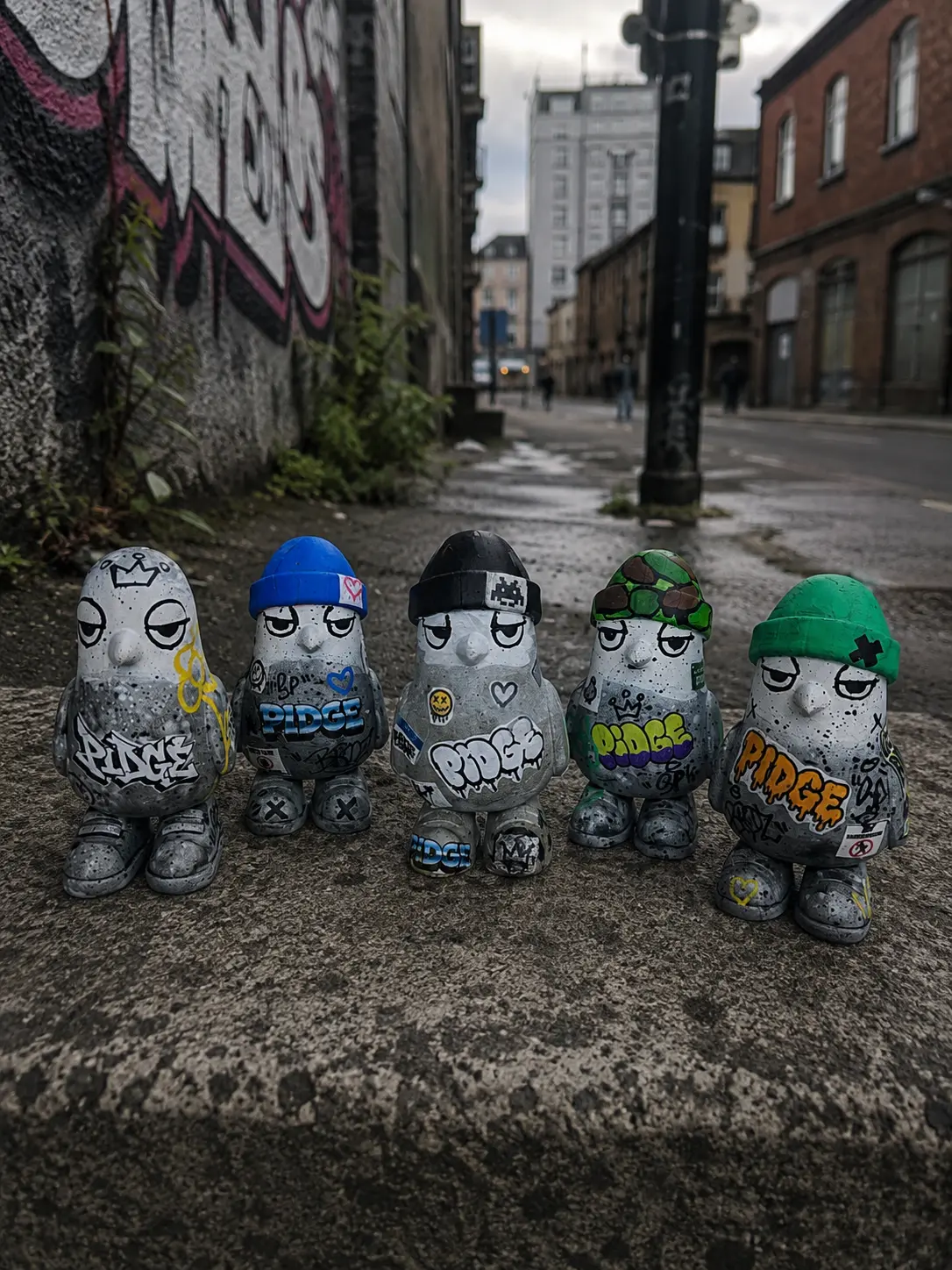
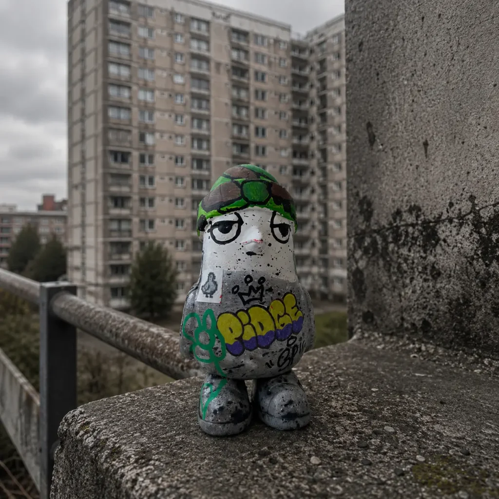
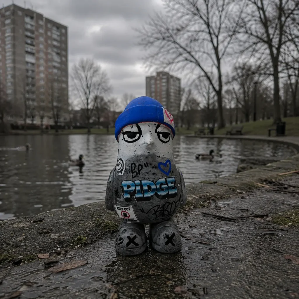
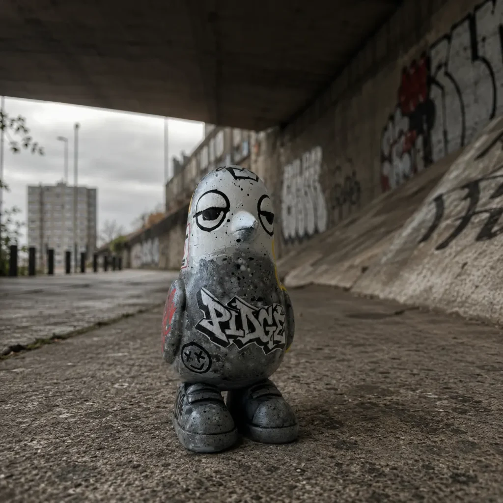
Pidge started as one of those ideas that didn’t really have a grand plan behind it.
I wanted to make a character. Something simple, physical and a little bit scruffy. Something that could exist away from a screen.
And eventually, Pidge appeared.
From an idea to an actual object
I’ve always liked making things.
A lot of my day-to-day work involves websites, design and things that ultimately exist on a screen. Personal projects give me an excuse to go in completely the opposite direction and make something physical.
Pidge is part character design, part sculpture, part street art and probably part toy.
The basic shape is deliberately simple. There’s something vaguely pigeon-like about him, but he’s also just a strange little character with big feet, a blank expression and not much enthusiasm for whatever is happening around him.
That expression became quite important.
He always looks slightly unimpressed.
Making the Pidges
Rather than making a single Pidge, I wanted to be able to create variations.
The original was made as a 3D model, which then gave me a physical form I could work from. From there I made my own silicone moulds and started casting them.
That’s probably one of my favourite parts of projects like this.
There’s a process.
Design something digitally. Print it. Make a mould. Cast it. Paint it. Photograph it.
Each stage changes the thing slightly.
The casts aren’t supposed to be absolutely perfect either. Small marks, textures and imperfections actually help. Once they’re painted, splattered, drawn on and covered in tiny bits of graffiti, those imperfections become part of the character.
I don’t really want them to look mass-produced.
Quite the opposite.
Giving each one an identity
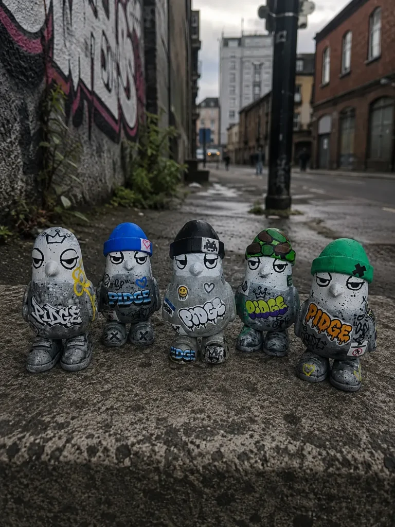
The basic Pidge might be the same, but each finished character is different.
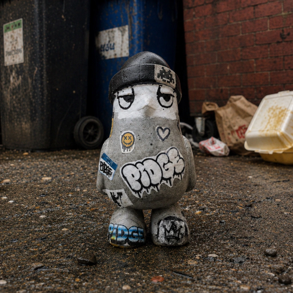
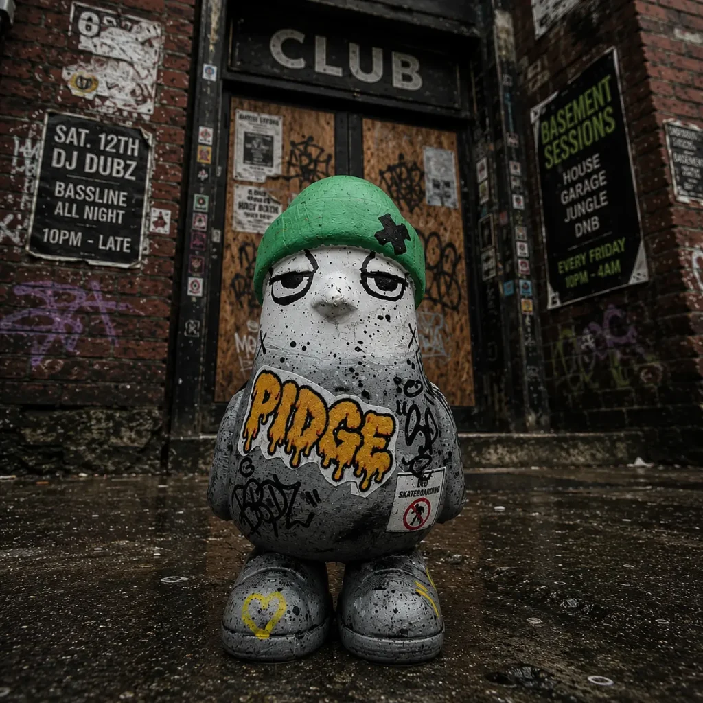
Different hats. Different colours. Different tags. Stickers. Scribbles. Paint splatters. Little references and marks.
I’ve treated the surface almost like a tiny wall somewhere in a city.
Things overlap.
Some bits are neat. Some aren’t.
New marks cover old ones.
There isn’t really a strict design system governing where everything goes. I prefer letting each one develop as I’m making it.
It means they end up feeling related without being identical.
A little Pidge crew.
Taking them outside
The project became much more interesting when I started photographing them away from home.
Instead of photographing them against a clean backdrop, I’ve been taking them into places that feel like they belong there.
Concrete.
Graffiti.
Underpasses.
Tower blocks.
Wet pavements.
Old brick buildings.
Suddenly the scale becomes slightly ambiguous.
A little cast character sitting on a concrete wall can almost look like it has always been there. Photographing them from close to ground level exaggerates that even further.
That’s become as much a part of the project as making the actual Pidges.
I’m not just making an object and documenting it.
I’m putting a character into an environment and photographing the little scene that happens as a result.
Why pigeons?
I’ve always loved pigeons.
They’re everywhere, particularly in towns and cities, but we barely notice them.
They’re scruffy, adaptable and surprisingly full of character.
They also seem appropriate for something influenced by graffiti and urban environments. A pigeon doesn’t need permission to be somewhere. It just turns up.
Pidge has ended up feeling much the same.
No real destination
I’m deliberately not trying to work out what Pidge needs to become.
It doesn’t need to become a product.
It doesn’t need a complicated story.
And it definitely doesn’t need a five-year brand strategy.
For now I like making them, experimenting with different finishes and taking them out to find places to photograph them.
That’s enough.
There will probably be more Pidges.
And they’ll probably continue looking completely unimpressed about it.
Almost everything is an iteration of something else.
An artist sees another artist’s work and takes something from it. A musician hears a sound and pushes it somewhere slightly different. A designer borrows a layout, a typeface, a colour combination or an idea. Architecture responds to architecture. Fashion circles back on itself. Religions develop from older beliefs, traditions and stories.
Even the things we describe as revolutionary rarely appear from nowhere.
They are iterations.
And perhaps that is simply how human creativity works.
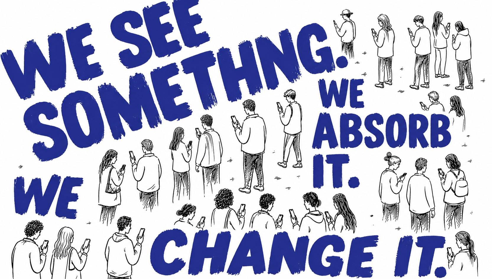
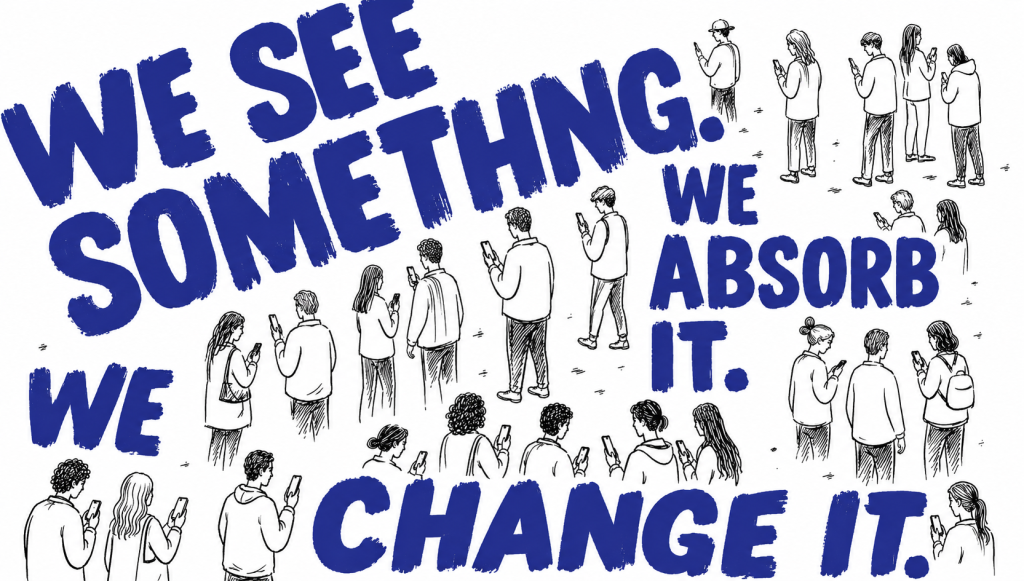
We see something. We absorb it. We change it.
We combine it with something else. Then somebody sees what we have made and the process begins again.
There is something quite comforting about that.
But lately I’ve been wondering whether iteration has changed.
Iteration used to have friction
Before the internet, influences travelled relatively slowly.
You might discover an artist through a book. Hear a new band through a friend. Find an unusual magazine in a shop. Visit another country and notice a completely different visual language.
Those influences would get mixed together with where you lived, the people around you, what you could afford, what materials were available and your own ability.
Copying was never perfect.
And perhaps those imperfections were important.
If ten people tried to recreate the same thing, they would probably produce ten slightly different results.
Something would inevitably be lost, misunderstood or changed along the way.
Perhaps that’s actually where originality lives.
Not necessarily in creating something from nothing, but in the distance between the original idea and our imperfect interpretation of it.
The gaps in our knowledge created variation.
Now we can see almost everything, instantly.
And everybody else can see it too.
The algorithmic iteration
Spend a little time on Instagram, TikTok or Pinterest and you can watch iteration happening at enormous speed.
Someone makes something interesting.
It performs well.
Someone else notices.
They make their version.
That performs well too.
Soon there are hundreds.
The same photographic styles. The same interiors. The same graphic design. The same video edits. The same clothes. The same restaurants. The same coffee shops. The same phrases. The same personal brands.
Eventually it becomes difficult to work out where the original idea came from.
Maybe that doesn’t matter.
What interests me more is what happens next.
The platforms learn that we like this thing, so they show us more of this thing.
We see more of it, so we become more familiar with it.
Familiarity becomes preference.
Preference becomes demand.
And demand creates more of the thing.
It is iteration feeding iteration.
Then brands arrive
Of course, brands understand this.
If enough people begin presenting themselves in a particular way, there is an opportunity to sell them the things required to complete the picture.
The right trainers.
The right coffee machine.
The right furniture.
The right car.
The right phone.
The right holiday.
Even the right houseplant.
Products have always been marketed through aspiration, but social media has made the feedback loop extraordinarily efficient.
We don’t just see advertising from brands anymore. We see thousands of people demonstrating the lifestyle surrounding the product.
And because those people are also watching each other, certain lifestyles begin to converge.
The strange part is that something can feel incredibly personal while being shared by millions of people.
This is me.
But where did me come from?
How much did I choose, and how much was gradually presented to me until it felt like a choice?
Is originality even possible?
Perhaps we’ve put too much value on originality.
The idea of creating something completely untouched by previous influence might be impossible.
Every drawing I’ve ever made is influenced by drawings I’ve previously seen. Every website I’ve designed contains decades of established conventions. Every piece of code I’ve written relies on ideas developed by other programmers.
Even rebellion requires something to rebel against.
Punk needed what came before punk.
Modernism needed what came before modernism.
The avant-garde needs a garde.
Trying to completely escape iteration might therefore be pointless.
We would have to somehow forget everything we’ve ever seen.
One idea becomes two. Two become four. Four become hundreds of strange variations.
Imagine an idea travelling slowly between people, places and disciplines.
A painter sees something in architecture. A musician sees the painting. A fashion designer hears the music. A graphic designer sees the clothes. Each person takes something different from what came before.
By the time the idea reaches the end of that chain, it might barely resemble where it started.
That’s iteration doing something interesting.
But what happens when everybody sees the same source at roughly the same time?
We don’t necessarily get branches.
We get thousands of people iterating from the same reference point. And increasingly, the platforms distributing those references are measuring the response.
Likes. Views. Shares. Saves. Watch time. Clicks.
Successful iterations are amplified. Unsuccessful ones disappear.
The next person isn’t simply responding to an idea. They’re responding to an idea that has already been tested and ranked.
That changes the process.
Iteration starts becoming optimisation. And optimisation is very different from exploration.
Instead of asking:
What could this become?
we begin asking:
What version of this is most likely to work?
That’s an incredibly useful question in many situations. But I’m not sure it’s always a particularly creative one.
The value of getting it wrong
I’ve become increasingly interested in processes where I don’t completely control the outcome.
Generative art is an obvious example.
You create the rules, but you don’t necessarily create the final image. You might define a grid, a set of colours, a movement system or a mathematical relationship. Then randomness enters the process. Run the same piece again and something changes. Run it a hundred times and occasionally something appears that you wouldn’t have consciously designed.
I find that fascinating.
Because in a strange way, the computer is introducing some of the friction we’ve been removing elsewhere.
The unexpected result becomes part of the creative process. And it doesn’t have to involve code.
It could be paint running somewhere you didn’t expect. A photograph being badly exposed. A material behaving differently from how you imagined. Mishearing a lyric. Picking up the wrong pen.
Some of the most interesting iterations happen because something went wrong.
Perhaps creativity needs a certain amount of information loss.
A gap between the reference and the result.
Deliberately introducing imperfection
Perhaps one way out is to introduce that friction ourselves.
Do something without researching it first. Use the wrong tool. Work with a material you don’t completely understand. Listen to music outside the genres recommended to you. Buy the strange magazine.
Visit somewhere without searching for the ten things you’re supposed to see when you arrive.
Make something and don’t immediately compare it with what other people have made.
Allow randomness into the process. Allow mistakes. Allow bad ideas to survive slightly longer.
Because sometimes the interesting part of iteration is the mutation.
The misunderstood instruction. The accidental mark. The badly remembered reference. The technical limitation. The thing that wasn’t supposed to happen.
Those are often the moments when an iteration stops being a copy and starts becoming something else.
But do we actually want to escape?
There is another possibility.
Perhaps we don’t.
Humans have always copied each other.
It helps us communicate. It creates culture. It allows ideas to spread. It gives us common visual languages, rituals, music, fashions and beliefs.
Iteration is how knowledge survives. If every generation started again from nothing, we’d get nowhere.
So I don’t think iteration itself is something we need to escape.
What might be worth escaping is unconscious iteration. Following because everyone else is following.
Buying because everyone else is buying.
Designing something a certain way because that’s what design currently looks like.
Making something because the algorithm has quietly demonstrated that this is the sort of thing that gets rewarded.
Maybe the important thing is simply to notice when it’s happening.
To occasionally ask:
Where did this idea come from?
Why do I like this?
Would I still make this if nobody else was going to see it?
What happens if I deliberately take it in the wrong direction?
We probably can’t escape iteration.
I’m not convinced we should.
Maybe we just need to put a little friction back into it.
Enough randomness, misunderstanding, curiosity and failure to stop every branch growing in the same direction.
Because perhaps originality isn’t the absence of influence.
Perhaps it’s what happens to an influence on the journey.
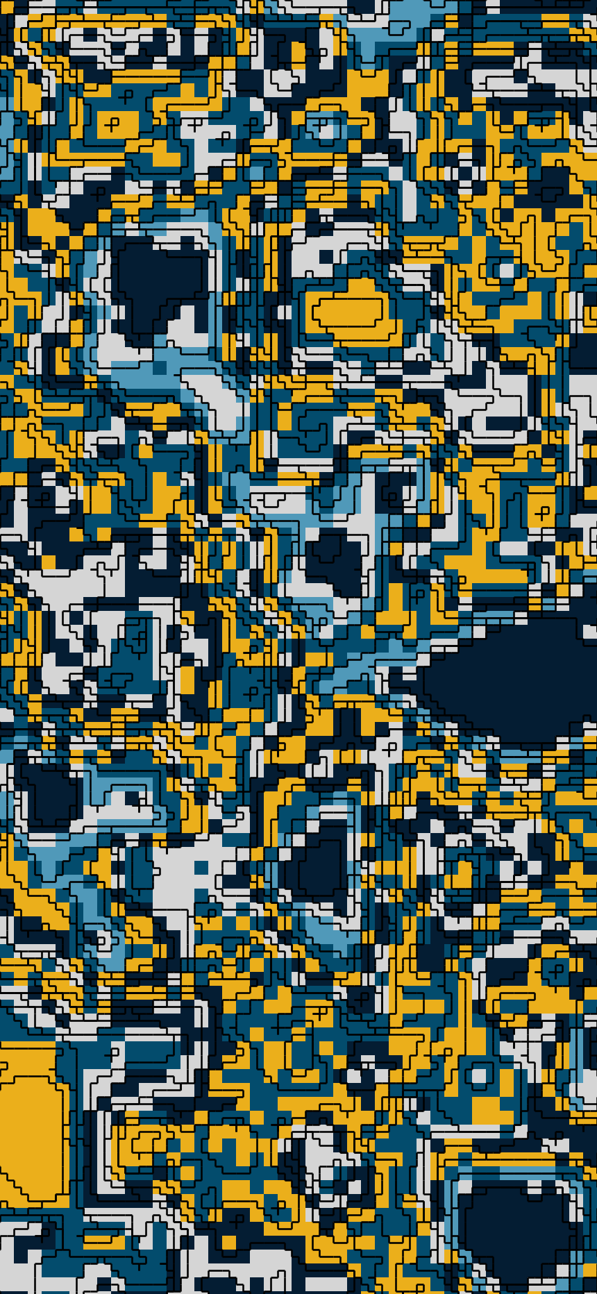
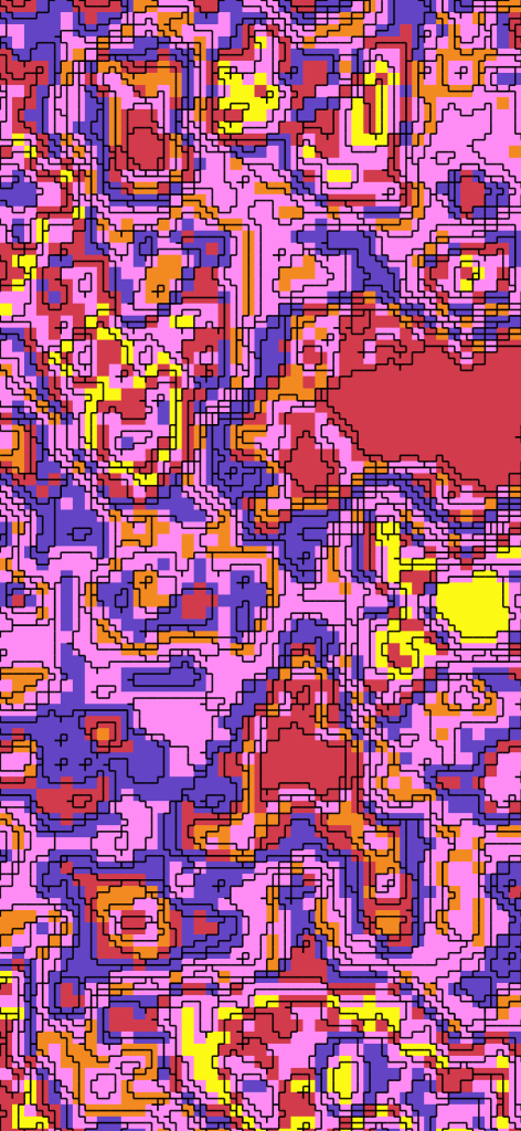
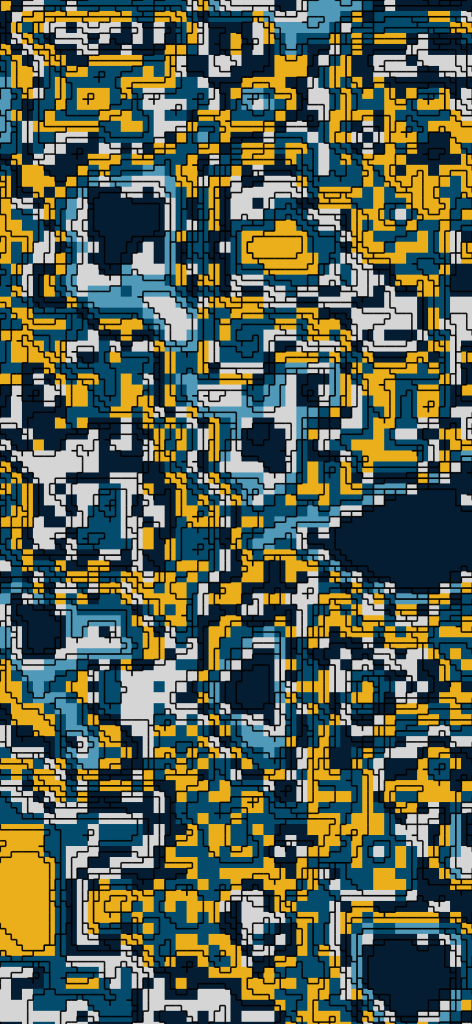
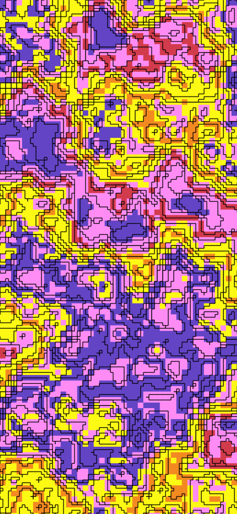
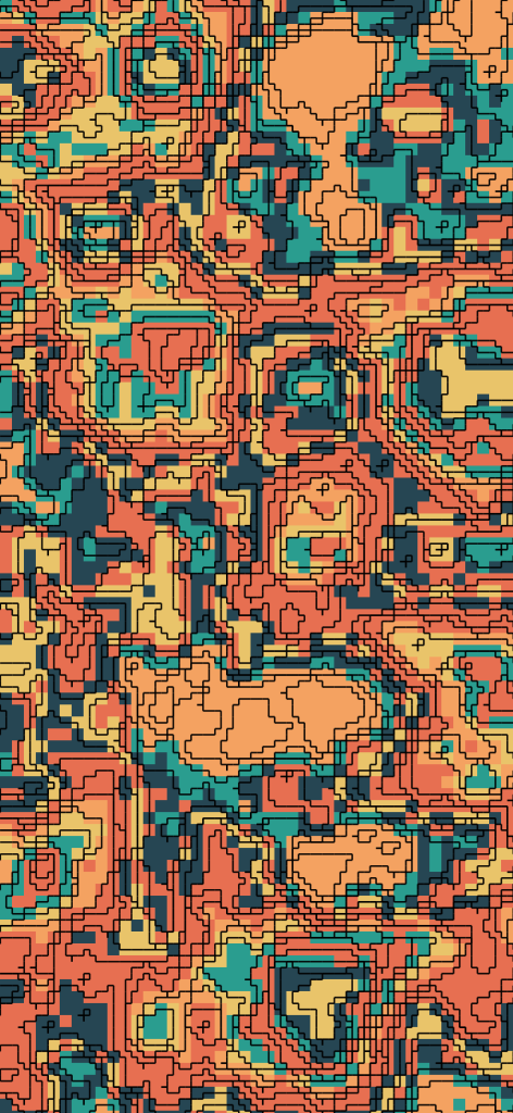
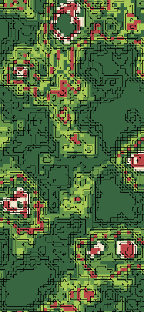
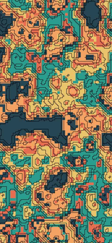
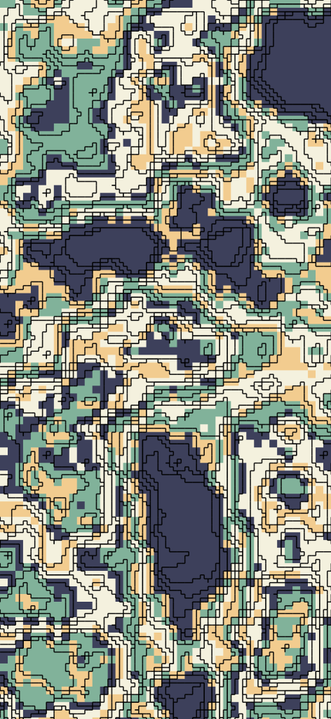
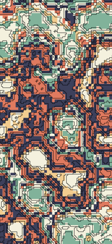
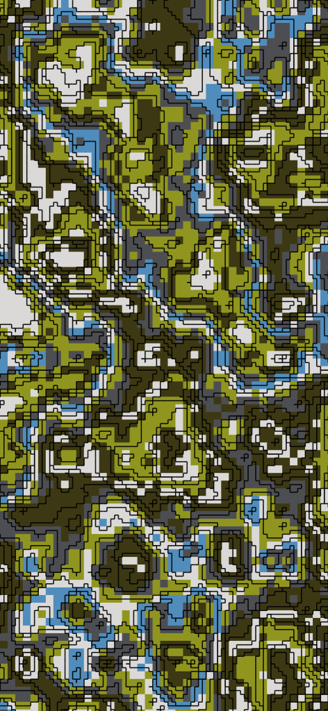
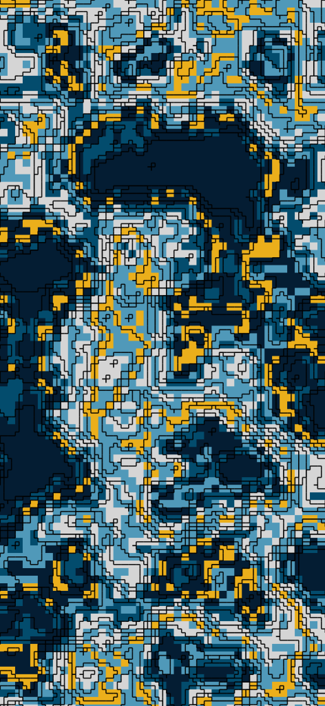
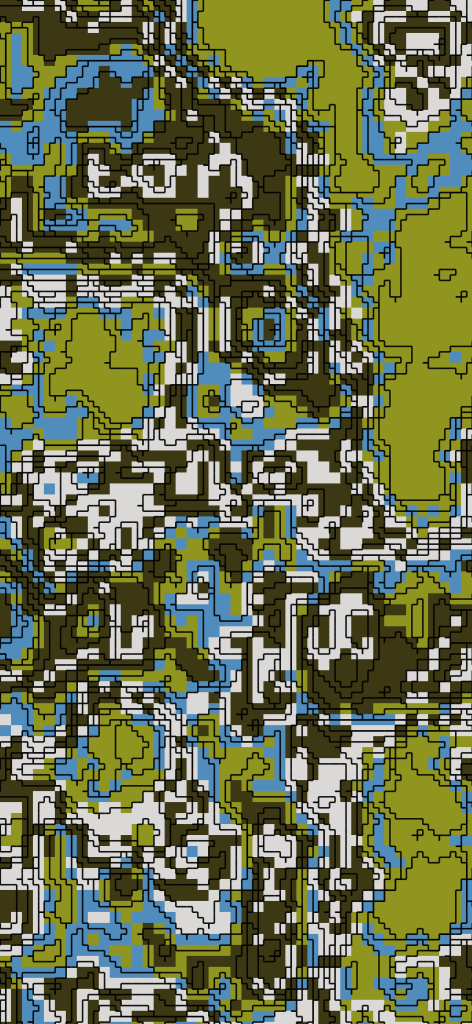
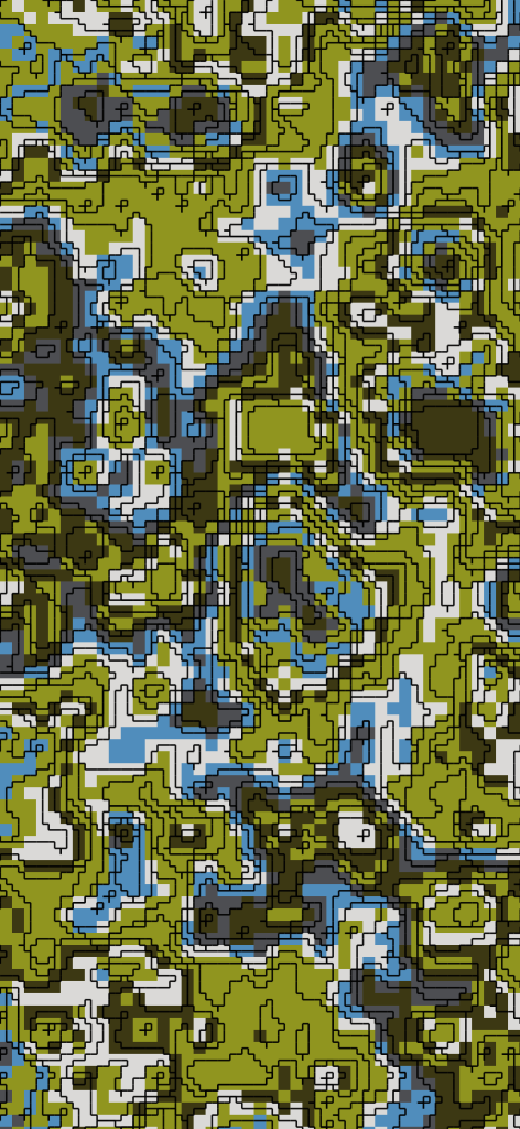
I’ve always liked map contours. There’s something about those repeated lines wrapping around hills, valleys and changes in elevation that feels both technical and strangely abstract. Take away the labels, roads and place names and they become patterns in their own right.
For this little Processing experiment, I wanted to take that idea and make it feel much less precise.
I’m also drawn to low-resolution graphics, early digital imagery and anything that feels slightly blocky or restricted by a grid. So instead of smooth contour curves, these are built from sharp 90-degree steps. It gives them a kind of retro mapping feel — somewhere between topographic data, pixel art and an old computer-generated landscape.
The terrain itself comes from Perlin noise. Each image is generated from a different random field, with contour levels gradually added until the piece is complete. I’ve always enjoyed using randomness in creative work because it introduces decisions I wouldn’t necessarily make myself. Sometimes the results are awkward, sometimes they’re unexpectedly balanced, and occasionally something appears that feels almost deliberately composed.
That unpredictability is a big part of the appeal.
Colour is random too, but within some boundaries. I’ve created a number of palettes based on colours I associate with favourite places, artists and bits of visual inspiration I’ve collected over the years. Each new piece chooses a palette and then distributes those colours across the landscape in different ways.
So although the code and underlying rules stay the same, every output is different.
Once a landscape has finished building, the sketch automatically saves it as an image before moving on and generating another. I can leave it running and gradually end up with a collection of strange, colourful, imaginary maps.
They don’t represent anywhere real, but sometimes I find myself looking at them and trying to decide where the hills, lakes, paths and settlements might be anyway.
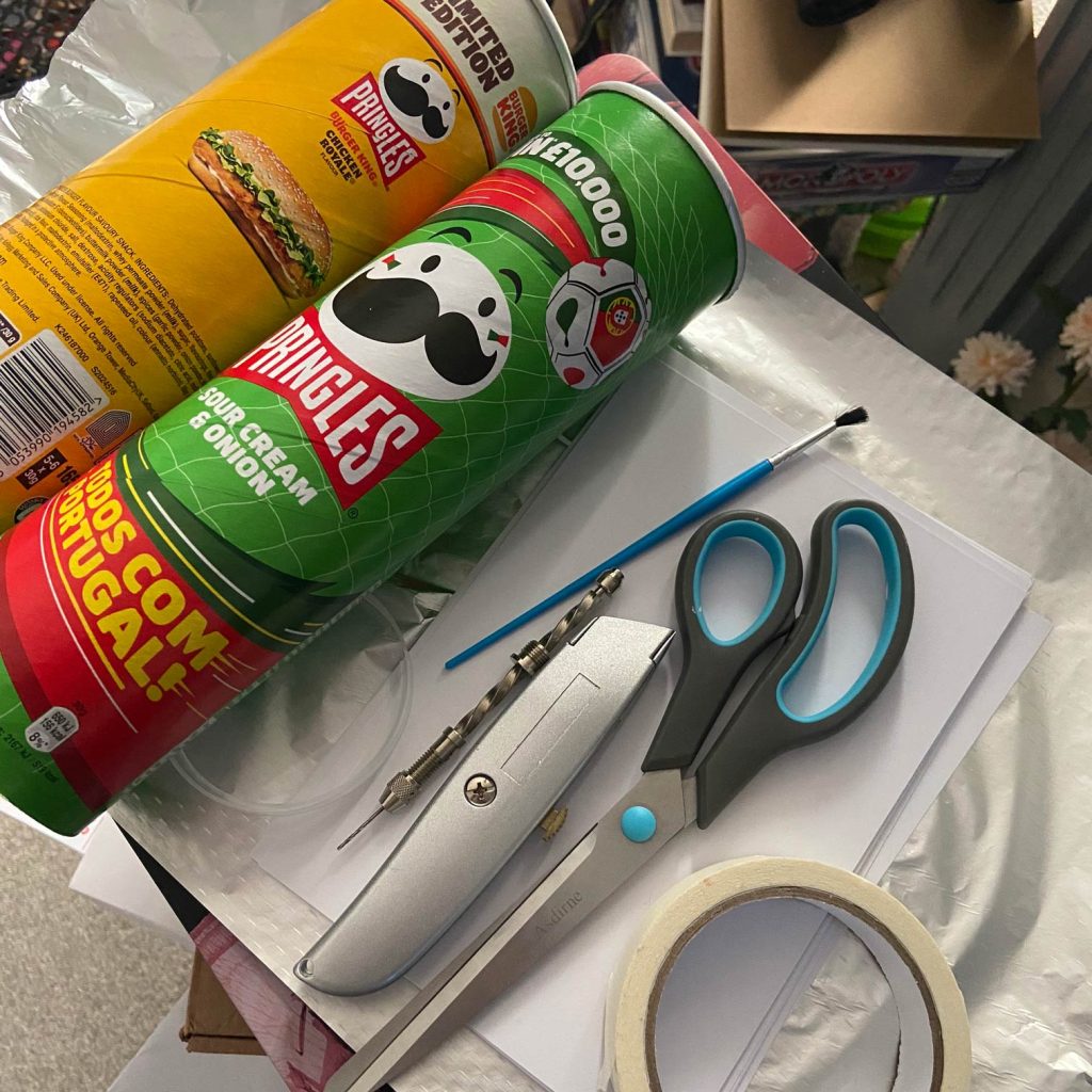
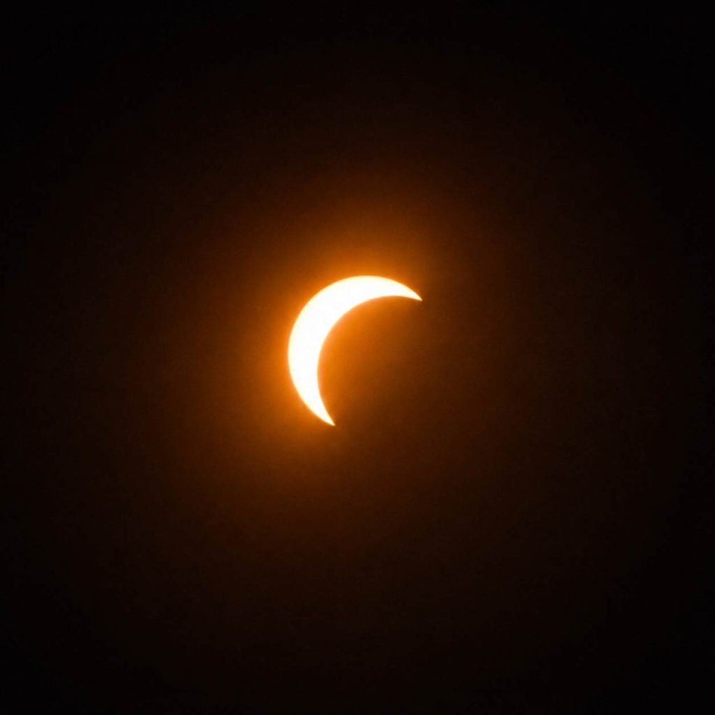
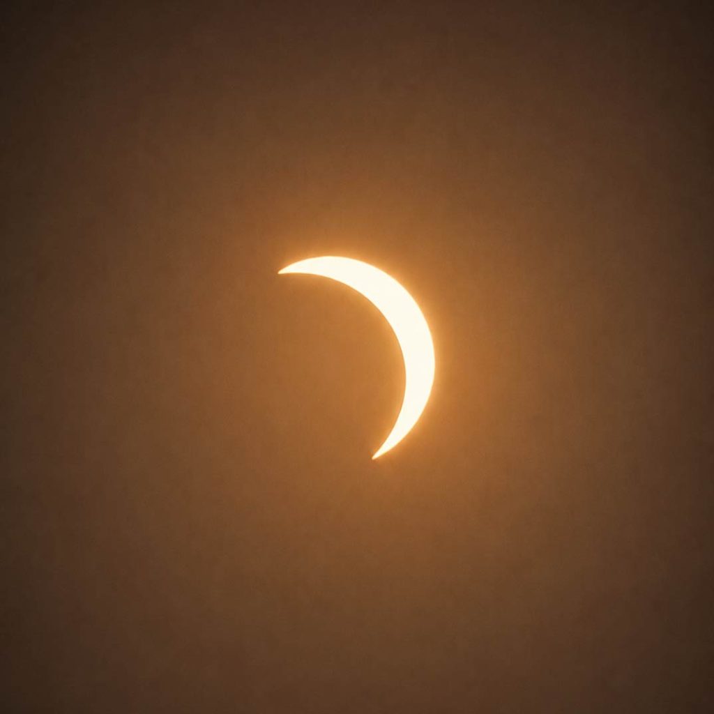
There’s something quite nice about watching a solar eclipse through a Pringles tube.
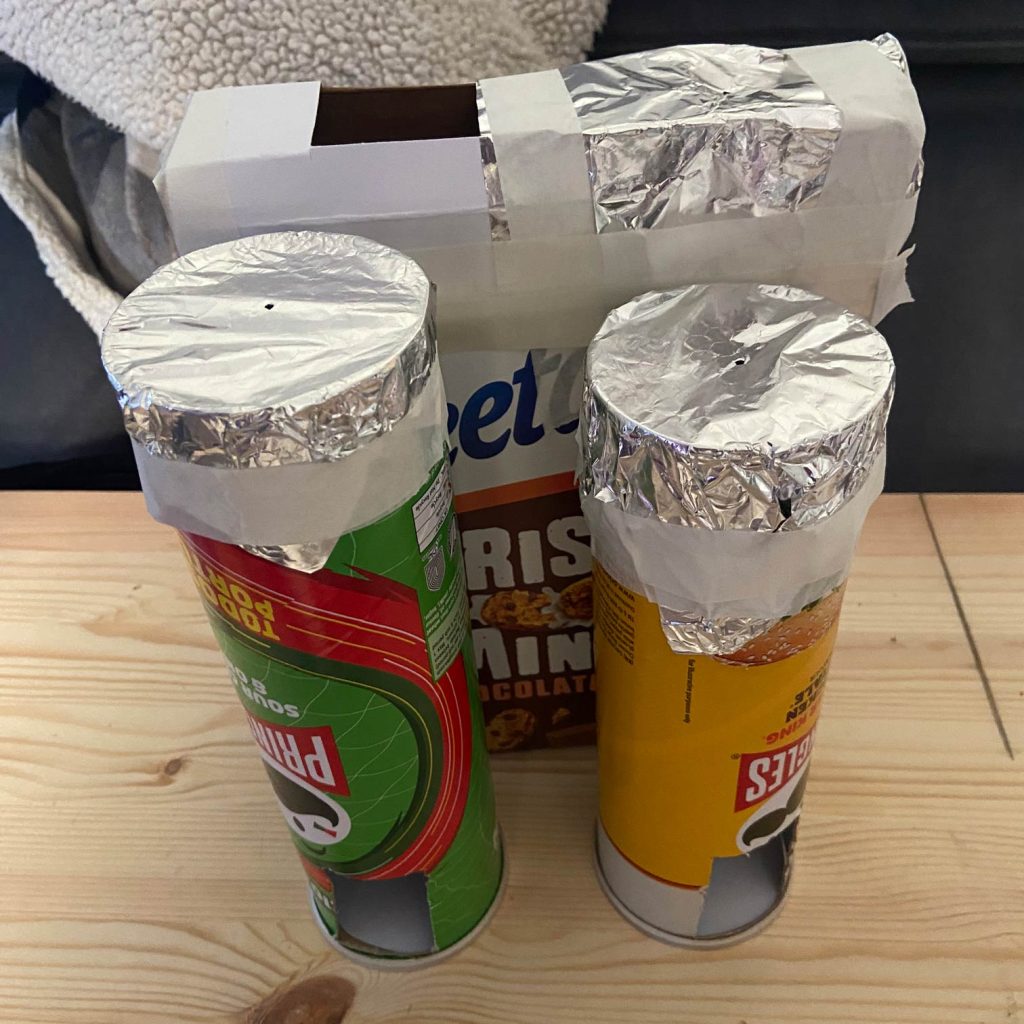
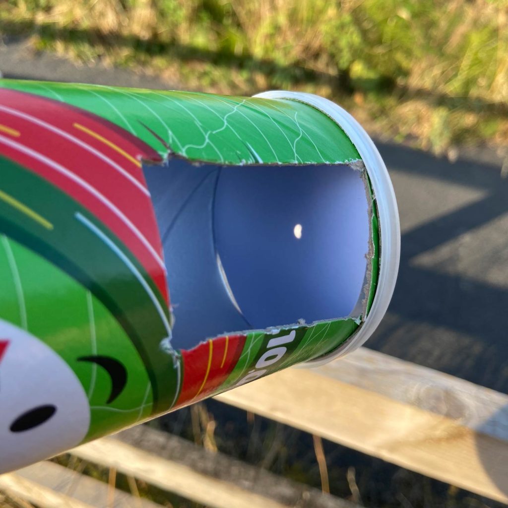
For all the technology we have around us, our preparations for the eclipse involved raiding the recycling and making pinhole viewers from cereal boxes and Pringles tubes. Very similar, really, to the sort of thing I remember doing at school in the 90s.
We’d planned a fairly secluded spot to watch it from, only to discover that a few other people had apparently had exactly the same idea.
That actually made the evening better.
We met some like-minded people, compared our slightly questionable homemade viewing contraptions and then stood around together waiting for the Moon to move across the Sun.
It got me thinking afterwards about the experience of an eclipse beyond simply seeing it.
What if you could see how people reacted?
The eclipse is obviously a huge visual event, but there’s another part of it that you can’t see.
Anticipation.
Excitement.
The strange change in light.
Waiting for the right moment.
And, potentially, the physiological response to all of that.
That led to another little generative art experiment.
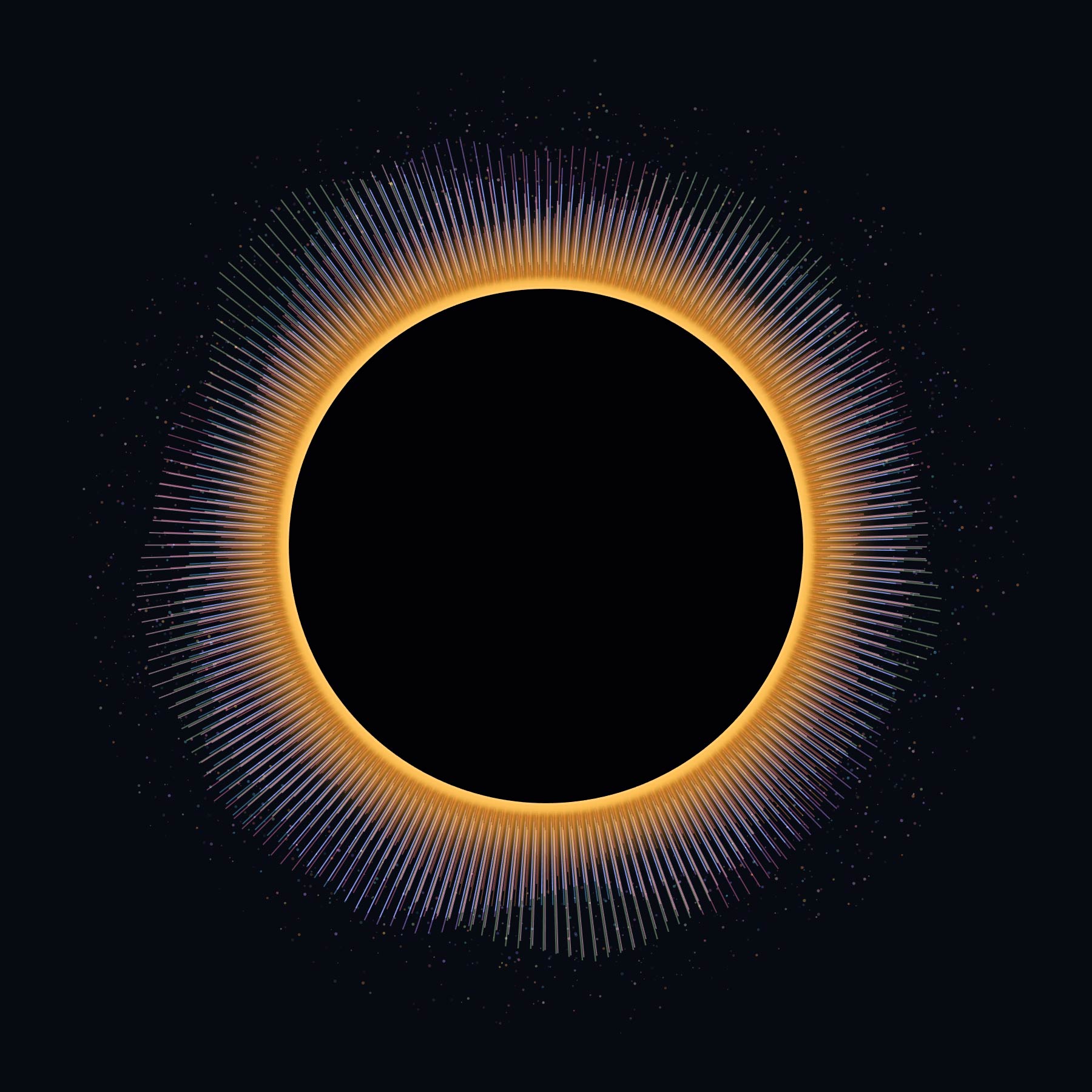
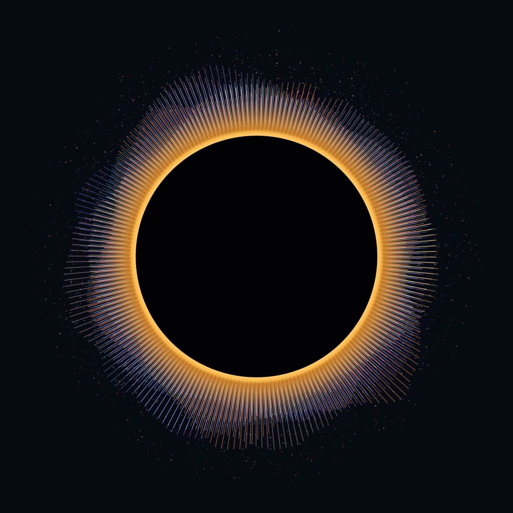
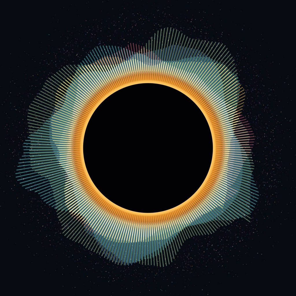
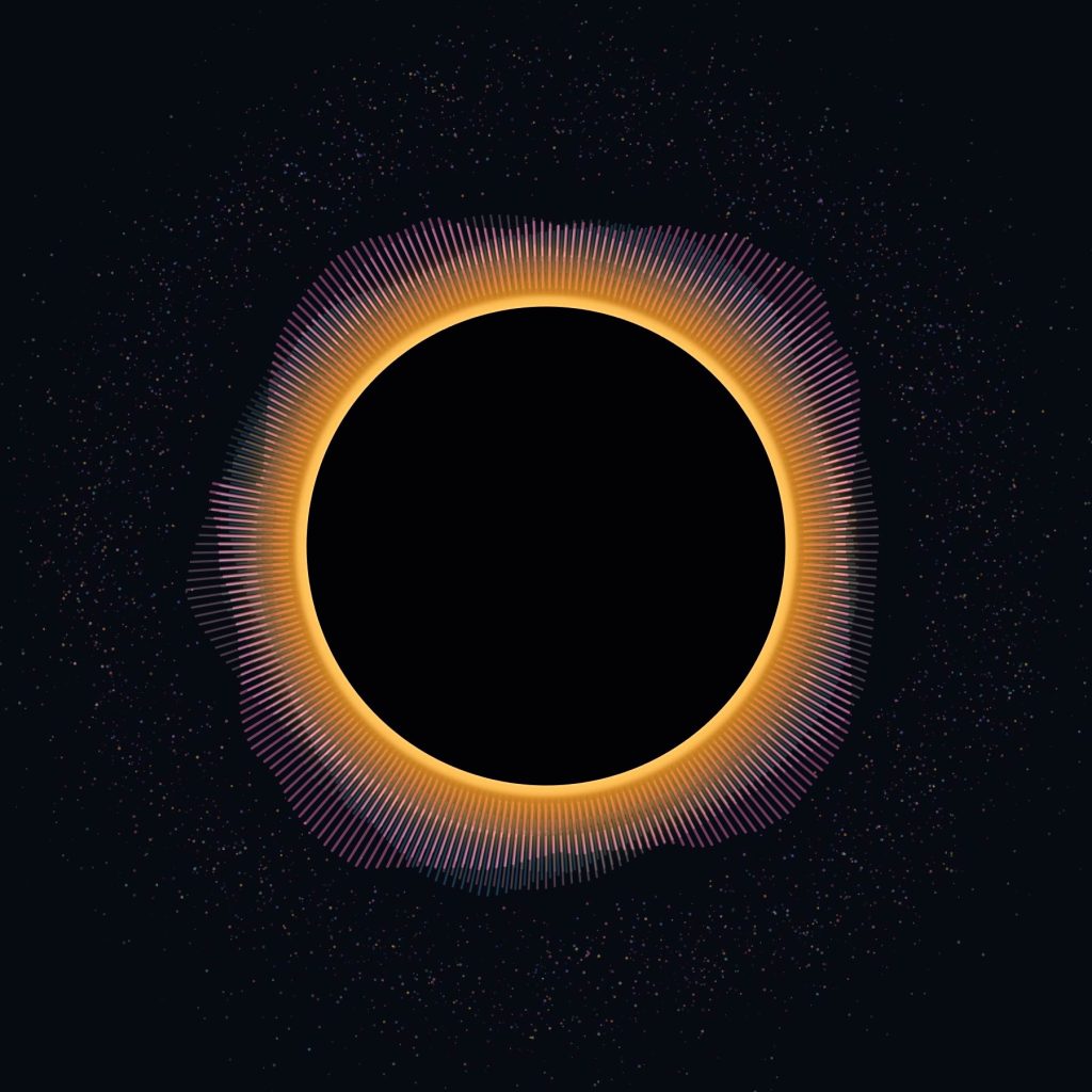
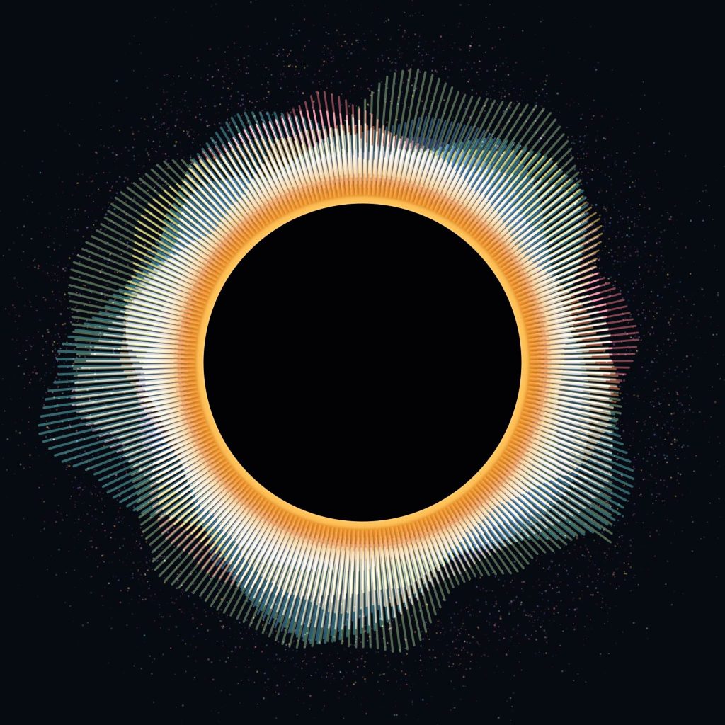
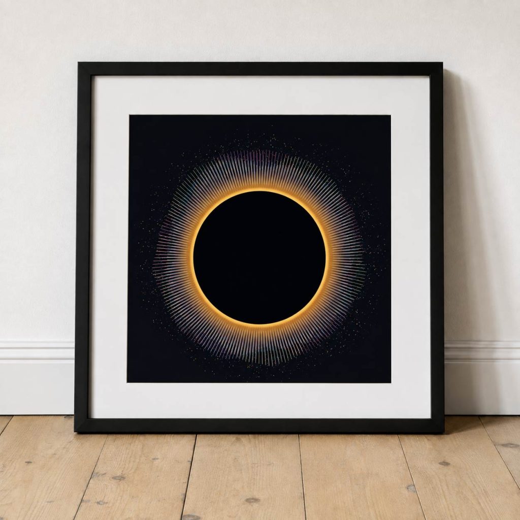
What if ten people watching an eclipse recorded their heart rates, and those heartbeats became the eclipse’s corona?
Rather than creating a conventional graph showing beats per minute over time, I wanted the data to become part of the artwork itself.
Ten people. Ten heart rates. One Eclipse.
The piece is being developed in Processing.
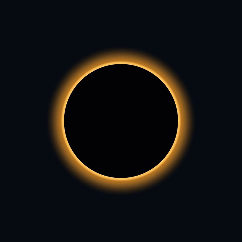
At the centre is a simple representation of the eclipse: a black disc surrounded by a thin, warm edge of light.
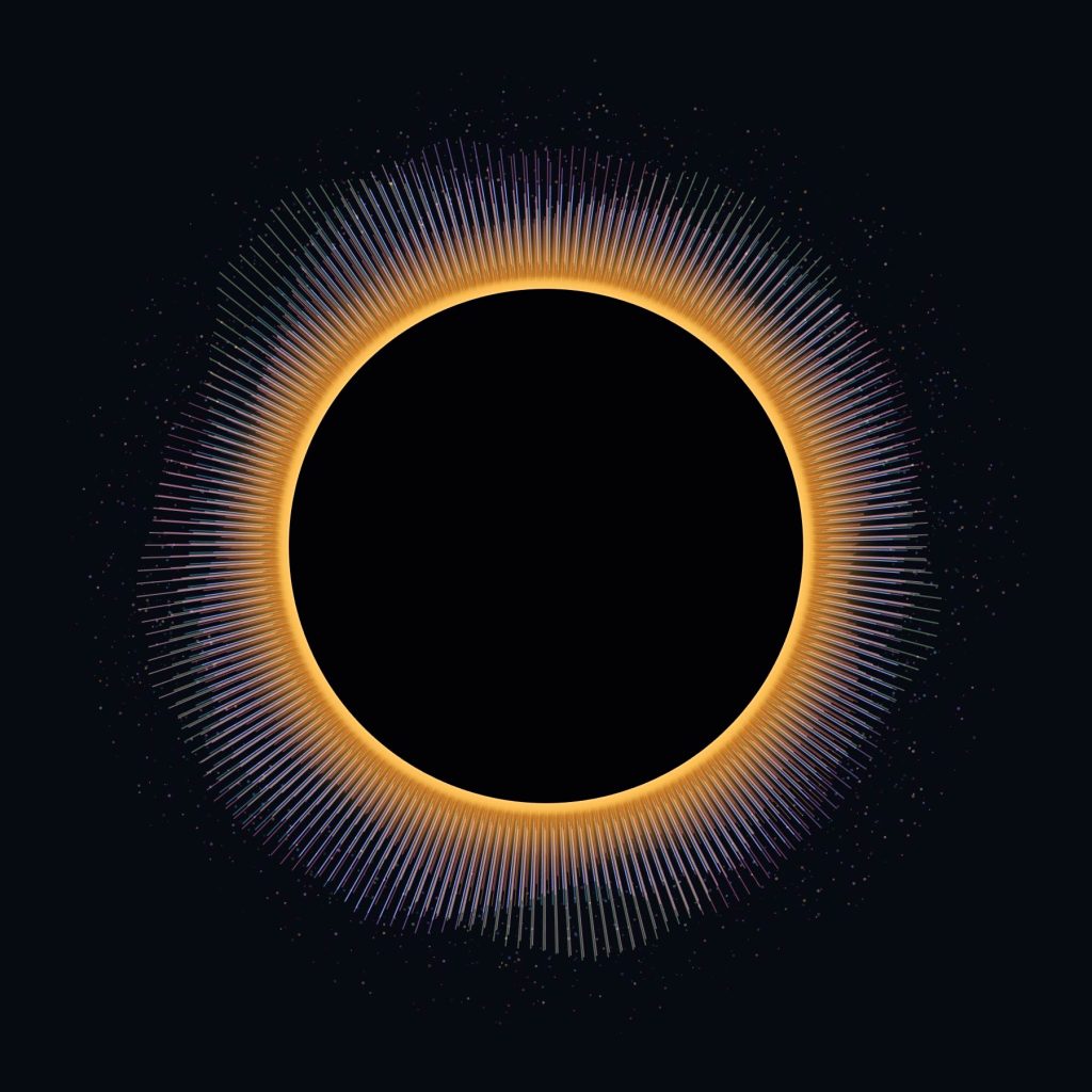
Behind it are ten separate circular systems.
Each person gets their own complete 360-degree layer made from hundreds of fine radial lines. Every layer has its own colour, pattern and heart rate, but they’re all positioned around exactly the same point.
So you don’t immediately see ten separate data visualisations.
You see one.
The layers overlap, interfere with each other and occasionally align, creating something resembling a colourful solar corona.
The important difference is that the corona is being generated by people.
Turning a heartbeat into movement
I didn’t want the heart-rate data to simply control the height of the lines.
That felt too much like an audio equaliser.
Instead, each heartbeat creates an event.
The radial lines slowly push away from the eclipse, reach their maximum extension and then ease back towards it.
I’ve deliberately exaggerated and slowed this movement. A literal visual representation of a heartbeat becomes incredibly frantic when ten people are running simultaneously.
The data determines when something happens, but the artwork determines how that event feels.
So each beat becomes more of a swell:
rest → expansion → peak → decay
At the peak of a pulse, fragments also begin to escape from the ends of the lines.
These become tiny particles travelling away from the centre before slowly disappearing.
I like the idea that the lines represent the immediate physical response, while the particles leave behind a temporary memory of what has already happened.
Stacked, not divided
One decision that became important quite early was how to represent the ten participants.
The obvious solution would be to divide the circle into ten sections, giving everyone a 36-degree slice.
But that would turn the artwork into a diagram.
Instead, all ten people occupy the entire circle.
Their layers are stacked.
Person one can pulse across all 360 degrees. So can person two, person three and everyone else.
Their heartbeats are also staggered, so the layers continually move in and out of phase with one another.
Every so often several beats might happen at almost the same moment and create a much larger burst.
Those moments aren’t specifically animated or programmed.
They’re coincidences in the data.
And that’s probably one of my favourite parts of the idea.
Compressing an eclipse into sixty seconds
I don’t want the final piece to run for the actual duration of the eclipse.
Instead, the recorded heart-rate data would be compressed into roughly one minute.
The beginning of the observation becomes the beginning of the animation. Maximum eclipse sits somewhere within that timeline, followed by the gradual return towards normality.
That gives the finished piece its own beginning, middle and end.
It also raises an interesting question.
Will anything actually happen at maximum eclipse?
It would be very easy to artificially make that moment enormous — more particles, longer lines, brighter colours.
But that would defeat the point.
If everyone’s heart rate increases as the eclipse approaches maximum, the artwork should naturally become more energetic.
If everyone’s heart rate remains relatively unchanged, then that’s what the artwork should show.
The interesting bit is finding out.
Building an instrument rather than a fixed animation
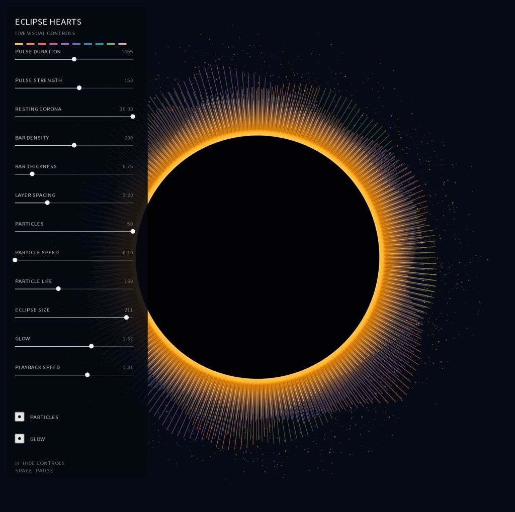
While developing it, I’ve also added a control panel to the Processing sketch.
I can adjust the pulse duration, strength, radial density, line thickness, particle speed, particle lifetime, eclipse size, glow, layer spacing and overall playback speed while the artwork is running.
This has become quite important.
There isn’t really a calculation that tells me a heartbeat should produce a line exactly 126 pixels long or that a particle should survive for precisely 140 frames.
Those are visual decisions.
The data provides the structure, but there’s still a process of designing how that data is interpreted.
Being able to move a slider and watch all ten systems respond immediately makes the Processing sketch feel less like a finished animation and more like an instrument for exploring the idea.
From a Pringles tube to Processing
That’s probably what I like most about this little project.
It started with something incredibly analogue.
A cardboard tube. A cereal box. A tiny hole. Sunlight projected onto a piece of card.
The same basic method of observing an eclipse that I remember from being younger.
Then there we were, years later, standing outside with our homemade viewers and a few people we’d only just met, all looking at the same event.
Now I’m taking that experience back to the computer and asking what else could have been recorded.
Not just what did the eclipse look like?
But:
What did it feel like to be there?
And could ten tiny streams of biological data turn that feeling into something we can see?
Sometimes an idea for a generative art project starts with data, a mathematical rule or something I’ve deliberately gone looking for.
This one started with an ornament sitting on my desk.
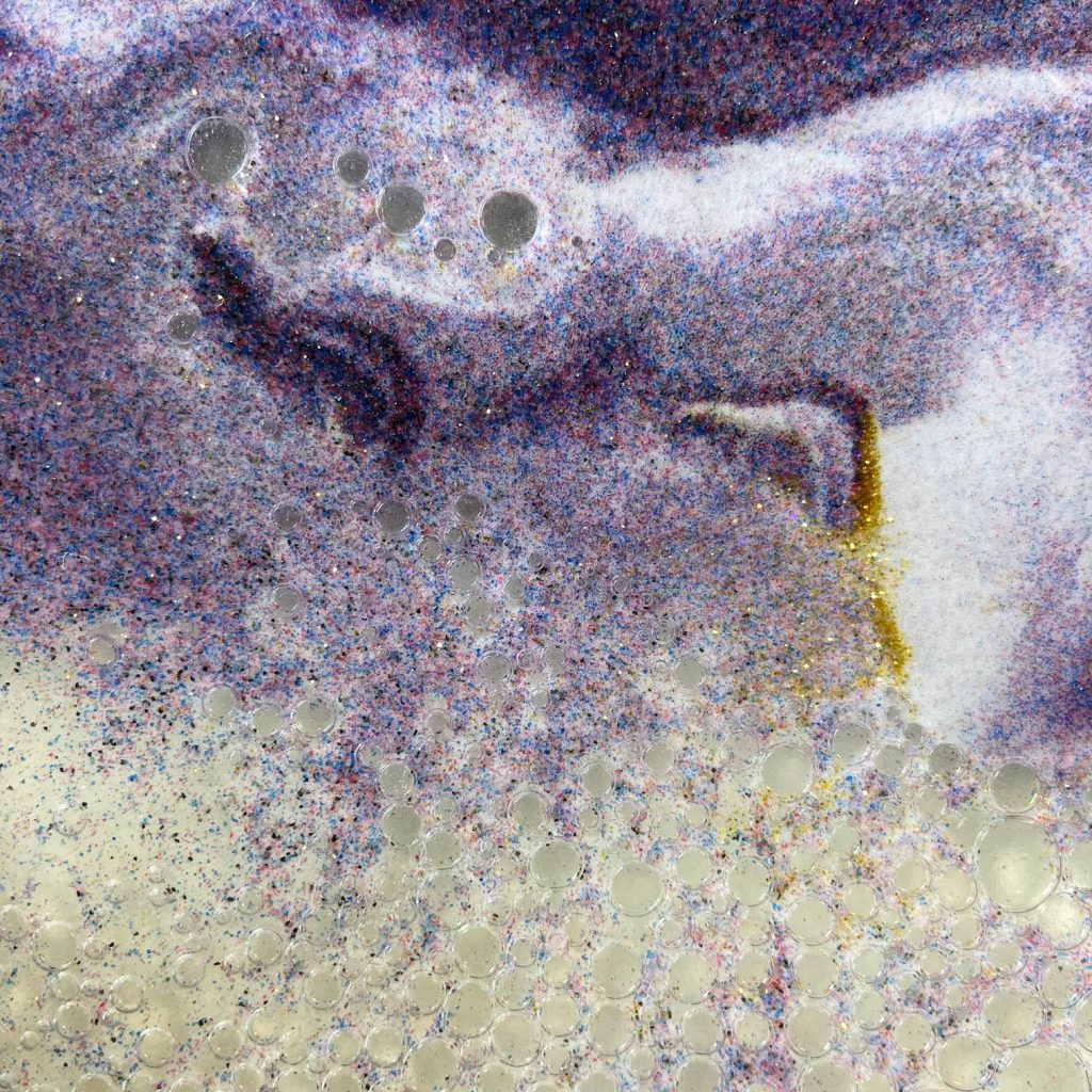
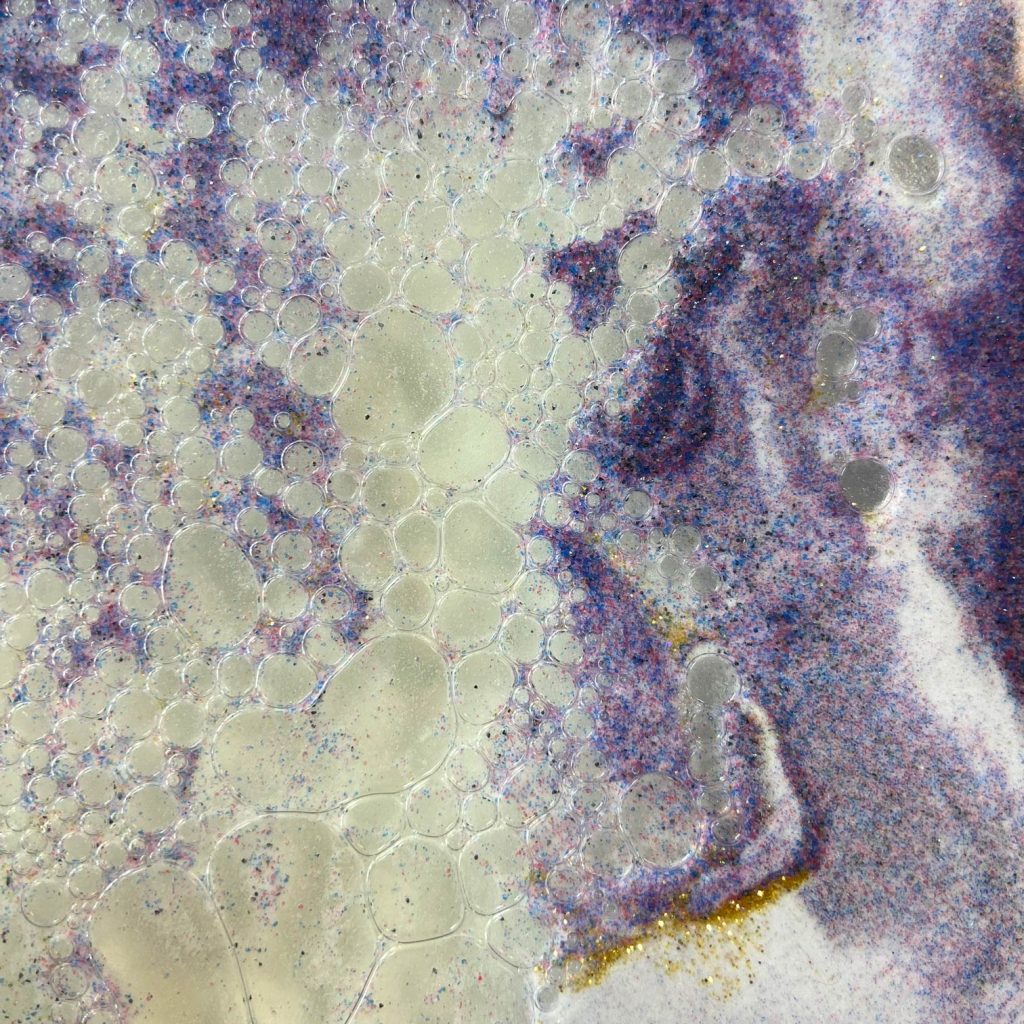
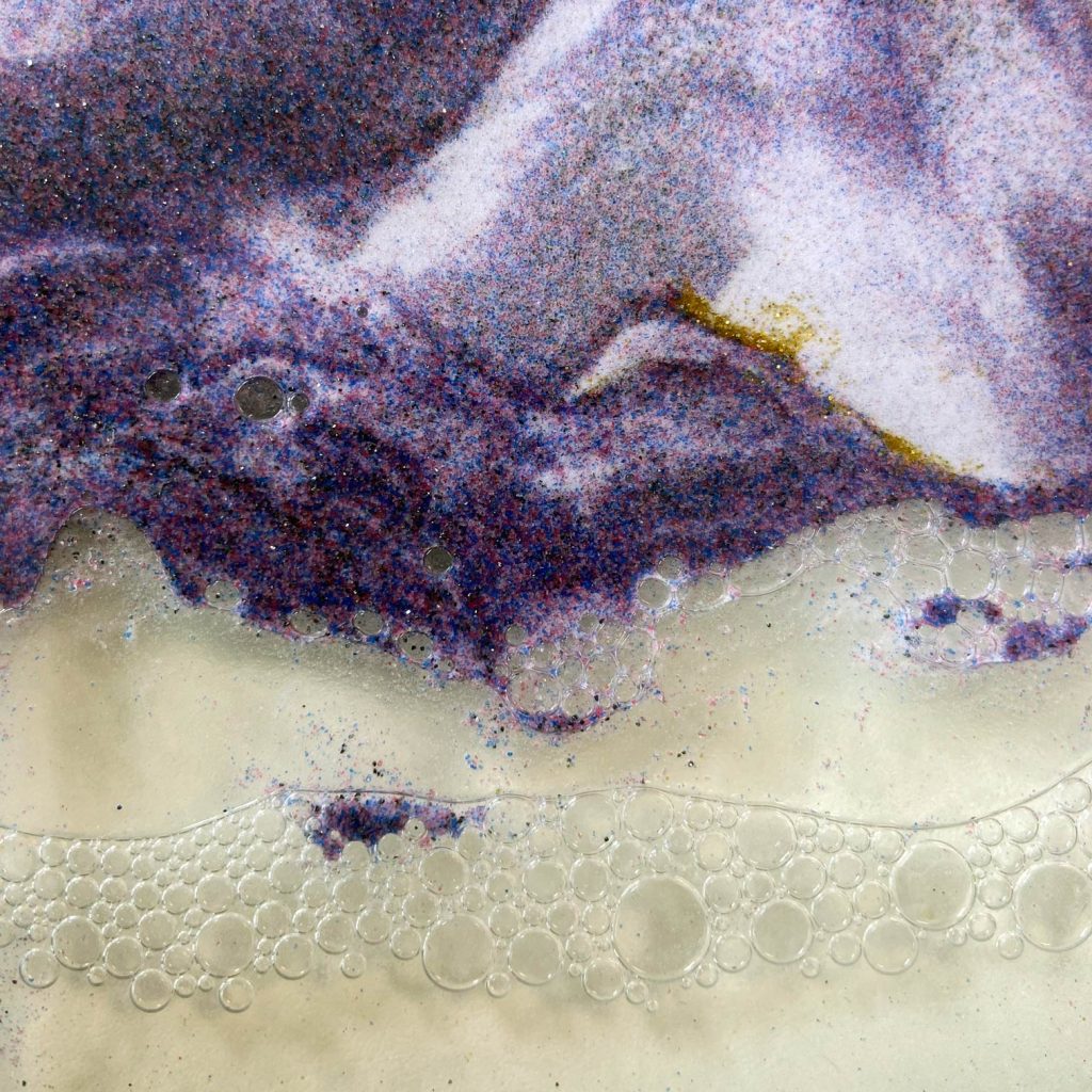
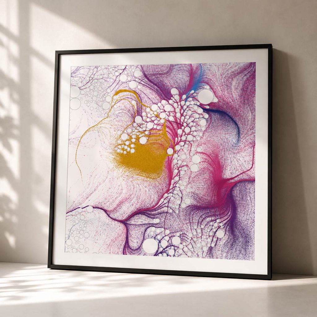
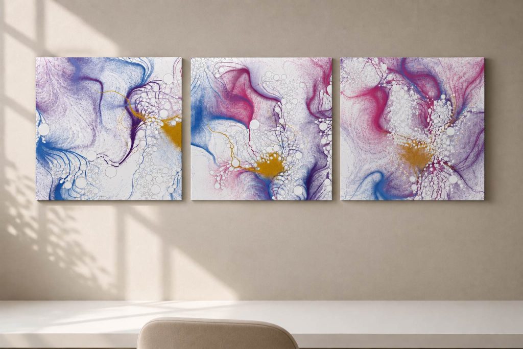
It’s one of those liquid motion ornaments filled with coloured sediment, oil and air. Turn it over and gravity takes care of the rest. The different materials slowly separate, collide and flow past one another, creating landscapes that exist for a few seconds before disappearing.
I’ve always found them strangely fascinating.
A little bit of 90s nostalgia
I remember seeing these sorts of things in gift shops while we were on holiday when I was much younger, particularly during the 1990s.
They’d be alongside lava lamps, plasma balls and all the other slightly odd things that seemed impossibly interesting at the time.
My dad always took a particular fancy to these liquid ornaments. I can remember stopping to look at them and watching the sand and oil slowly make their way from one side to the other.
There was something compelling about the fact that you didn’t really control what happened. You simply turned it over and watched.
Years later, I’ve somehow ended up with one sitting next to my computer.
And while watching it recently, I started wondering:
Could I recreate some of that behaviour with code?
Looking closer
Taking a few close-up photographs made the ornament considerably more interesting.
From a distance, you see flowing purple sediment.
Up close, there’s much more going on.
Tiny particles collect into dense areas before thinning out into clouds. Oil forms bubbles of wildly different sizes. Those bubbles gather into groups and channels. Sediment flows around them. Fine gold particles occasionally collect along boundaries, while elsewhere large areas remain almost completely empty.
It started to look less like a desk ornament and more like an abstract painting.
That became the starting point for the Processing experiment.
Building the system
I didn’t particularly want to reproduce the ornament literally. The aim was to identify some of its behaviours and use them as rules for generating something new.
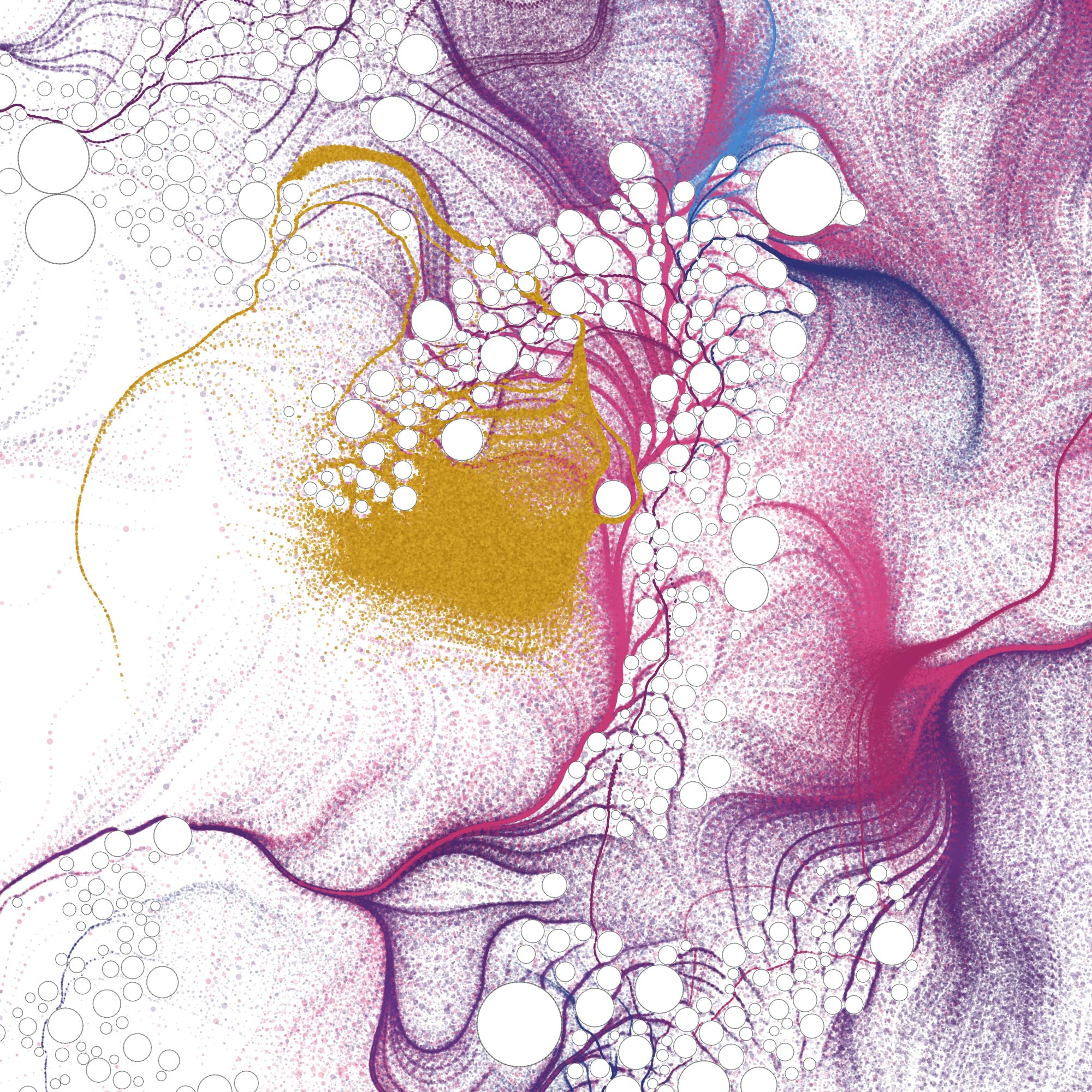
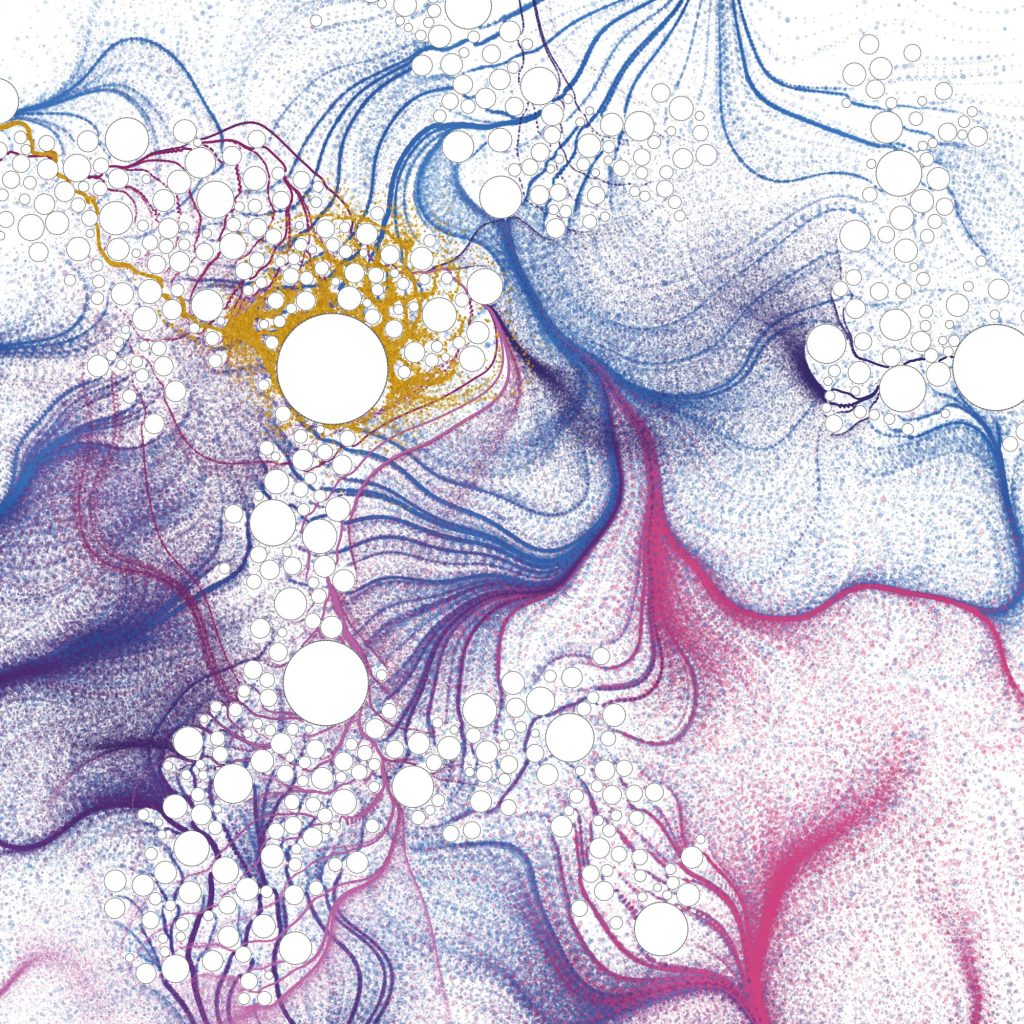
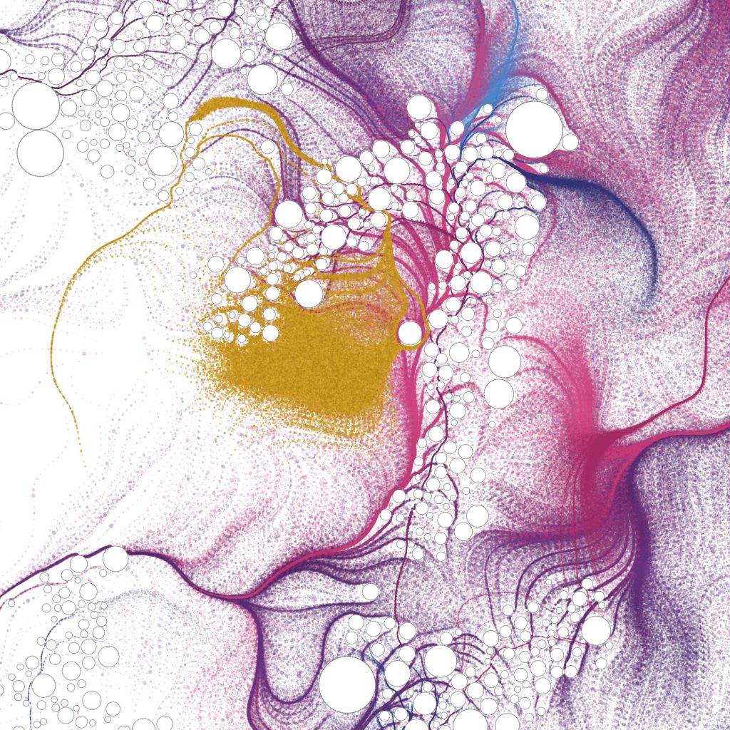
I started with a 1600 × 1600 pixel white canvas and a limited palette derived loosely from the ornament: blue, purple, magenta and a contrasting sediment-like gold.
Rather than drawing large solid shapes, the colour is made from thousands of tiny particles.
Each particle starts somewhere within a larger group and moves across the canvas according to a flow field.
A simplified version of the idea looks something like this:
float n = noise(
  x * flowScale,
  y * flowScale
);

float angle =
  n * TWO_PI * 2.9;

x += cos(angle) * speed;
y += sin(angle) * speed;
I’m using Perlin noise here because completely random movement quickly looks exactly that: random.
Noise gives neighbouring particles similar instructions. Instead of visual static, thousands of individual dots begin to form currents, folds, waves and larger structures.
That’s where the experiment became much more interesting.
Making bubbles into obstacles
Initially the bubbles were simply circles drawn over the finished artwork.
Visually it worked, but physically it didn’t make much sense.
Looking again at the real ornament, the bubbles are part of the system. Material has to move around them.
So the bubbles became obstacles within the simulation.
When a particle approaches a bubble, its normal direction is altered. An outward force stops it entering the circle while a tangential force encourages it to travel around the circumference.
Conceptually, it became something like:
float nx = dx / distance;
float ny = dy / distance;

float tx = -ny;
float ty = nx;

vx += tx * tangentForce;
vy += ty * tangentForce;

vx += nx * outwardForce;
vy += ny * outwardForce;
The result was unexpectedly effective.
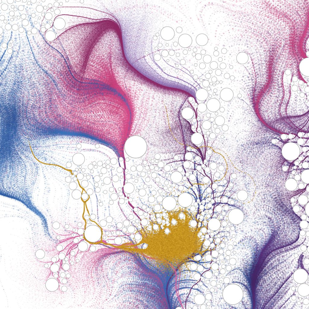
Instead of bubbles merely appearing on top of the artwork, streams started dividing around them. Groups of bubbles produced channels. Pigment accumulated around their edges and then rejoined further downstream.
Suddenly the bubbles were helping to create the composition.
Gold behaves differently
The gold became another little experiment within the experiment.
I didn’t want it evenly distributed throughout the image. In the physical ornament it feels more like a sediment: something heavier that collects in particular places.
So the gold particles have their own behaviour.
They follow the same underlying flow, but respond more strongly to bubble boundaries and have a chance of being deposited when they get close to an edge.
if (edgeDistance < 8) {

  if (random(1) < 0.035) {
    deposited = true;
  }
}
It’s a tiny rule, but across thousands of particles it produces occasional concentrations and thin gold trails.
I particularly like that I don’t decide exactly where the gold appears.
The system does.
Controlled, but not designed
That’s probably my favourite aspect of this project.
I’m choosing the palette, particle density, noise scale, bubble sizes, forces and probabilities, but I’m not actually drawing the final composition.
Every regeneration produces a different result.
Some are balanced.
Some are chaotic.
Some contain huge empty areas.
Some become almost completely overwhelmed by colour and bubbles.
And occasionally one appears where everything happens to come together.
There’s something pleasingly similar about that process to turning over the original ornament and waiting to see what happens.
From simulation to artwork
Once I started getting outputs I liked, I realised they worked surprisingly well away from the Processing window.
At 1600 × 1600 pixels they’re naturally suited to square digital artwork, but the detail also makes them interesting as prints.
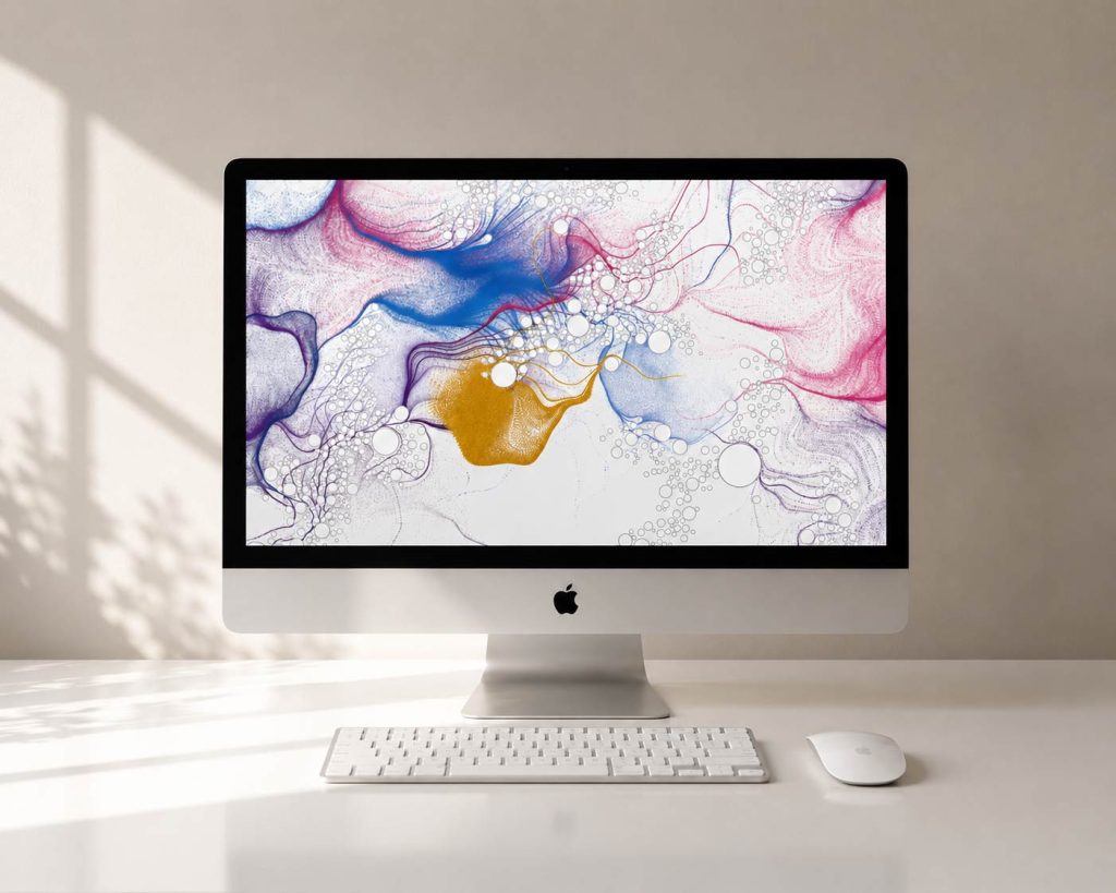
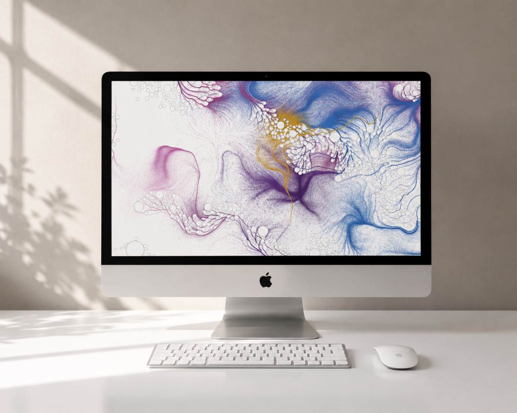
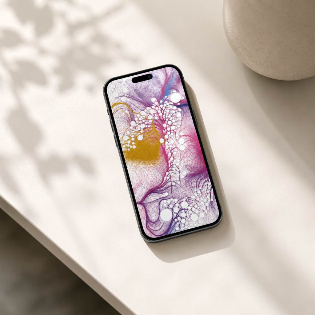
I’ve experimented with them as large square framed pieces, groups of three prints, desktop artwork and phone wallpapers. Cropping into the images also reveals smaller compositions that I hadn’t deliberately created.
That opens another interesting possibility: generating at a much larger resolution and treating the resulting image almost like a landscape, finding compositions within compositions.
The artwork could equally become animation. Instead of saving the final particle paths, the movement itself could become the work: pigment slowly flowing around bubbles, separating and collecting before eventually settling.
Back to the desk
What I like most is how circular the whole experiment feels.
A fairly simple ornament sitting beside my computer reminded me of being on holiday in the 90s and watching these things with my dad.
Thirty-odd years later, I’m looking at the same object and wondering how its behaviour can be translated into Perlin noise, particles, collision detection and Processing.
The finished images aren’t really simulations of oil and sediment.
They’re interpretations of it.
Gold, sediment, waves and oil — translated from something physical into a set of rules, then handed back to chance.
There’s something wonderfully low-tech about watching a solar eclipse through a cardboard box.
I remember being at school in the 80s and 90s and making simple pinhole viewers — cardboard boxes, a tiny hole and an image of the Sun projected safely onto the inside. No screens, no apps, no live streams. Just a little glowing circle of light and the slightly strange feeling that something unusual was happening above us.
With another solar eclipse arriving on Wednesday 12 August 2026, I wanted to revisit that memory, but through generative art.
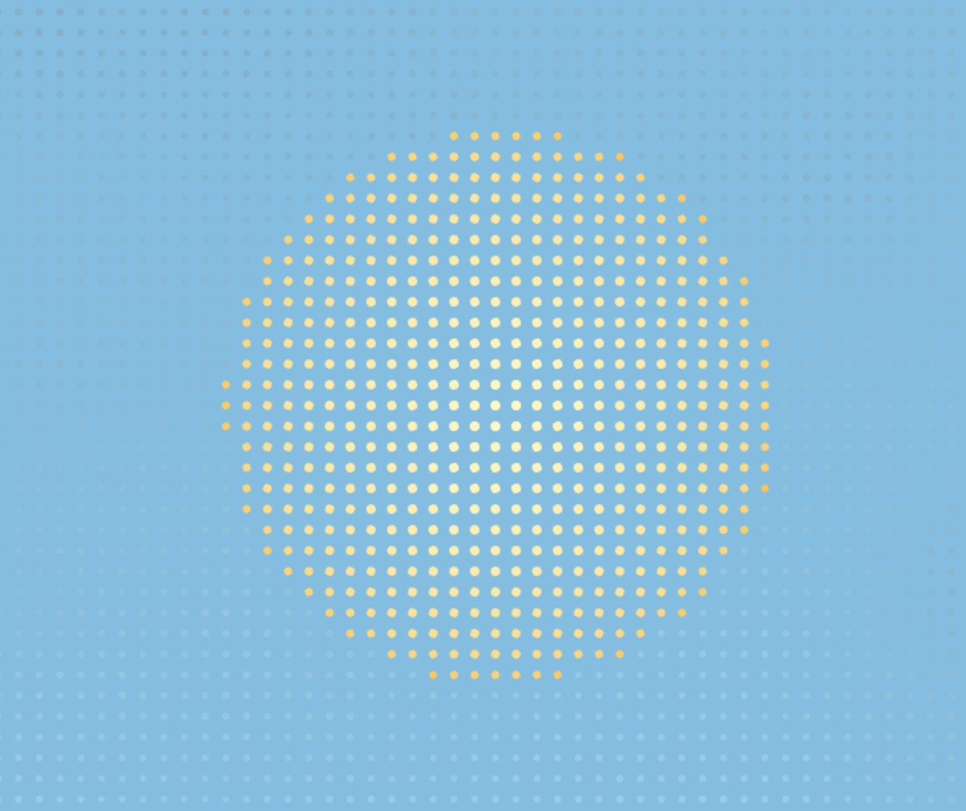
The entire sky is constructed from a grid of tiny dots. In the centre, brighter yellow and white dots form the Sun, while shades of sky blue create the surrounding atmosphere.
Rather than drawing recognisable clouds, slowly moving noise passes through the grid. It creates subtle areas of light and shade that drift across the image — more like changing atmospheric conditions than illustrated clouds.
The dot-matrix appearance is a little nod back to available technology back then. The image isn’t trying to reproduce the sky perfectly. It’s reducing it to light, dark and a grid of tiny marks.
Following the real eclipse
The project has two modes.
Simulate compresses the entire eclipse into a short animation, allowing me to experiment with the effect at any time.
Live is the more interesting one.
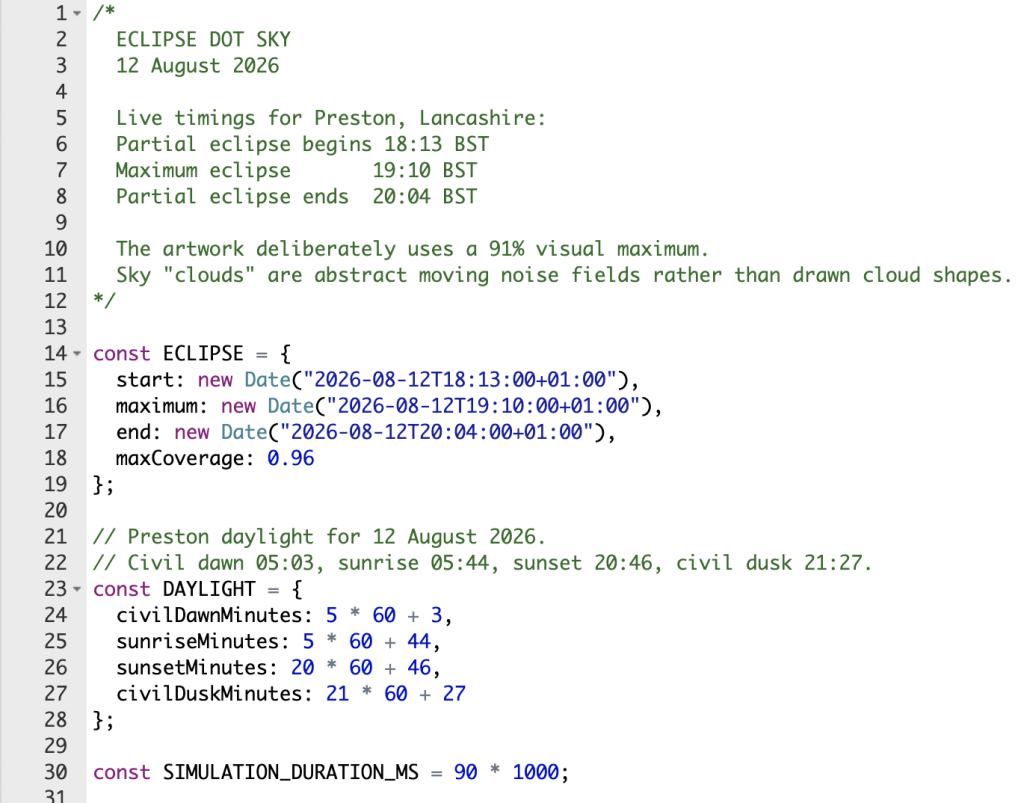
On 12 August, the artwork follows the actual time of day and the progression of the eclipse. The sky begins as a light blue around #87CEEB, gradually changes with the natural daylight, and becomes darker as more of the Sun is obscured.
As the Moon moves across the Sun, its dots are progressively swallowed by the darker grid. The surrounding sky responds at the same time, before gradually becoming lighter again as the Moon moves away.
Because the eclipse is happening towards the evening, the natural transition towards sunset is happening at the same time. The two systems overlap: the real day is getting darker while the eclipse temporarily makes it darker still.
Taking the cardboard version with us
The digital version won’t be our only viewer.
We’ll be heading to Moor Park in Preston with our pinhole box viewers to watch the real thing.
A free community viewing event starts at 5.45pm, with astronomers from the University of Lancashire and Preston and District Astronomical Society bringing specialist equipment and eclipse glasses so people can observe it safely.
It’s being billed as the UK’s deepest solar eclipse in over a decade, with the Moon covering up to 96% of the Sun in parts of the UK.
So while there will be plenty of sophisticated astronomical equipment pointing towards the sky, I quite like the idea that we’ll also be standing there with a cardboard box.
Some technology is difficult to improve upon.
And somewhere nearby, my devices will be doing essentially the same thing — turning the Sun into a collection of little dots and watching them disappear.
Sometimes an idea for a project doesn’t come from looking for one.
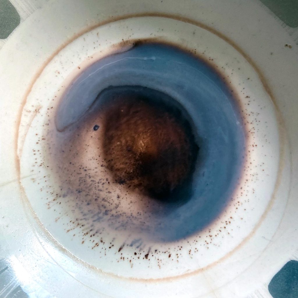
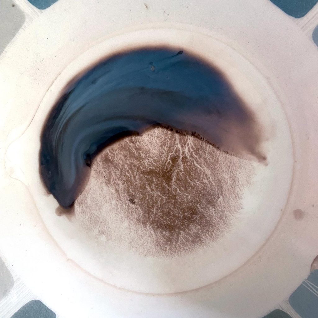
I was doing the washing up after breakfast and noticed the sediment left in the bottom of a cereal bowl. The liquid had drained away, leaving behind a strange collection of stains, particles, darker edges and almost vein-like structures.
I took a photograph.
At first, I was simply interested in whether I could recreate some of those textures using Processing. But there was something else about the shape that seemed familiar.
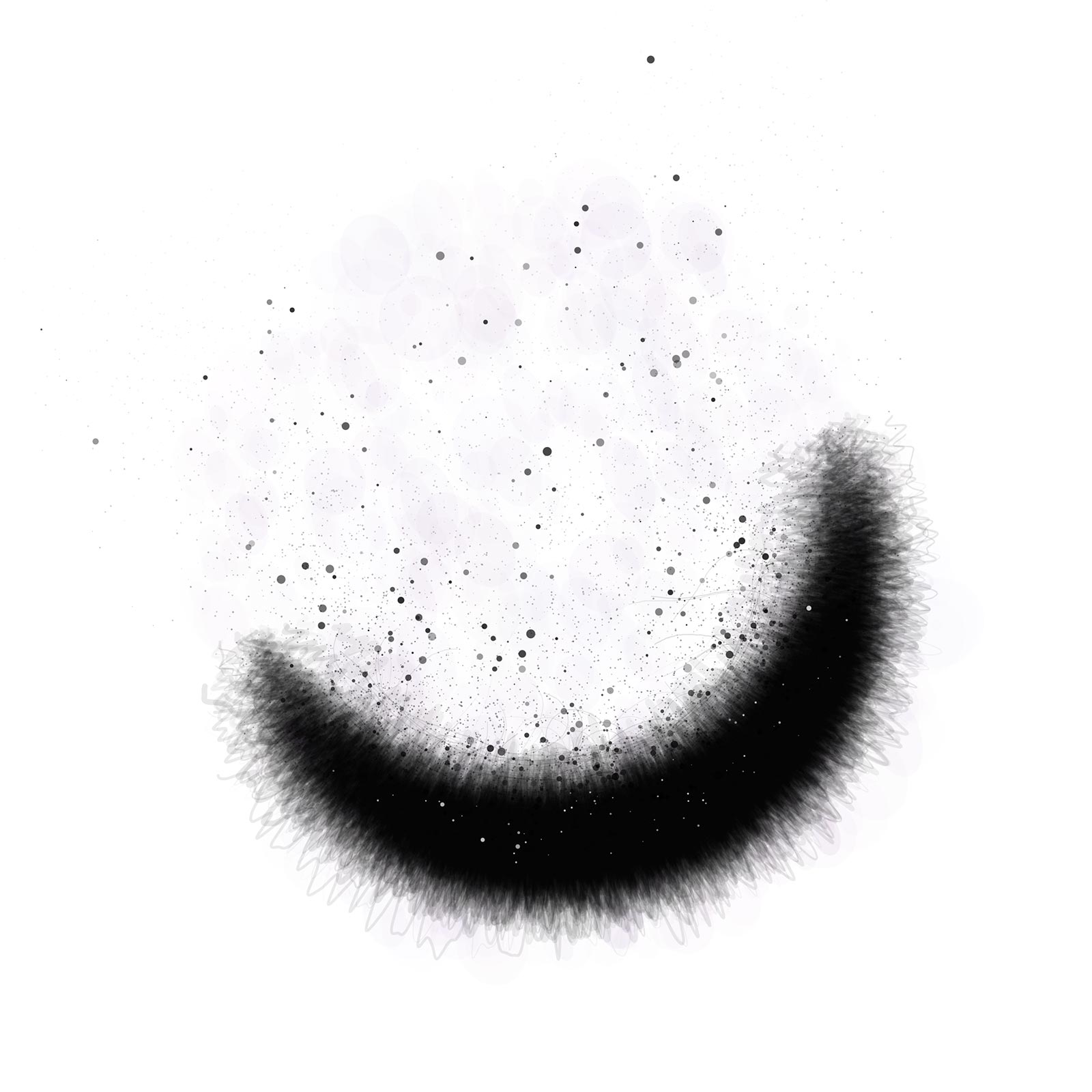
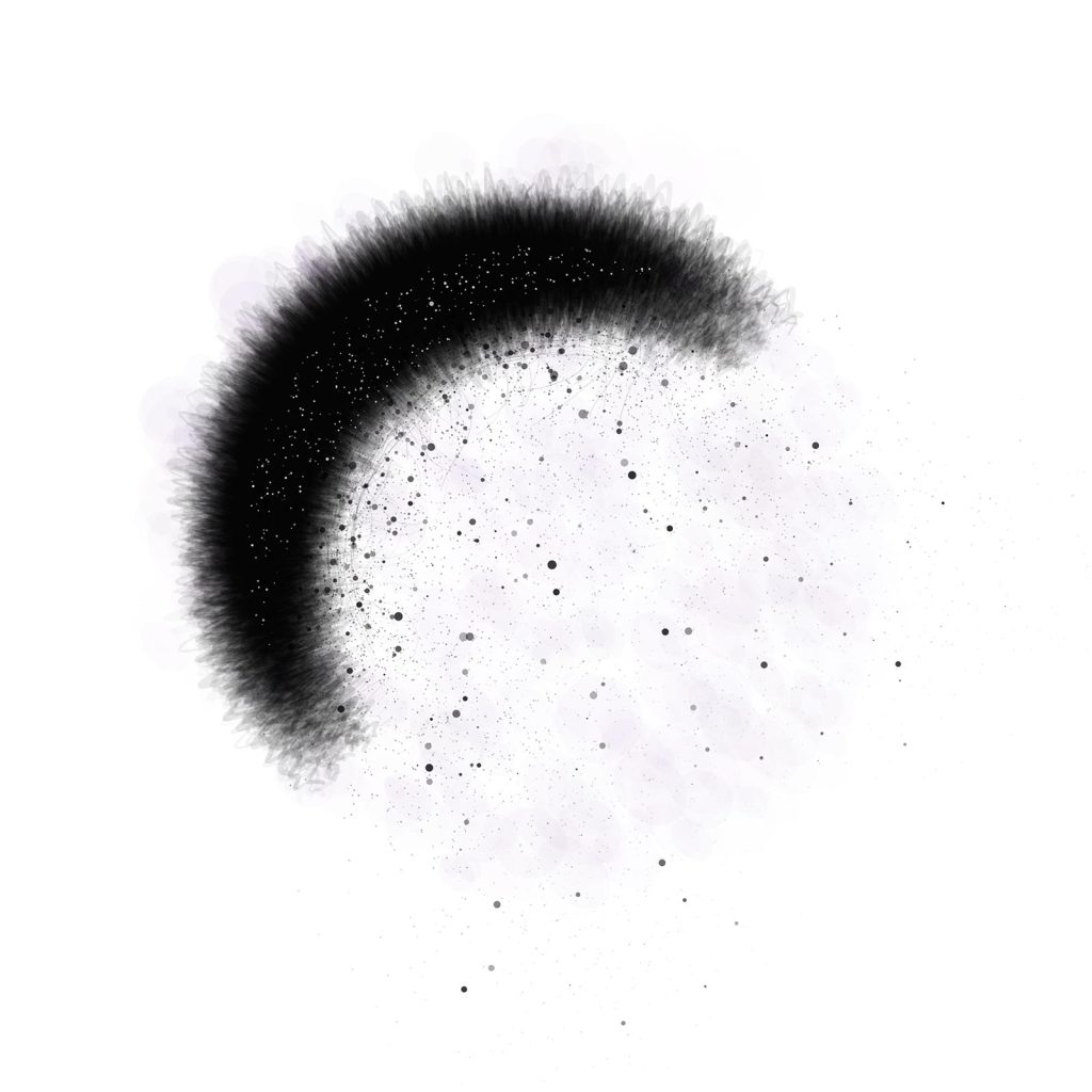
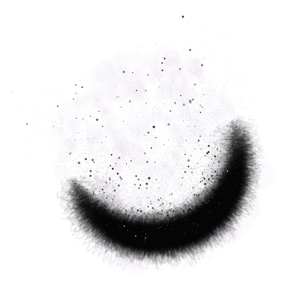
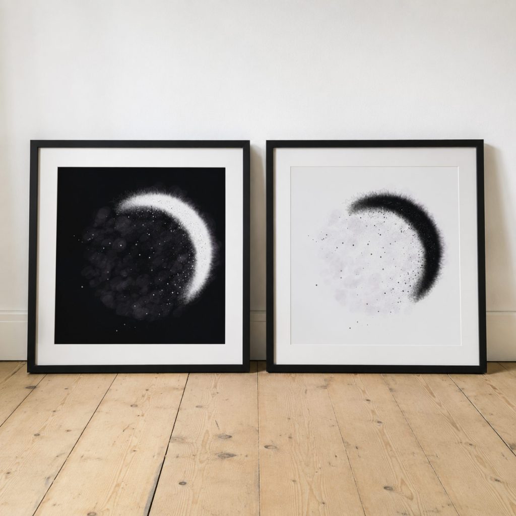
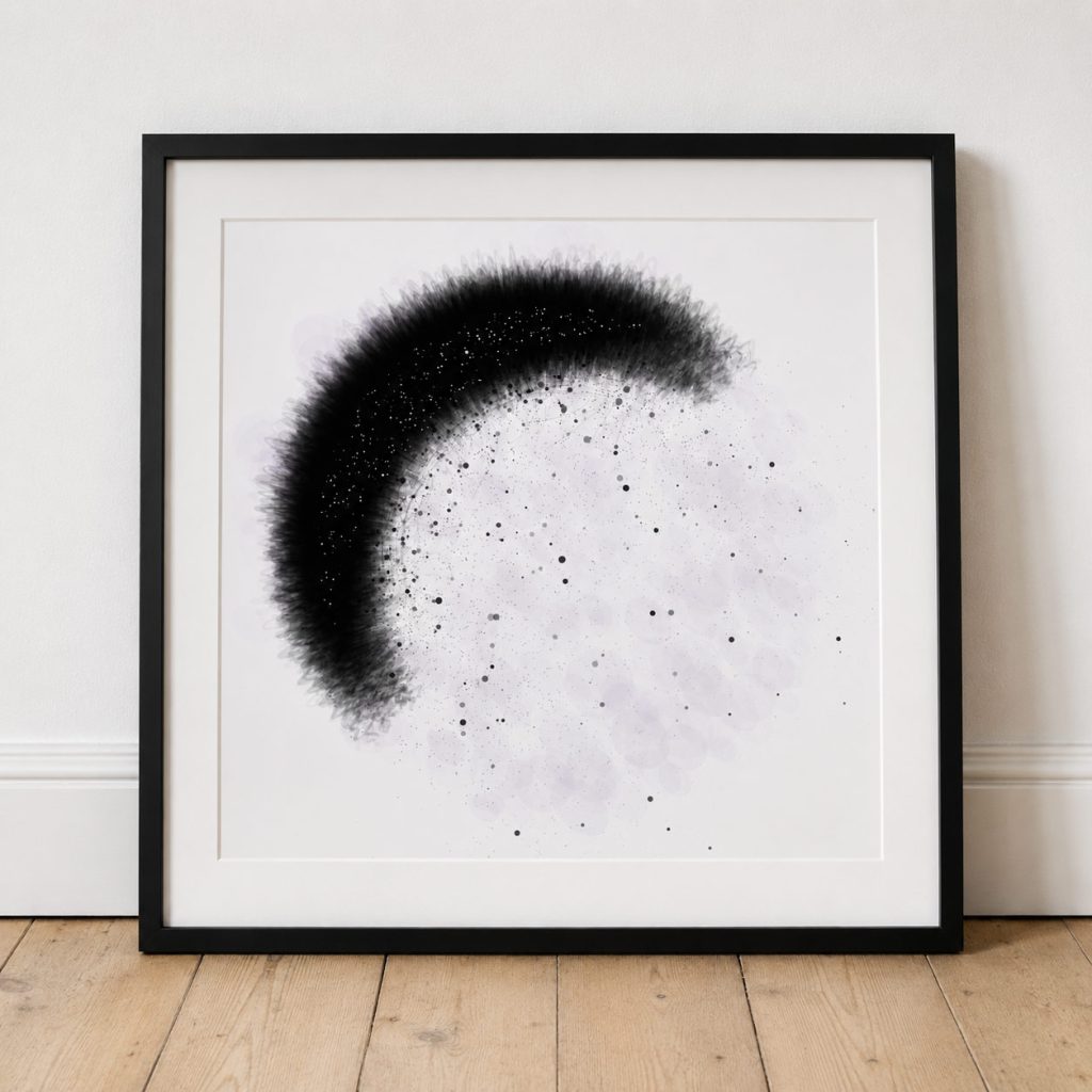
A dark crescent.
And, by coincidence, this Wednesday evening there’s a major solar eclipse.
Suddenly the experiment had a direction.
Cereal bowl inspiration No 1Cereal bowl inspiration No 2
From cereal bowl to crescent
I wasn’t particularly interested in recreating the photograph pixel for pixel. What interested me was working out why it looked the way it did.
There seemed to be a few different things happening:
a large area of very diluted colour;
pigment collecting more heavily in one area;
thousands of tiny particles spreading away from it;
occasional larger deposits;
branching, vein-like structures;
areas where the sediment had disappeared completely.
Instead of drawing a crescent, I wanted to create a system that could produce something that felt like one.
The main structure is therefore made from hundreds of individually generated curves.
for (int i = 0; i < 650; i++) {

  float startAngle =
    radians(105) + radians(random(-20, 35));

  float endAngle =
    radians(255) + radians(random(-35, 20));

  // draw the sediment curve...

}
The important part here is the randomness in the starting and finishing angles.
My first attempts gave the crescent very obvious straight edges. Giving every strand a slightly different length allowed the sediment to gradually break apart instead.
An accidental eclipse
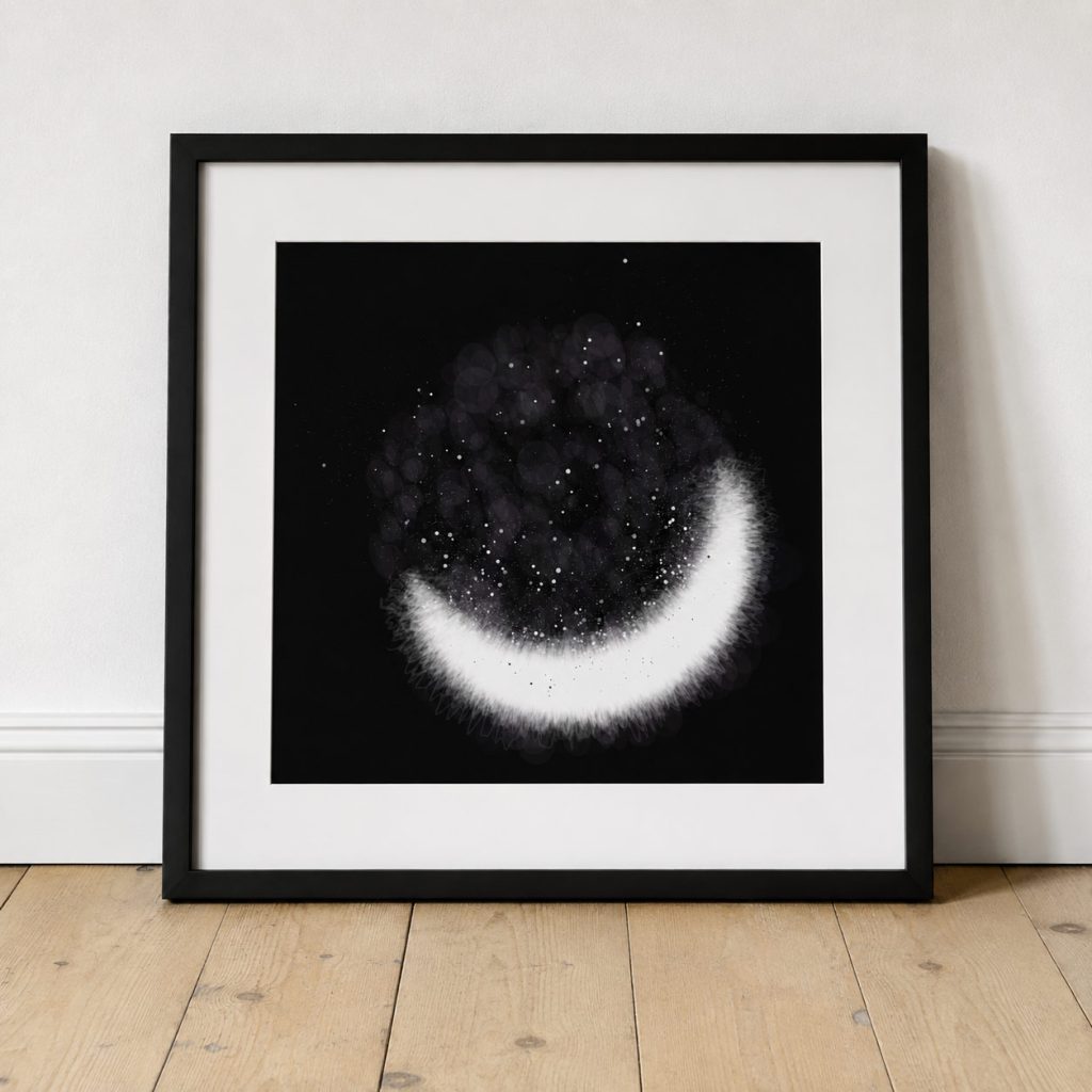
Once the crescent began appearing, it was difficult not to see an eclipse in it.
That’s particularly timely because on 12 August 2026 a total solar eclipse will cross parts of the Northern Hemisphere, with a deep partial eclipse visible from the UK.
I liked the idea of taking two completely unrelated events from the same week — washing a cereal bowl and looking forward to an eclipse — and allowing one to influence how I interpreted the other.
The code isn’t actually drawing the Sun or Moon.
There are no circles being placed on top of one another to manufacture an eclipse symbol.
Instead, the illusion comes from the distribution of sediment.
Making sediment with code
The smallest particles are just ellipses.
Lots of them.
float d = random(0.4, 2.1);

fill(0, alpha);

ellipse(
  x,
  y,
  d,
  d
);
On their own they’re nothing particularly interesting.
The important part is where they appear.
Each particle originates somewhere around the crescent before being allowed to drift away from it.
means most of the particles remain relatively close to their source while progressively fewer travel a long distance.
It’s a very small mathematical decision, but visually it makes the particles feel as though they are dispersing from something, rather than simply being sprinkled randomly across the canvas.
A little imperfection
One detail I particularly liked in the original bowl was that the darkest sediment wasn’t uniformly dark.
There were tiny holes and lighter particles within it.
So I added a deliberately limited number of white sediment particles over the black.
int fineCount =
  int(random(70, 130));

float d =
  random(0.7, 2.7);

fill(
  255,
  random(100, 210)
);

ellipse(x, y, d, d);
There aren’t many.
That’s intentional.
Too many and it starts looking like a graphic effect. A small number helps break apart the otherwise dense black area.
Adding washed-out colour
The original photographs also contained very subtle colour.
Rather than creating a palette of unrelated colours, the sketch starts with just one:
color baseColour = #208FA0;
Processing then generates lighter tones by mixing that colour with white.
That seed controls the proportions, sediment, texture and rotation.
So every generation is related, but none is identical.
Sometimes the result looks very obviously like an eclipse. Other times it looks more like ink, a microscopic image, a coastline or something geological.
I prefer that ambiguity.
The eclipse was the inspiration for the form, rather than something the program has been instructed to illustrate.
Turning the light off
There’s also an inverted version.
Pressing I switches between the light and dark compositions.
Importantly, it doesn’t generate another random seed.
The same artwork is redrawn with the relationship between light and dark reversed.
It felt particularly appropriate for a project that had unexpectedly become about an eclipse.
Look at the washing up
I like that this project started with something as mundane as doing the washing up.
There was no plan to make an eclipse artwork.
I noticed some sediment in a cereal bowl, wondered whether I could reproduce it with code, started experimenting with particles and curves, and then realised the forms I was producing connected with something happening in the sky a few days later.
A cereal bowl gave me the texture.
An eclipse gave me the form.
Processing gave me a way of connecting the two.
And on Wednesday evening, assuming the British weather cooperates, I’ll hopefully get to see the other version.
One last thought…
I’m wondering what happens if I take these back out of the computer. I’m thinking of printing a few of the black-on-white versions and adding washes of real watercolour by hand — bringing some of the unpredictability of the original cereal-bowl sediment back into the finished pieces.
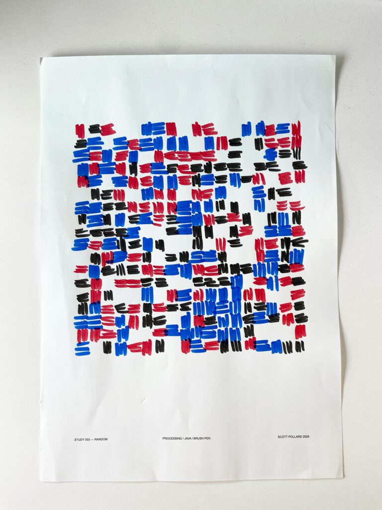
For Study 003, I wanted to move away from using code to create the finished image.
Instead, the computer would simply tell me what to do.
The Processing sketch creates an invisible square grid. Each position in the grid is randomly assigned one of seven possible instructions:
.↓      Colour 1 / down
..↓     Colour 2 / down
...↓    Colour 3 / down

.→      Colour 1 / right
..→     Colour 2 / right
...→    Colour 3 / right

blank   No mark
The number of dots tells me which of three brush pen colours to use, while the arrow tells me whether to make the mark horizontally or vertically.
That’s all the computer decides.
Random within rules
Unlike the previous two studies, there isn’t a mathematical relationship between one grid position and the next.
Processing randomly chooses from the seven possible outcomes:
int outcome = int(random(7));
This means every generated sheet is different, but the randomness is still tightly controlled. The computer can only choose from the rules I’ve given it.
Adding the blank or null instruction turned out to be particularly important. Without it, every position had to contain a mark and the results became very dense. Empty cells introduce gaps and allow irregular areas of white space to form naturally.
From code to paper
I printed the generated instructions onto A4 paper in a very light grey and then worked through the grid by hand with three brush pens.
This is where the computer loses control.
The algorithm determines the colour, position and direction, but it can’t determine exactly how I make the mark. Pressure changes. Lines aren’t perfectly straight. Some strokes are wider than others. Colours behave differently on the paper.
Repeating the same generated process with different sets of three colours also produces surprisingly different results.
What starts as a rigid grid of random computer instructions becomes something much less precise once it’s interpreted by hand.
For me, that’s the interesting part of this study: the code creates the rules, randomness creates the composition, and the hand creates the final image.
For the second experiment in this series, I wanted to keep the rules almost identical to the first project and change just one thing.
Study 01 used multiplication to determine the rotation of each line. This time, I’ve replaced the lines with outlined squares and changed the mathematics from multiplication to addition.
The question became:
What if every square knew where it was?
Each square sits within a regular grid. Its position is described by two values: its column and its row. Instead of multiplying those values together, I simply add them.
float angle = radians(column + row);
Every square is then rotated by the angle produced from that calculation.
The result is surprisingly different. Squares that share the same column + row value also share the same rotation, creating gentle diagonal bands that flow across the composition. Where the multiplication project felt more complex and unpredictable, this one feels calmer and much more structured.
Nothing else changes.
The grid remains fixed.
Every square is the same size.
Every outline has the same weight.
Only the mathematical relationship has changed.
This is what fascinates me about working in code. A tiny adjustment to a single formula can completely alter the visual language of the piece.
Like the first project, this isn’t about creating a finished artwork. It’s about asking a simple question, changing one variable, and observing what happens.
Sometimes the smallest mathematical change produces the biggest visual surprise.
What if every line could remember the moment it was created?
This project explores that thought by treating every line as its own little life. Each one is born with a timestamp, a unique set of characteristics and its own colourful identity. Some grow quickly, some take their time. Some live long lives, while others disappear much sooner.
As each line ages, it slowly grows, changing direction as it travels. Every twist and turn becomes part of its story. Although the movement appears random, each line is confined to its own invisible space, giving every life a set of boundaries it can never leave.
When a line reaches the end of its lifespan, it doesn’t simply vanish. It fades to a soft grey and remains on the canvas as a memory of where it has been, while a new generation begins its own journey.
Watching the artwork over time reveals hundreds of small, individual stories unfolding at once. Some areas become dense with memories, while others remain surprisingly sparse. No two runs are ever the same.
Like many of my projects, this started with a simple question. It isn’t trying to represent anything literally; it’s more about exploring how a few straightforward rules can create something that feels surprisingly human.