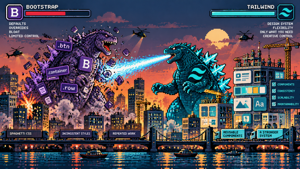
I’ve been using Bootstrap for well over ten years. It’s been a familiar part of my development workflow for so long that starting a new project without it would have seemed a little strange.
I’ve always enjoyed working with CSS and SCSS, creating my own components and having control over how websites look and behave. Bootstrap provided a reliable foundation for that, particularly when it came to responsive layouts and grids.
But recently I’ve made the move to Tailwind CSS.
Not because I’ve suddenly decided Bootstrap is outdated or because Tailwind is the latest thing everyone seems to be using. The decision has more to do with how my approach to development has changed, particularly since moving in-house.
I’m becoming increasingly interested in building design systems rather than simply designing individual pages. Systems that provide consistency, reduce unnecessary work and make it easier to develop a website over several years.
And that’s where Tailwind has started to make sense to me.
Working in-house changes how you think
When I first moved in-house, I was the first dedicated digital lead to join the team. There was a considerable amount of work to do, including reinventing how the brand presented itself digitally.
Over the years, I’ve helped reshape that identity, establishing a more consistent visual language and improving how the brand is represented across its website and wider digital presence.
That involved a lot of creative work, but also plenty of development, experimentation and reconsidering how things were structured.
One of the differences between agency and in-house work is the relationship you develop with a brand.
Rather than moving between different clients and identities, you’re continually developing the same one. You become familiar with its strengths, its limitations and all those little inconsistencies that inevitably appear over time.
And while brands naturally evolve, you’re not making fundamental changes to their identity every few weeks.
Once you’ve established a visual direction, the challenge becomes maintaining that consistency while continuing to introduce new content, features and functionality.
That’s where I’ve started thinking more seriously about design systems.
Building a system rather than another page
For me, the ultimate goal is relatively simple.
I want to be able to create a new piece of content, whether that’s a product page, a landing page or an entirely new section, and have it fit naturally into the existing website.
The typography should be consistent. Spacing should follow established rules. Colours, buttons, containers and responsive behaviour should already be considered.
I shouldn’t have to revisit those decisions every time I create something new.
Of course, that doesn’t mean every page should look identical. There still needs to be room for experimentation and creative thinking.
But there’s a difference between making a deliberate design decision and repeatedly solving a problem you’ve already solved.
A good design system should take care of the latter.
I’ve started thinking about websites less as collections of individual pages and more as collections of reusable components.
Hero sections, feature grids, product cards, testimonials, comparison tables and calls to action can all become part of a shared system.
Once those components are established, creating something new becomes more about choosing the appropriate structure and concentrating on the content.
And importantly, when something needs changing, it can be updated consistently rather than having to revisit dozens of individual pages.
Why Tailwind?
Bootstrap already provides many of these things, so why change?
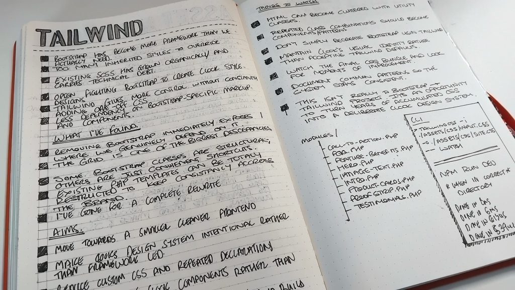
For me, it comes down to control and how much of the framework I actually need.
Over the years, I’ve spent a considerable amount of time customising Bootstrap. Changing variables, overriding component styles, adjusting spacing and creating additional SCSS to achieve something slightly different from its defaults.
There’s nothing particularly wrong with that approach. Bootstrap is designed to be customised, and its Sass architecture makes that possible.
But I increasingly found myself using its grid and utilities while replacing or heavily modifying many of its visual components.
Tailwind approaches things differently.
Rather than providing a collection of predefined interface components, it gives you smaller utility classes that can be combined to create your own.
That means I’m making more of the visual decisions myself, rather than adapting an existing component to fit what I want.
For someone who works across both design and development, that’s appealing.
I can establish the brand’s design tokens, define consistent spacing and typography, and build components around those foundations without having to work around a framework’s existing visual identity.
It’s not necessarily less work initially, but it feels more appropriate for what I’m trying to achieve.
I’m not abandoning SCSS
One thing I was keen to retain was SCSS.
I’ve used Sass for years and still find it incredibly useful for organising styles, creating reusable patterns and managing more complicated components.
Moving to Tailwind doesn’t mean I suddenly want to put every styling decision directly into HTML.
I’m finding that the two approaches can complement one another, provided their responsibilities are clearly defined.
Tailwind is useful for layouts, spacing, responsive utilities and common styling decisions. SCSS remains useful for bespoke components, complex selectors and styling that makes more sense when managed separately.
I still like having organised stylesheets and being able to understand how a component works without reading through an enormous collection of utility classes.
The important thing is avoiding duplication.
I don’t want one set of colours defined in Tailwind and another collection of slightly different values scattered throughout SCSS.
The same applies to typography, spacing and breakpoints.
Those decisions need to come from a shared set of design tokens, with a clear approach to how they’re used throughout the project.
I’m still refining that balance, but I like having the flexibility to use whichever approach makes the most sense for a particular task.
Only compiling what I actually need
One of the features that particularly appealed to me was Tailwind’s approach to generating CSS.
Most of the websites I work on are built using PHP, with reusable templates and components making up the individual pages.
Tailwind can scan those PHP files, identify the utility classes being used and generate the CSS required for them.
Rather than starting with a large collection of predefined component styles, the build process produces CSS based on the utilities it finds in the project.
I like that approach.
If I’m not using a particular utility, there’s generally no reason for it to be included in the generated stylesheet.
It also fits nicely with the idea of creating a streamlined design system. As I build new components or introduce additional layouts, the generated CSS reflects the utilities being used.
There are some considerations, particularly when working with PHP.
Tailwind scans source files as text rather than executing PHP, so dynamically constructing class names can cause problems if the complete classes aren’t visible to the scanner.
That’s something worth understanding before getting too carried away with generating classes programmatically.
Custom SCSS also needs its own compilation process, so there’s still some thought required around the overall build workflow.
Nevertheless, I appreciate the idea of generating the utility CSS the project actually uses rather than carrying around a collection of styles that may never be needed.
It’s a relatively small detail in the wider development process, but one that appeals to my preference for keeping things organised and efficient.
Thinking about the fiftieth page, not the first
Something I’ve become increasingly conscious of while working in-house is the difference between building a website and maintaining one.
Getting the first few pages designed and developed is only the beginning.
Over time, new products appear, existing services change, marketing requirements evolve and new ideas need to be accommodated.
You might need a different type of comparison table, a new promotional section or a completely different way of presenting information.
Without a consistent system, those additions can gradually introduce inconsistencies.
A slightly different button here, some additional spacing there, another variation of a component that already exists somewhere else.
Individually, none of these things seems particularly significant. But over several years, they can make a website increasingly difficult to maintain.
That’s what I’m trying to avoid.
By investing more thought into reusable components and design foundations now, I’m hoping to make future development more straightforward.
It should also make it easier to experiment.
If the underlying design decisions are already established, I can concentrate on how best to communicate something rather than spending time recreating the same visual patterns.
And when the brand does evolve, having those foundations organised should make introducing changes considerably easier.
A different way of measuring efficiency
We often measure development efficiency by how quickly we can produce something.
How long does it take to build a page? How quickly can we turn a design into a working website?
Those things matter, but I’ve started looking at efficiency over a longer period.
If a component takes a little longer to build initially but can be reused across twenty pages, that’s potentially a worthwhile investment.
If changing a design token updates the relevant elements consistently, that’s time saved in the future.
And if a new page can be assembled from existing components without compromising the visual identity, that’s a sign the system is working.
There’s also a creative benefit.
Repetitive design decisions take time and attention. Reducing them leaves more room to think about content, user experience and the problems that actually require a new approach.
The aim isn’t to remove creativity from the process. It’s to create more space for it.
Still learning, still experimenting
I’m relatively new to Tailwind, and after more than a decade of Bootstrap, there’s certainly some muscle memory to overcome.
I still occasionally find myself reaching for familiar Bootstrap classes without thinking.
There are aspects of Tailwind I’m getting used to as well. Long strings of utility classes can become difficult to read, and there’s a balance to find between keeping things flexible and creating reusable components.
I’m also conscious that it’s possible to overengineer a design system.
Not every variation needs its own component, and not every styling decision needs to become a configurable option. Sometimes a simple piece of CSS is all that’s required.
I don’t want to replace one collection of unnecessary complexity with another.
What I do want is a development environment that feels considered, maintainable and flexible enough to support the website as it continues to evolve.
Bootstrap has served me well for a long time, and I wouldn’t hesitate to use it again if a project called for it.
But at this stage, Tailwind, combined with SCSS and reusable PHP components, feels like an interesting direction.
It’s encouraging me to think more carefully about the relationship between design and development, and how the decisions I make today will affect the work I do several years from now.
Ultimately, I want to spend less time rebuilding things I’ve already designed and more time improving the website.
Because the real measure of a good design system isn’t how quickly you can build the first page. It’s how easily you can build the fiftieth.