Category: Web Design

Website design, UI, UX, branding and typography.

  • Why I Built My Own Design System

    Why I Built My Own Design System

    Using PHP, SASS and Tailwind to make website development faster, more consistent and easier to maintain.
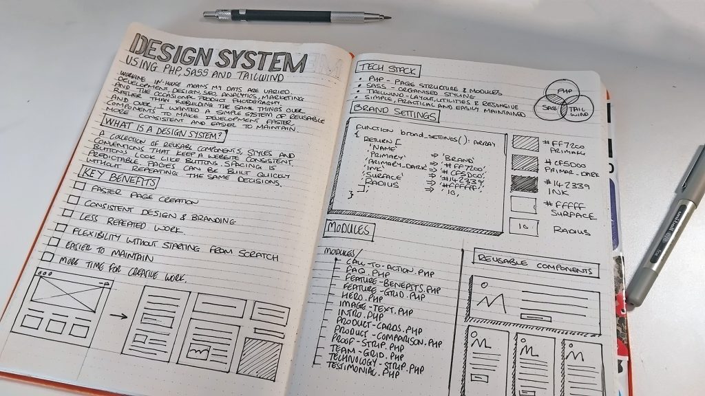
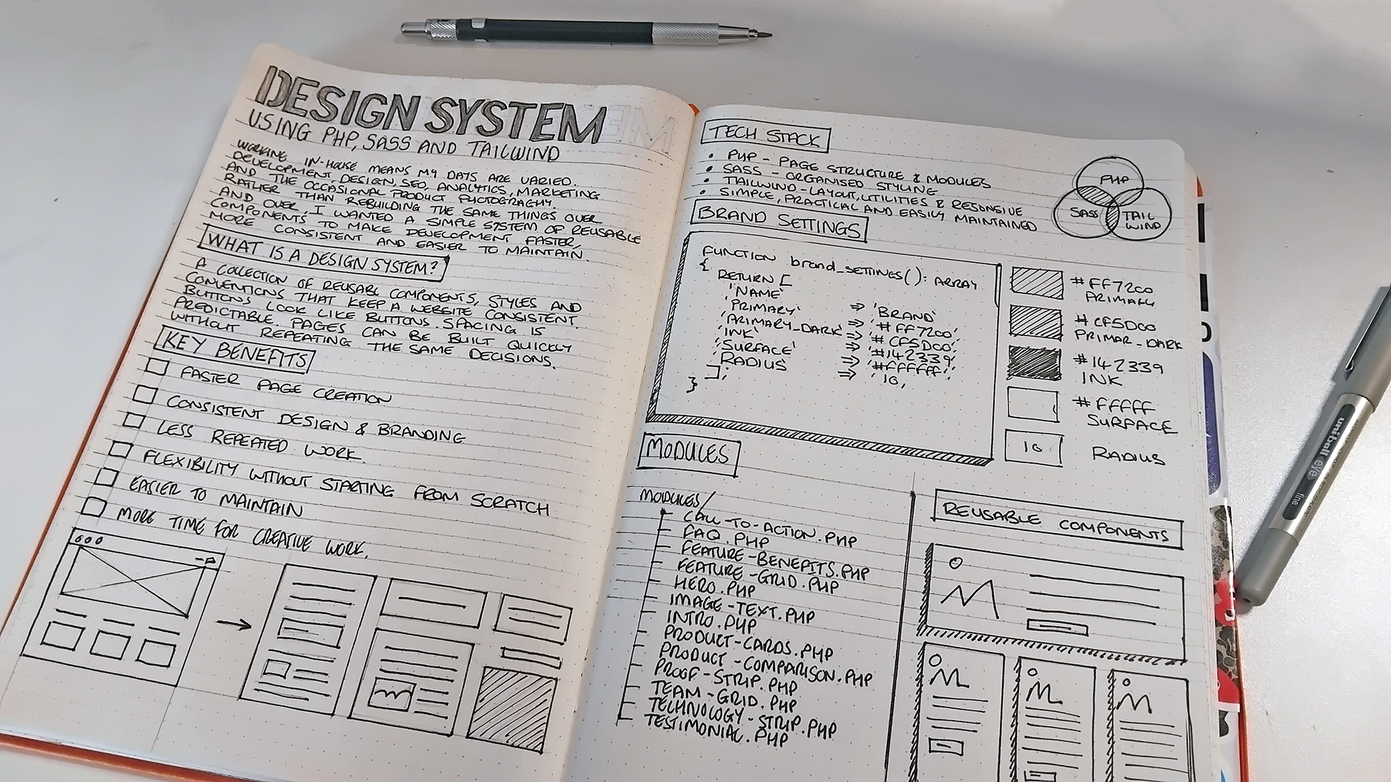
    Working in-house as a web developer and digital designer means my days can be quite varied. I might spend the morning developing a new page, the afternoon looking at analytics or SEO, and somewhere in between find myself working on branding, UX or a marketing campaign. Occasionally, I’ll even get the camera out to photograph products or create imagery for the website.

    It’s one of the things I enjoy about working in-house. There’s always something different to get involved with, and I get to use a mixture of creative and technical skills rather than concentrating on just one discipline.

    Recently, I’ve been working on a website rebuild and decided to approach things a little differently. Rather than developing individual pages and repeatedly writing similar code, I’ve been putting together my own lightweight design system.

    It’s built around PHP modules, SASS and Tailwind CSS, with an emphasis on reusable components, consistency and making future development easier.

    Nothing particularly groundbreaking in terms of technology, but that’s not really the point.
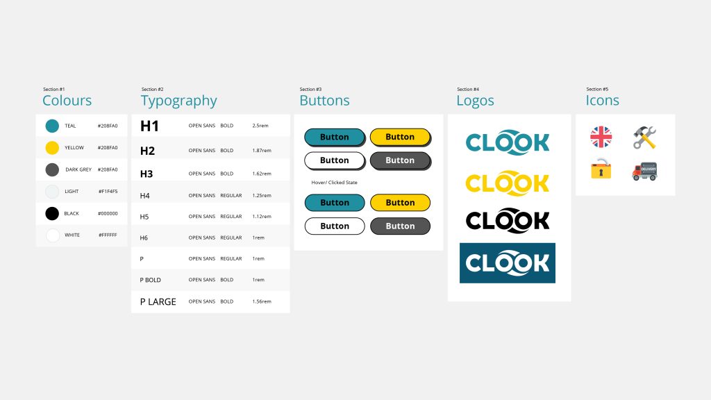

    Here is an example fo a visual design system I created for Clook.

    What is a design system, and why bother?

    A design system is essentially a collection of reusable components, styles and conventions that help keep a website consistent.

    At one end, that might simply mean having an agreed set of colours, typography and spacing rules. At the other, it could involve extensive component libraries, documentation and development frameworks.

    For me, the appeal is somewhere in the middle.

    I wanted a way to create pages quickly without having to make the same design decisions repeatedly. Buttons should look like buttons, spacing should be predictable, and elements such as testimonials, feature grids and calls to action shouldn’t need rebuilding every time they’re used.

    There’s also a longer-term benefit. Websites are rarely finished. Content changes, products evolve, designs get refined and new requirements appear.

    Having a system in place makes those changes easier to manage.

    Building something practical

    I didn’t want to introduce a complicated framework or create a dependency on something that might become difficult to maintain.

    Instead, I’ve been using technologies I’m already comfortable working with.

    PHP handles the page structure and reusable modules. SASS helps organise the styling, while Tailwind provides utility classes for quickly creating layouts and handling common spacing and responsive requirements.

    I’ve also been applying principles associated with object-oriented development, particularly separating responsibilities and keeping related functionality together. The module examples themselves use procedural PHP, rather than classes, but follow the same broader aim of making code easier to reuse and maintain.

    The result is a growing collection of components that I can use across different pages.

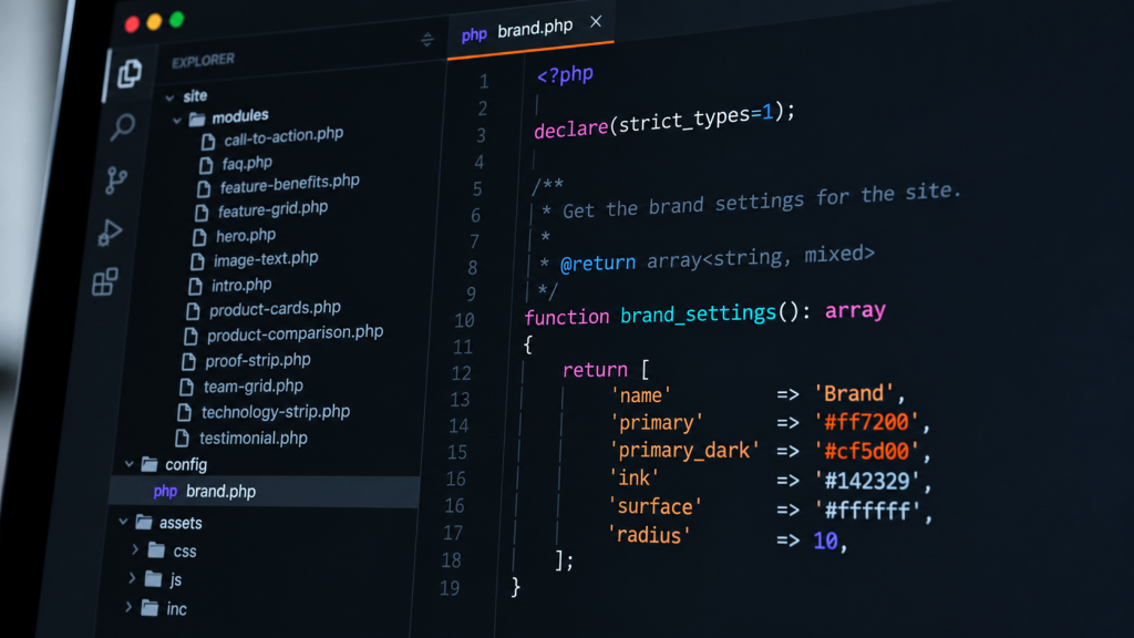
    Here’s a small selection from the current module directory:

    modules/
    ├── call-to-action.php
    ├── faq.php
    ├── feature-benefits.php
    ├── feature-grid.php
    ├── hero.php
    ├── image-text.php
    ├── intro.php
    ├── product-cards.php
    ├── product-comparison.php
    ├── proof-strip.php
    ├── team-grid.php
    ├── technology-strip.php
    └── testimonial.php

    Each module has a particular responsibility. Some are fairly simple, while others handle more complicated layouts and content.

    The important thing is that I can reuse them without copying large sections of HTML between pages.

    I simply include the module in the HTML and pass it some information to use.


    An example: reusable testimonials

    A testimonial section is a good example because it’s something that might appear on several pages, but with different content.

    Previously, I might have written the HTML directly into each page. That works, but it creates more work when something needs changing.

    With the new approach, I define the content in an array and pass it to a PHP module.

    Here’s a simplified example using fictional testimonials:

    <?php
    $testimonials = [
        [
            'quote' => 'Really pleased with the service.',
            'name' => 'Alex',
            'detail' => 'Customer',
        ],
        [
            'quote' => 'Helpful support and a great experience.',
            'name' => 'Sam',
            'detail' => 'Customer',
        ],
    ];
    
    include __DIR__ . '/modules/testimonial.php';
    ?>

    The module handles the presentation, while the page controls which testimonials appear.

    If I decide to change the appearance of testimonial cards, adjust their spacing or improve the responsive layout, I can make those changes in one place.

    It’s a relatively simple approach, but when you’re working across a growing website, those small efficiencies start to matter.


    Keeping the visual identity consistent

    Another part of the system involves centralising the brand settings.

    Rather than scattering colours and other design values throughout different stylesheets, I’ve created a PHP helper that defines a set of defaults and can read overrides from a JSON configuration file.

    Here’s a simplified example:

    function brand_settings(): array
    {
        return [
            'name' => 'Brand',
            'primary' => '#ff7200',
            'primary_dark' => '#cf5d00',
            'ink' => '#142329',
            'surface' => '#ffffff',
            'radius' => 10,
        ];
    }

    The full helper also validates values loaded from the configuration file, including checking that colours are valid hexadecimal values and that border-radius settings fall within an expected range.

    Those settings can then be turned into CSS custom properties:

    :root {
        --brand-primary: #ff7200;
        --brand-primary-dark: #cf5d00;
        --brand-ink: #142329;
        --brand-surface: #ffffff;
        --brand-radius: 10px;
    }

    This provides a common reference for the components.

    SASS gives me a way to organise component-specific styles, variables and more complicated styling rules. Tailwind sits alongside it, handling much of the routine layout work.

    I’m still refining where one approach ends and the other begins. There’s little point having three different ways to control the same thing, so keeping that relationship understandable is important.


    Speed matters, but consistency matters more

    The obvious benefit of reusable components is speed.

    If I need to create a new page, I already have a collection of elements to work with. Instead of starting from scratch, I can concentrate on choosing the right components and arranging the content.

    But consistency is probably the bigger advantage.

    When you’re building pages individually, small differences can gradually appear. Spacing changes slightly, headings behave differently, buttons develop variations and layouts become less predictable.

    These aren’t necessarily major problems individually, but collectively they make a website harder to maintain.

    A design system helps reduce that drift.

    It also encourages me to think about design decisions at a component level rather than treating every page as an isolated piece of work.

    That doesn’t mean every page has to look the same. The components provide a consistent foundation, but there’s still plenty of flexibility in how they’re combined.


    The in-house advantage

    I think this approach is particularly useful when working in-house.

    Unlike working exclusively on development projects, my responsibilities cover quite a few different areas. Development is only one part of the job, alongside design, content, SEO, marketing and improving the overall user experience.

    Sometimes I have a full day to concentrate on development. Other times, I might only have an hour or two between other responsibilities.

    Having an established collection of components makes it much easier to pick things up again without having to revisit decisions I’ve already made.

    It also makes experimenting with page layouts less time-consuming. I can concentrate on how information is structured, what needs communicating and how someone might interact with a page, rather than spending that time recreating familiar elements.

    That’s where I see the greatest value.

    The system isn’t simply about producing pages more quickly. It’s about reducing repetitive work so I can spend more time thinking about the problems that actually need solving.


    Knowing when not to complicate things

    There’s a temptation with projects like this to keep adding functionality.

    Every repeated element becomes a component. Every component gets configuration options. Before long, something intended to simplify development becomes another complicated system to maintain.

    I’ve been trying to avoid that.

    Not everything needs to be abstracted, and sometimes a straightforward piece of HTML is perfectly adequate.

    My general approach has been to create modules when there’s a genuine reason for them, rather than trying to anticipate every possible future requirement.

    The same applies to the technologies involved. I could probably achieve similar results using a larger framework, but I don’t necessarily need one for this particular project.

    I’d rather have something relatively simple that I understand and can maintain.


    A system that grows with the website

    The design system is still evolving, and I expect it will continue to change as I develop more pages and encounter new requirements.

    There are components that could be improved, opportunities to reduce duplicated code and areas where better documentation would help.

    But I’m already finding the approach useful.

    After more than twenty years working across design and development, I’ve become increasingly interested in the processes behind the work, not just the finished result.

    Good design isn’t always about creating something new. Sometimes it’s about recognising patterns, removing unnecessary decisions and making things easier for the next time.

    For me, that’s what this project is really about.

    Less time rebuilding things I’ve already built, and more time concentrating on the work that needs creative thought.
  • Healthy Habits: Why I Still Audit Our Websites Every Month

    Healthy Habits: Why I Still Audit Our Websites Every Month

    Some habits stick with you throughout your career, and one I’ve carried from agency life into my current in-house role is the humble monthly website audit.

    Years ago, when I worked at a design agency, we’d be given a list of around 10 to 15 client websites each month. Our job was to work through them, checking everything from broken links and performance to security, functionality and general website health.

    It wasn’t particularly glamorous work, but it was valuable. More importantly, it taught me the benefits of regularly checking websites rather than waiting for something to go wrong.

    Fast-forward to today, and I still follow much the same process for the websites I look after in-house.


    Making time for maintenance

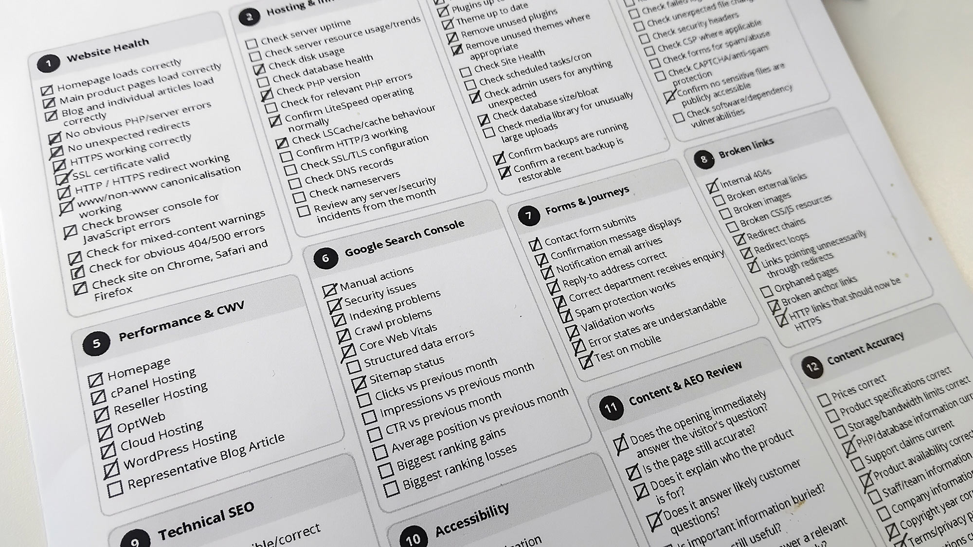
    Once a month, I sit down with a printed checklist and work through the various areas of our websites.

    It covers quite a bit: website functionality, hosting, WordPress updates, security, performance, Core Web Vitals, technical SEO, accessibility, forms, broken links and content accuracy.

    Some checks take seconds, while others need a little investigation. Occasionally, I’ll spot something that needs fixing, but often everything is working exactly as expected.

    And that’s fine. In fact, that’s what I’m hoping for.

    Having a physical checklist might seem a little old-fashioned, particularly when so much can be monitored automatically, but I quite like the process. It encourages me to slow down, look at things properly and occasionally notice something I wouldn’t have spotted otherwise.


    The benefits of doing it in-house

    One of the advantages of working in-house is having a deeper understanding of the websites you’re responsible for. You know their history, the decisions behind them and the changes that have been made over time.

    Regular audits build on that knowledge.

    They also encourage you to look beyond your immediate workload. When you’re busy developing new features, creating content or working on campaigns, it’s easy to overlook the smaller details of an existing website.

    A form might stop working, a redirect might break, or a page might gradually become slower. Individually, these things can seem minor, but they all contribute to the overall experience.

    Regular checks help catch them before they become bigger problems.


    Not everything needs automating

    I’m a big believer in automation, particularly for monitoring uptime, errors and other technical issues. But I also think there’s value in occasionally stepping away from dashboards and looking at a website as an actual visitor would.

    Does the navigation make sense? Is the information still accurate? Does the contact form work? Are there any obvious frustrations?

    Automated tools can tell you plenty about a website’s technical health, but they don’t always tell you how pleasant it is to use.

    For me, the two approaches complement each other.


    Small habits, long-term benefits

    After more than 20 years working across design and development, I’ve come to appreciate the value of simple, repeatable processes.

    A monthly audit isn’t particularly exciting, and it rarely produces anything worth showing off. But it helps keep websites reliable, highlights opportunities for improvement and provides a little reassurance that everything is working as intended.

    It’s one of those habits I picked up years ago that has followed me throughout my career.

    And I don’t see myself stopping anytime soon.

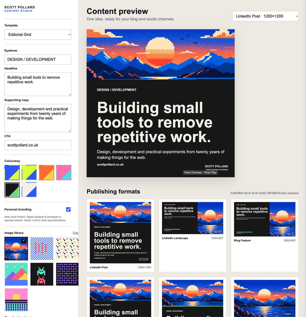
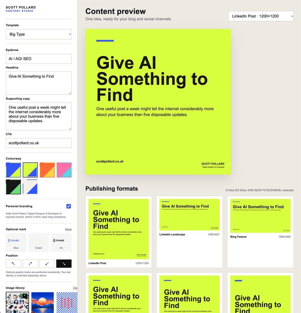
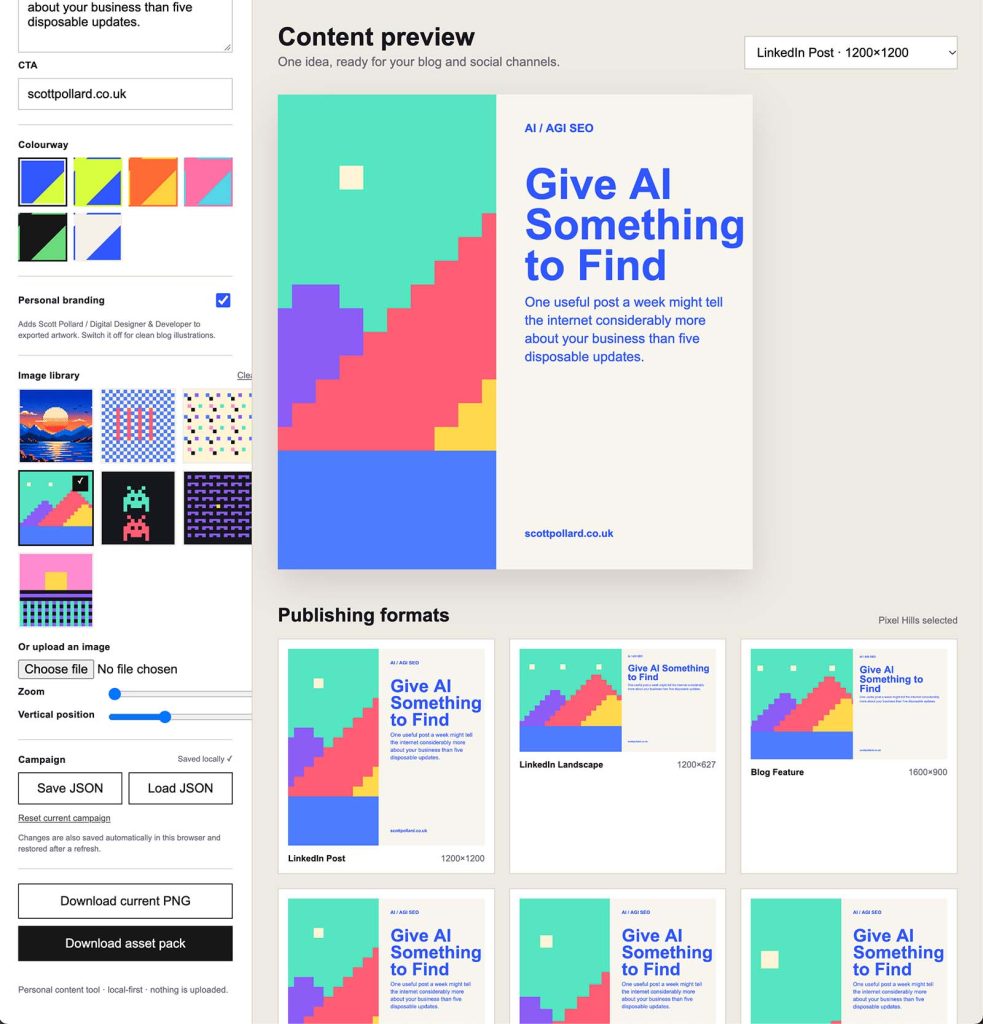
  • I built it because I could

    I built it because I could

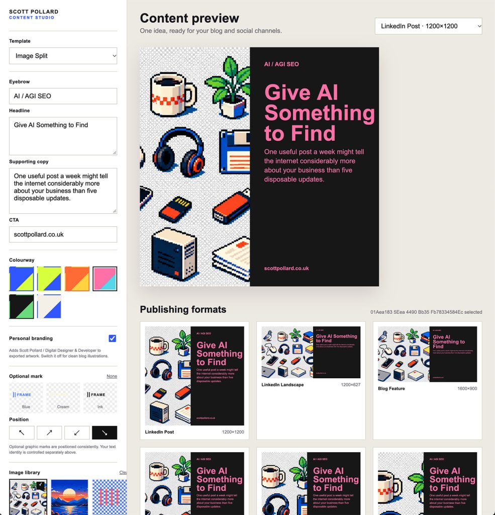
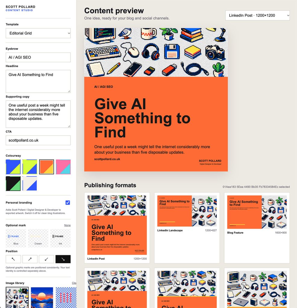
    There are already plenty of tools online for creating social media graphics.

    Canva. Adobe Express. Figma. And probably hundreds of smaller SaaS products doing variations of the same thing.

    I didn’t build this because I thought the world needed another one.

    I built it because I could.


    Solving a very small problem

    Creating a social graphic isn’t particularly difficult.

    But when you’re regularly creating graphics for LinkedIn, Instagram, blog posts and other bits of content, you start repeating the same process.

    Create the document. Set the dimensions. Add the colours. Position the type. Drop in an image. Export it.

    Then do roughly the same thing again at another size.

    What I actually wanted was something much simpler.

    Write a headline, choose an image, pick a layout and generate the sizes I need.

    More importantly, I wanted those graphics to feel consistent without having to consciously recreate the design every time.

    So I started building a small tool to do exactly that.


    Deliberately limited

    One of the things I like about building tools for myself is that they don’t need to cater for everyone.

    A SaaS product needs options.

    Lots of fonts. Lots of templates. Lots of controls. Integrations. Accounts. Cloud storage. Collaboration. AI features.

    My tool doesn’t.

    It only needs the things I actually use.

    That constraint turned out to be one of its best features.

    Rather than staring at a blank canvas every time I want to create something, I’ve already made most of the design decisions.

    There are a handful of layouts, a set of colour combinations, some image treatments and the output sizes I regularly need.

    I can concentrate on the content rather than designing the container around it every time.


    AI helped me build it

    This is also one of those projects that probably wouldn’t have happened quite as quickly a few years ago.

    AI helped me mock up ideas, work through bits of JavaScript and PHP, troubleshoot things and iterate on the interface.

    Instead of spending ages planning the application, I could get something working quickly and then react to it.

    Does this control need to be here?

    Would it be useful if I could change this?

    Can I export all the different sizes together?

    Build it. Try it. Change it.

    That’s probably where I’ve found AI most useful in development. Not necessarily doing the thinking for me, but dramatically shortening the distance between having an idea and having something tangible enough to test.


    And it runs on my computer

    There’s another thing I quite like about it.

    It doesn’t need an account.

    There’s no subscription.

    There’s no service sitting somewhere on the internet that the application depends on.

    I run it locally on my Mac.

    Open it in a browser, create what I need, export the images and close it again.

    There’s something quite satisfying about software working like that.


    It became genuinely useful

    What started as a little experiment has ended up becoming something I actually use.

    I’ve used versions of it for my own projects and I’ve found the same idea useful in my in-house work too.

    That’s probably my favourite kind of side project.

    Not something built because I’ve identified a market for it.

    Not something that needs users, subscriptions or a launch on Product Hunt.

    Just a small piece of software that removes a repetitive job from my day.

    Could I have used an existing SaaS product instead?

    Absolutely.

    But then I wouldn’t have learnt anything building it.

    And sometimes, “because I could” is a perfectly good reason to make something.

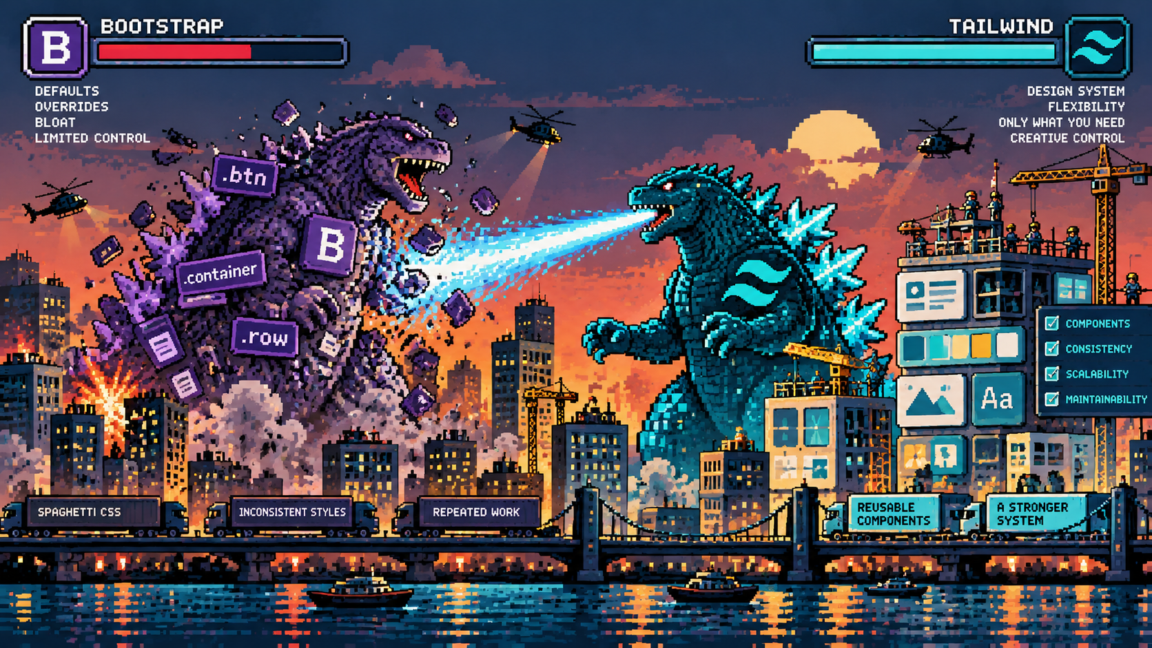
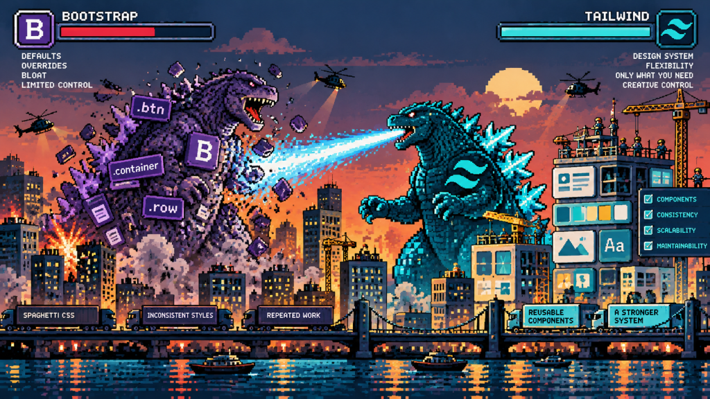
  • After 10 Years of Bootstrap, Why I’ve Moved to Tailwind

    After 10 Years of Bootstrap, Why I’ve Moved to Tailwind

    I’ve been using Bootstrap for well over ten years. It’s been a familiar part of my development workflow for so long that starting a new project without it would have seemed a little strange.

    I’ve always enjoyed working with CSS and SCSS, creating my own components and having control over how websites look and behave. Bootstrap provided a reliable foundation for that, particularly when it came to responsive layouts and grids.

    But recently I’ve made the move to Tailwind CSS.

    Not because I’ve suddenly decided Bootstrap is outdated or because Tailwind is the latest thing everyone seems to be using. The decision has more to do with how my approach to development has changed, particularly since moving in-house.

    I’m becoming increasingly interested in building design systems rather than simply designing individual pages. Systems that provide consistency, reduce unnecessary work and make it easier to develop a website over several years.

    And that’s where Tailwind has started to make sense to me.


    Working in-house changes how you think

    When I first moved in-house, I was the first dedicated digital lead to join the team. There was a considerable amount of work to do, including reinventing how the brand presented itself digitally.

    Over the years, I’ve helped reshape that identity, establishing a more consistent visual language and improving how the brand is represented across its website and wider digital presence.

    That involved a lot of creative work, but also plenty of development, experimentation and reconsidering how things were structured.

    One of the differences between agency and in-house work is the relationship you develop with a brand.

    Rather than moving between different clients and identities, you’re continually developing the same one. You become familiar with its strengths, its limitations and all those little inconsistencies that inevitably appear over time.

    And while brands naturally evolve, you’re not making fundamental changes to their identity every few weeks.

    Once you’ve established a visual direction, the challenge becomes maintaining that consistency while continuing to introduce new content, features and functionality.

    That’s where I’ve started thinking more seriously about design systems.


    Building a system rather than another page

    For me, the ultimate goal is relatively simple.

    I want to be able to create a new piece of content, whether that’s a product page, a landing page or an entirely new section, and have it fit naturally into the existing website.

    The typography should be consistent. Spacing should follow established rules. Colours, buttons, containers and responsive behaviour should already be considered.

    I shouldn’t have to revisit those decisions every time I create something new.

    Of course, that doesn’t mean every page should look identical. There still needs to be room for experimentation and creative thinking.

    But there’s a difference between making a deliberate design decision and repeatedly solving a problem you’ve already solved.

    A good design system should take care of the latter.

    I’ve started thinking about websites less as collections of individual pages and more as collections of reusable components.

    Hero sections, feature grids, product cards, testimonials, comparison tables and calls to action can all become part of a shared system.

    Once those components are established, creating something new becomes more about choosing the appropriate structure and concentrating on the content.

    And importantly, when something needs changing, it can be updated consistently rather than having to revisit dozens of individual pages.


    Why Tailwind?

    Bootstrap already provides many of these things, so why change?

    For me, it comes down to control and how much of the framework I actually need.

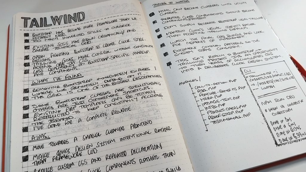
    Over the years, I’ve spent a considerable amount of time customising Bootstrap. Changing variables, overriding component styles, adjusting spacing and creating additional SCSS to achieve something slightly different from its defaults.

    There’s nothing particularly wrong with that approach. Bootstrap is designed to be customised, and its Sass architecture makes that possible.

    But I increasingly found myself using its grid and utilities while replacing or heavily modifying many of its visual components.

    Tailwind approaches things differently.

    Rather than providing a collection of predefined interface components, it gives you smaller utility classes that can be combined to create your own.

    That means I’m making more of the visual decisions myself, rather than adapting an existing component to fit what I want.

    For someone who works across both design and development, that’s appealing.

    I can establish the brand’s design tokens, define consistent spacing and typography, and build components around those foundations without having to work around a framework’s existing visual identity.

    It’s not necessarily less work initially, but it feels more appropriate for what I’m trying to achieve.


    I’m not abandoning SCSS

    One thing I was keen to retain was SCSS.

    I’ve used Sass for years and still find it incredibly useful for organising styles, creating reusable patterns and managing more complicated components.

    Moving to Tailwind doesn’t mean I suddenly want to put every styling decision directly into HTML.

    I’m finding that the two approaches can complement one another, provided their responsibilities are clearly defined.

    Tailwind is useful for layouts, spacing, responsive utilities and common styling decisions. SCSS remains useful for bespoke components, complex selectors and styling that makes more sense when managed separately.

    I still like having organised stylesheets and being able to understand how a component works without reading through an enormous collection of utility classes.

    The important thing is avoiding duplication.

    I don’t want one set of colours defined in Tailwind and another collection of slightly different values scattered throughout SCSS.

    The same applies to typography, spacing and breakpoints.

    Those decisions need to come from a shared set of design tokens, with a clear approach to how they’re used throughout the project.

    I’m still refining that balance, but I like having the flexibility to use whichever approach makes the most sense for a particular task.


    Only compiling what I actually need

    One of the features that particularly appealed to me was Tailwind’s approach to generating CSS.

    Most of the websites I work on are built using PHP, with reusable templates and components making up the individual pages.

    Tailwind can scan those PHP files, identify the utility classes being used and generate the CSS required for them.

    Rather than starting with a large collection of predefined component styles, the build process produces CSS based on the utilities it finds in the project.

    I like that approach.

    If I’m not using a particular utility, there’s generally no reason for it to be included in the generated stylesheet.

    It also fits nicely with the idea of creating a streamlined design system. As I build new components or introduce additional layouts, the generated CSS reflects the utilities being used.

    There are some considerations, particularly when working with PHP.

    Tailwind scans source files as text rather than executing PHP, so dynamically constructing class names can cause problems if the complete classes aren’t visible to the scanner.

    That’s something worth understanding before getting too carried away with generating classes programmatically.

    Custom SCSS also needs its own compilation process, so there’s still some thought required around the overall build workflow.

    Nevertheless, I appreciate the idea of generating the utility CSS the project actually uses rather than carrying around a collection of styles that may never be needed.

    It’s a relatively small detail in the wider development process, but one that appeals to my preference for keeping things organised and efficient.


    Thinking about the fiftieth page, not the first

    Something I’ve become increasingly conscious of while working in-house is the difference between building a website and maintaining one.

    Getting the first few pages designed and developed is only the beginning.

    Over time, new products appear, existing services change, marketing requirements evolve and new ideas need to be accommodated.

    You might need a different type of comparison table, a new promotional section or a completely different way of presenting information.

    Without a consistent system, those additions can gradually introduce inconsistencies.

    A slightly different button here, some additional spacing there, another variation of a component that already exists somewhere else.

    Individually, none of these things seems particularly significant. But over several years, they can make a website increasingly difficult to maintain.

    That’s what I’m trying to avoid.

    By investing more thought into reusable components and design foundations now, I’m hoping to make future development more straightforward.

    It should also make it easier to experiment.

    If the underlying design decisions are already established, I can concentrate on how best to communicate something rather than spending time recreating the same visual patterns.

    And when the brand does evolve, having those foundations organised should make introducing changes considerably easier.


    A different way of measuring efficiency

    We often measure development efficiency by how quickly we can produce something.

    How long does it take to build a page? How quickly can we turn a design into a working website?

    Those things matter, but I’ve started looking at efficiency over a longer period.

    If a component takes a little longer to build initially but can be reused across twenty pages, that’s potentially a worthwhile investment.

    If changing a design token updates the relevant elements consistently, that’s time saved in the future.

    And if a new page can be assembled from existing components without compromising the visual identity, that’s a sign the system is working.

    There’s also a creative benefit.

    Repetitive design decisions take time and attention. Reducing them leaves more room to think about content, user experience and the problems that actually require a new approach.

    The aim isn’t to remove creativity from the process. It’s to create more space for it.


    Still learning, still experimenting

    I’m relatively new to Tailwind, and after more than a decade of Bootstrap, there’s certainly some muscle memory to overcome.

    I still occasionally find myself reaching for familiar Bootstrap classes without thinking.

    There are aspects of Tailwind I’m getting used to as well. Long strings of utility classes can become difficult to read, and there’s a balance to find between keeping things flexible and creating reusable components.

    I’m also conscious that it’s possible to overengineer a design system.

    Not every variation needs its own component, and not every styling decision needs to become a configurable option. Sometimes a simple piece of CSS is all that’s required.

    I don’t want to replace one collection of unnecessary complexity with another.

    What I do want is a development environment that feels considered, maintainable and flexible enough to support the website as it continues to evolve.

    Bootstrap has served me well for a long time, and I wouldn’t hesitate to use it again if a project called for it.

    But at this stage, Tailwind, combined with SCSS and reusable PHP components, feels like an interesting direction.

    It’s encouraging me to think more carefully about the relationship between design and development, and how the decisions I make today will affect the work I do several years from now.

    Ultimately, I want to spend less time rebuilding things I’ve already designed and more time improving the website.

    Because the real measure of a good design system isn’t how quickly you can build the first page. It’s how easily you can build the fiftieth.

  • AI is spoiling the enjoyment of surprise

    AI is spoiling the enjoyment of surprise

    We seem to have become obsessed with how quickly things can be done. How quickly can we build the website? How quickly can we create the concept? How quickly can we write the code? And increasingly, how quickly can AI do all of the above?

    Speed has become one of the easiest ways to measure progress. If something took two days and now takes two hours, that must be better. And in plenty of situations, it absolutely is. But I’m starting to wonder whether we’ve accidentally started optimising something else out of the process.

    Surprise.


    We don’t like uncertainty very much

    Most businesses are naturally built around reducing uncertainty. We create processes, make templates, automate repetitive tasks, establish best practices and look at what worked last time so we can do more of it. It makes perfect sense.

    If a problem can be solved logistically rather than creatively, logistics normally wins. Creativity introduces uncertainty. You might spend three hours exploring an idea only to discover it doesn’t work. You might write some code, run it and get an error. You might design something, leave it overnight, come back the following morning and decide it’s rubbish.

    From a productivity point of view, this isn’t particularly efficient. But perhaps that inefficiency has some value.


    I’ve probably had this thought reinforced by watching many Rory Sutherland lectures. One of the recurring ideas I’ve taken from his work is that we’re very good at valuing things we can logically explain and measure. Efficiency is easy to defend in a meeting. Spending an afternoon experimenting with something that might go nowhere is rather harder.


    Ludwig von Mises wrote about something he called the “joy of labour”. Part of that joy comes from mastering something and being able to look at the result and think: I know how to make this. There’s another part I think anyone who has spent time coding will recognise. That feeling when something finally works.

    Not because somebody handed you the answer, but because you’ve spent an hour changing things, reading documentation, breaking it, fixing it, breaking something else and eventually understanding what was wrong. The result matters, but so does everything that happened before the result.

    I’ve been thinking about this quite a lot while using AI for coding. There’s a particular little dopamine hit that comes from writing some code, hitting run and seeing something happen that you weren’t completely expecting. Sometimes it works. Sometimes it spectacularly doesn’t. Occasionally the mistake is actually more interesting than the thing you were trying to make.

    That happens in design too. Move something accidentally, try the wrong colour, crop an image strangely, misunderstand an instruction or combine two ideas that weren’t originally supposed to go together. You stop and think, actually, there’s something in that.

    Those moments are difficult to put on a project plan. They’re also some of the most interesting moments in creative work.


    Then along came “the full script please”

    I should probably admit something here. I use AI a lot.

    Over the past year I’ve used it to help me build all sorts of creative coding experiments. Generative artwork, simulations, data visualisations and interactive pieces. I’ll have an idea, describe it to ChatGPT, get some code, run it and then start experimenting.

    Make the pixels move. Add some randomness. Change the colours. What happens if gravity is added? Can we make it 3D?

    And, quite regularly:

    “The full script please.”

    (If ChatGPT starts saying replace that with this somewhere)

    It’s brilliant. An idea that might once have remained scribbled in a notebook can be running on my screen twenty minutes later. AI has opened up a creative playground for me. I can explore ideas quickly, make dozens of variations and pick out the strange, unexpected and beautiful things that appear along the way.

    I wouldn’t want to give that up.

    But there is a contradiction in there. The quicker I ask AI to solve every problem, the less time I spend understanding the problem myself. Eventually something subtle changes. I’m no longer making the thing in quite the same way. I’m directing the making of the thing.

    Those aren’t necessarily the same experience.


    Creativity needs some friction

    Steve Jobs once described creativity as connecting things. His argument was that creative people often arrive at interesting ideas because they’ve accumulated experiences and thought about them enough to make connections between them.

    I think there’s something important in that. You need some dots before you can connect them, and those dots often come from doing things the slow way. Reading the documentation. Trying something that doesn’t work. Learning why it doesn’t work. Remembering a completely unrelated technique from five years ago.

    It’s about understanding enough CSS, JavaScript, PHP or whatever else you’re using to know when the obvious solution isn’t necessarily the right one. AI can jump straight to a plausible answer, but sometimes the wandering around before the answer was where we acquired the knowledge that would help us solve the next problem.

    There’s another problem with efficiency too. It encourages us to stay where things are predictable.

    Businesses understandably like repeatable outcomes. Designers develop styles. Developers use familiar frameworks. Marketing teams repeat campaigns that performed well previously. Then AI arrives with an extraordinary ability to look at everything that already exists and give us another plausible version of it.

    That can make the safe lane even safer.

    The danger isn’t necessarily that AI produces bad work. Quite the opposite. It can produce perfectly competent work incredibly quickly, and perhaps that’s the more interesting problem. If the competent answer arrives almost instantly, what makes us continue exploring?

    Why try the strange idea? Why spend an afternoon making something that might not work? Why write the awkward first version yourself?

    Efficiency tells us to stop when the problem has been solved. Creativity often asks what happens if we keep going.


    Perhaps we need slow AI

    Perhaps we don’t actually need less AI. Perhaps we need slower AI.

    I don’t mean artificially making the computer take thirty seconds to answer instead of three. That would just be annoying. I mean slowing down how we use it.

    There is already some interesting research around this idea. Researchers have explored “Reflective AI”, applying ideas from slow technology to creative education. Rather than treating AI purely as a machine for producing finished outputs, the idea is to use it in ways that encourage reflection, understanding and engagement with the process.

    I like that distinction because it changes the relationship we have with the tool.

    Imagine asking AI not to give you the finished function, but to explain what might be causing the problem. Ask for three possible approaches. Ask it to explain the part you don’t understand. Write your own version, break it and then ask AI why it broke.

    The goal changes from get me to the answer as quickly as possible to help me explore this.

    AI becomes less like a vending machine and more like someone sitting next to you while you work.


    I don’t want to give the speed back

    None of this means I want to return to development before AI. I don’t.

    AI has removed huge amounts of tedious work from my day. It helps me investigate unfamiliar code, generate starting points, debug problems and explore ideas that would otherwise require far more time than I have available.

    My everyday development work now sits somewhere between AI-assisted and traditionally written code. Sometimes I know exactly what I want and writing it myself is quicker. Sometimes AI gets me 80% of the way there. Sometimes I deliberately work through the problem because I want to understand it.

    And sometimes I just want the full script please.

    The important thing, I think, is recognising that these choices have different consequences. Saving time is useful. Learning is useful. Enjoyment is useful too.

    We’ve spent decades making computers faster. Then we made the internet faster, our workflows faster and our development tools faster. Now AI can compress hours of thinking and making into minutes. That’s an extraordinary achievement.

    But perhaps speed shouldn’t be the only measurement.

    There is value in knowing how something works. There is value in struggling with something for a while. There is value in making the wrong thing. And there is definitely value in pressing run without being entirely sure what is going to happen.

    Because sometimes the best part isn’t that it worked.

    It’s the surprise when it does.


    Acknowledgement

    A quick shout out to Rory Sutherland, whose lectures and talks I’ve really enjoyed watching online. His way of questioning our obsession with logic, efficiency and optimisation has definitely influenced some of the thinking behind this article.

    These aren’t necessarily Rory’s conclusions about AI. They’re my own thoughts, but his work certainly helped send me down this particular rabbit hole.

    References and further reading

    Ludwig von Mises, Human Action: A Treatise on Economics
    In his discussion of the “joy and tedium of labour”, Mises considers the satisfaction that can accompany work, including the pride of being able to look at something and say, essentially, “I know how to make this. This is my work.”

    Steve Jobs, interviewed by Gary Wolf, WIRED, 1996
    Jobs discusses design as something requiring genuine understanding rather than simply appearance. In the same interview he describes creativity as connecting experiences and argues that broader experiences give people more “dots” to connect.

    Rory Sutherland
    Vice Chairman of Ogilvy UK, author of Alchemy: The Surprising Power of Ideas That Don’t Make Sense, and a frequent speaker on behavioural economics, creativity and the limitations of purely rational decision-making. His talks and lectures around efficiency, logic and human behaviour were an influence on the thinking behind this article.

    Reflective AI and slow technology
    Research presented at CHI 2026 explores “Reflective AI”, looking at how deliberately slowing AI-supported creative processes can encourage reflection, understanding and creative agency rather than simply optimising for faster outputs.

  • Solar Eclipse 12/8/2026: A Dot-Matrix Sky

    Solar Eclipse 12/8/2026: A Dot-Matrix Sky

    There’s something wonderfully low-tech about watching a solar eclipse through a cardboard box.

    I remember being at school in the 80s and 90s and making simple pinhole viewers — cardboard boxes, a tiny hole and an image of the Sun projected safely onto the inside. No screens, no apps, no live streams. Just a little glowing circle of light and the slightly strange feeling that something unusual was happening above us.

    With another solar eclipse arriving on Wednesday 12 August 2026, I wanted to revisit that memory, but through generative art.


    Watch my live simulation here


    A digital pinhole viewer

    The idea for this project is deliberately simple.

    The entire sky is constructed from a grid of tiny dots. In the centre, brighter yellow and white dots form the Sun, while shades of sky blue create the surrounding atmosphere.

    Rather than drawing recognisable clouds, slowly moving noise passes through the grid. It creates subtle areas of light and shade that drift across the image — more like changing atmospheric conditions than illustrated clouds.

    The dot-matrix appearance is a little nod back to available technology back then. The image isn’t trying to reproduce the sky perfectly. It’s reducing it to light, dark and a grid of tiny marks.


    Following the real eclipse

    The project has two modes.

    Simulate compresses the entire eclipse into a short animation, allowing me to experiment with the effect at any time.

    Live is the more interesting one.

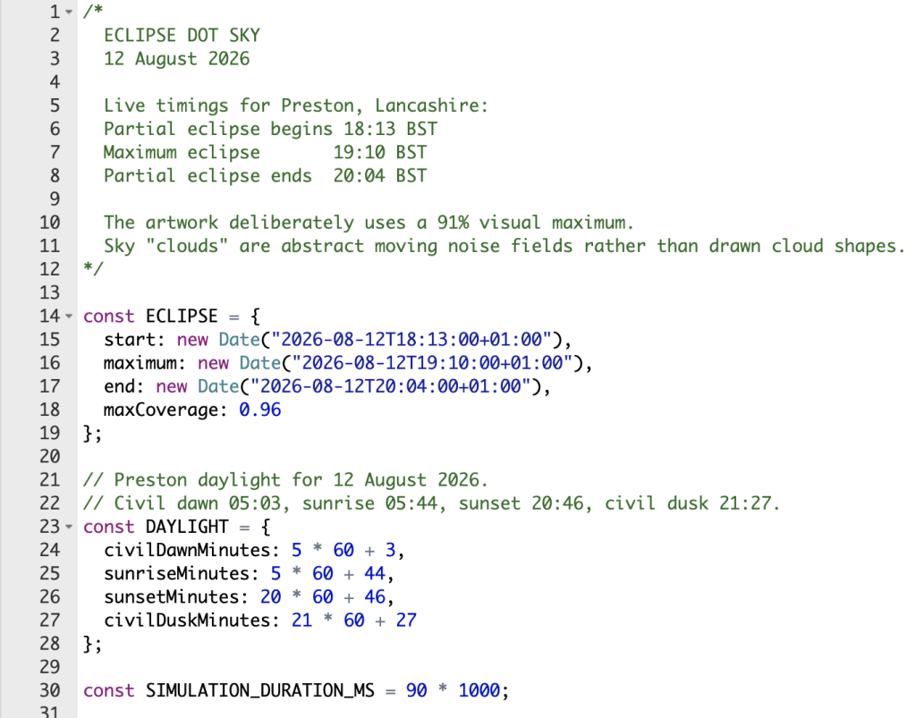
    On 12 August, the artwork follows the actual time of day and the progression of the eclipse. The sky begins as a light blue around #87CEEB, gradually changes with the natural daylight, and becomes darker as more of the Sun is obscured.

    As the Moon moves across the Sun, its dots are progressively swallowed by the darker grid. The surrounding sky responds at the same time, before gradually becoming lighter again as the Moon moves away.

    Because the eclipse is happening towards the evening, the natural transition towards sunset is happening at the same time. The two systems overlap: the real day is getting darker while the eclipse temporarily makes it darker still.


    Taking the cardboard version with us

    The digital version won’t be our only viewer.

    We’ll be heading to Moor Park in Preston with our pinhole box viewers to watch the real thing.

    A free community viewing event starts at 5.45pm, with astronomers from the University of Lancashire and Preston and District Astronomical Society bringing specialist equipment and eclipse glasses so people can observe it safely.

    It’s being billed as the UK’s deepest solar eclipse in over a decade, with the Moon covering up to 96% of the Sun in parts of the UK.

    So while there will be plenty of sophisticated astronomical equipment pointing towards the sky, I quite like the idea that we’ll also be standing there with a cardboard box.

    Some technology is difficult to improve upon.

    And somewhere nearby, my devices will be doing essentially the same thing — turning the Sun into a collection of little dots and watching them disappear.

    Watch my live simulation here