I filled my car up this morning and paid the highest price for petrol I can remember paying. Not exactly a great start to the day, but everything else about the experience was completely normal.
I used pay at pump, filled the car, paid and was about to leave when a row of faces appeared on the screen asking how I felt about my experience.
I normally ignore these surveys, but this time I was very close to pressing the unhappy face. It had nothing to do with the pump, though. The pump worked, the payment worked and there was no queue. I was annoyed because I’d just seen how much it had cost me to fill the car.
It got me thinking about what that little survey is actually measuring.
Presumably all those button presses end up somewhere. Maybe there’s a dashboard showing customer satisfaction across different petrol stations, different days or different times of day. If enough people answer, it probably produces some quite convincing-looking data.
But what happens when petrol prices suddenly increase?
If the number of unhappy faces goes up at the same time, has the experience actually got worse? Or are people just more annoyed about how much they’ve paid?
There are probably dozens of things influencing that response which have very little to do with the thing being measured. Someone might be late for work, stuck in traffic, having a bad morning or irritated that filling their car has just cost considerably more than it did a few weeks ago.
Pay at pump makes it even more interesting because there isn’t much of a customer experience in the traditional sense. I did almost everything myself. I filled the car, operated the terminal and paid without speaking to anyone. The petrol station provided a working pump and payment system, but beyond that there wasn’t much to judge.
Yet I’m still being asked how satisfied I am.
The problem isn’t necessarily the data itself. If more people press the unhappy face one week, then more people pressed the unhappy face. That’s a perfectly valid measurement.
It’s the meaning we attach to it that becomes questionable.
Imagine looking at a dashboard and seeing customer satisfaction drop from 82% to 69%. You might start looking for problems with the payment process, staff, queues or the condition of the forecourt.
Now imagine putting average petrol prices on the same graph and seeing them rise sharply at exactly the same time.
It doesn’t prove that price caused the drop, but it would certainly make you think twice before deciding the customer experience needed fixing.
And this goes well beyond petrol stations.
We collect an enormous amount of data because it’s easy to collect. Website engagement, conversion rates, satisfaction scores, and countless other metrics get turned into percentages and graphs. Once they’re sitting on a dashboard with a red or green arrow next to them, they start to feel very authoritative.
But a precise number doesn’t necessarily mean we’ve precisely measured the thing we care about.
Sometimes the most useful question isn’t why a metric went up or down.
It’s whether we’re actually measuring what we think we’re measuring.
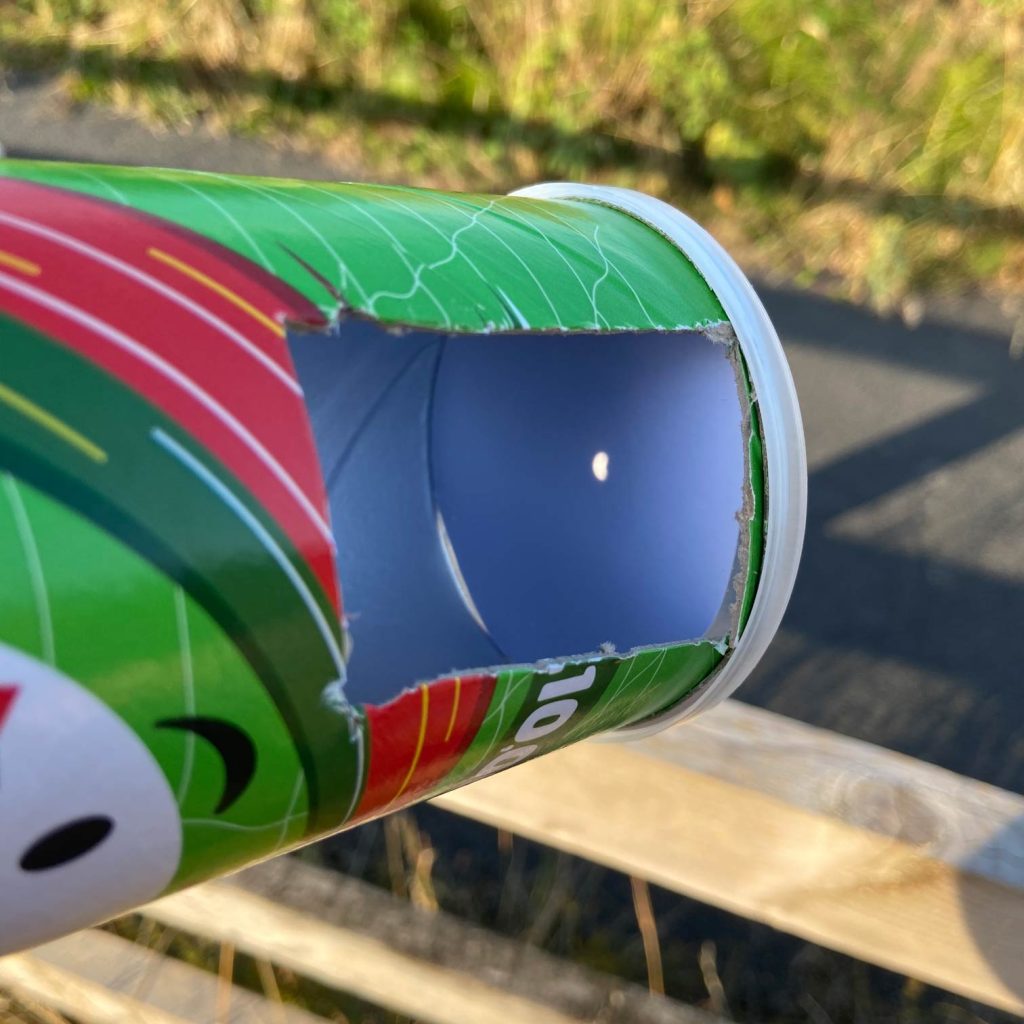
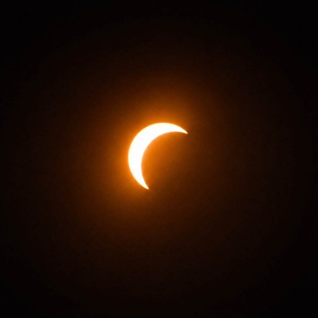
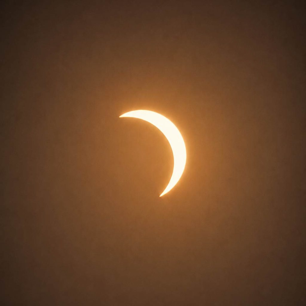
There’s something quite nice about watching a solar eclipse through a Pringles tube.
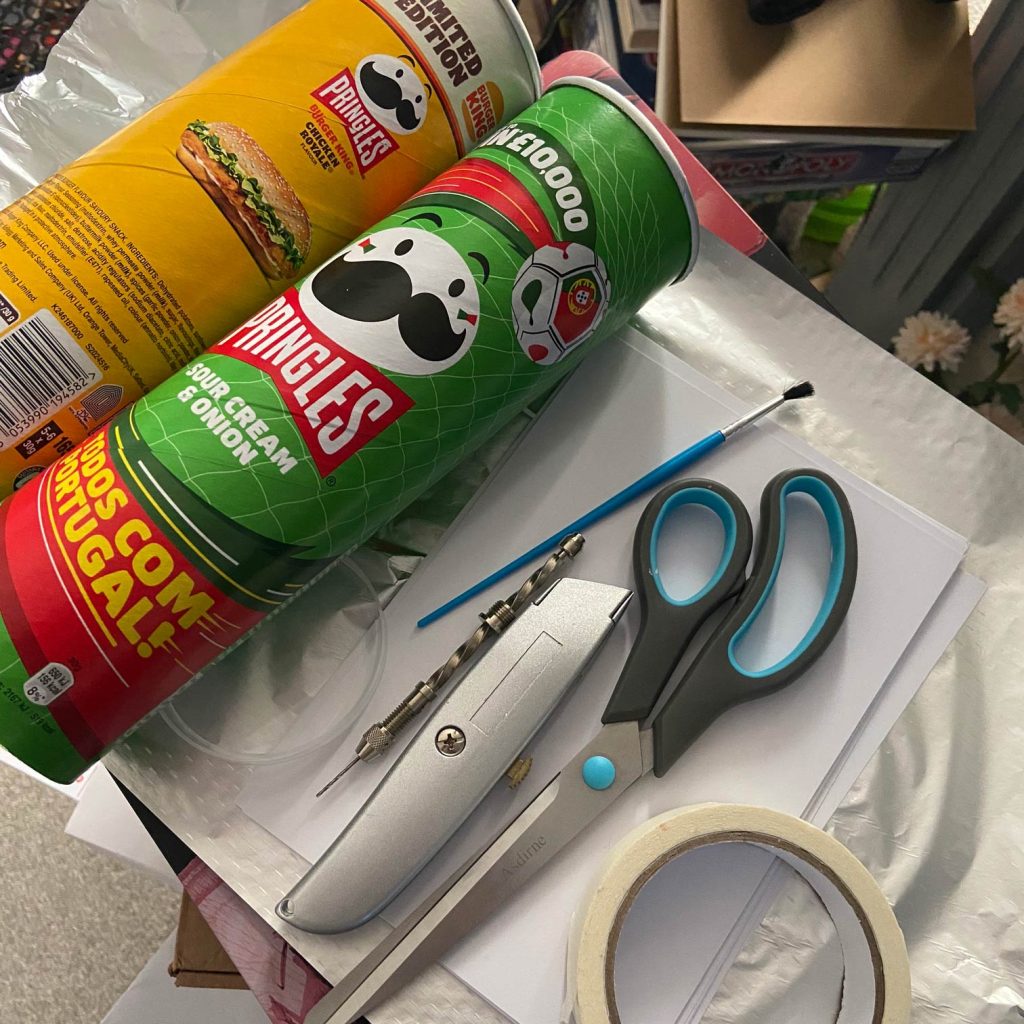
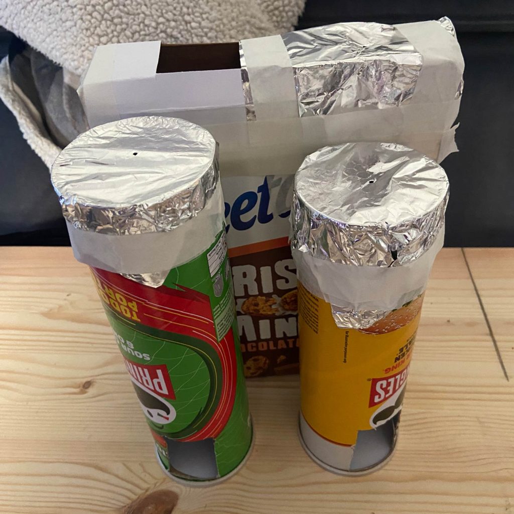
For all the technology we have around us, our preparations for the eclipse involved raiding the recycling and making pinhole viewers from cereal boxes and Pringles tubes. Very similar, really, to the sort of thing I remember doing at school in the 90s.
We’d planned a fairly secluded spot to watch it from, only to discover that a few other people had apparently had exactly the same idea.
That actually made the evening better.
We met some like-minded people, compared our slightly questionable homemade viewing contraptions and then stood around together waiting for the Moon to move across the Sun.
It got me thinking afterwards about the experience of an eclipse beyond simply seeing it.
What if you could see how people reacted?
The eclipse is obviously a huge visual event, but there’s another part of it that you can’t see.
Anticipation.
Excitement.
The strange change in light.
Waiting for the right moment.
And, potentially, the physiological response to all of that.
That led to another little generative art experiment.
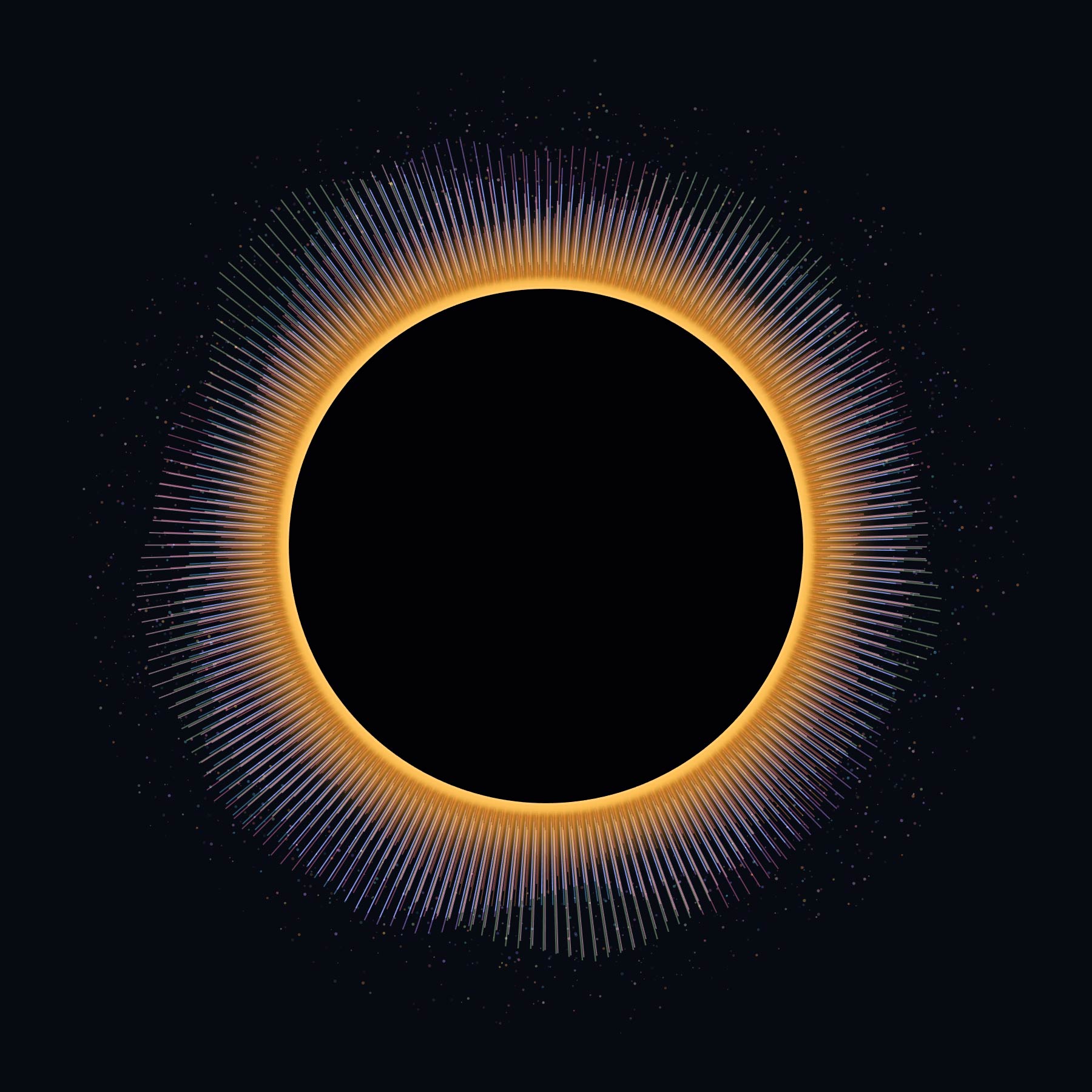
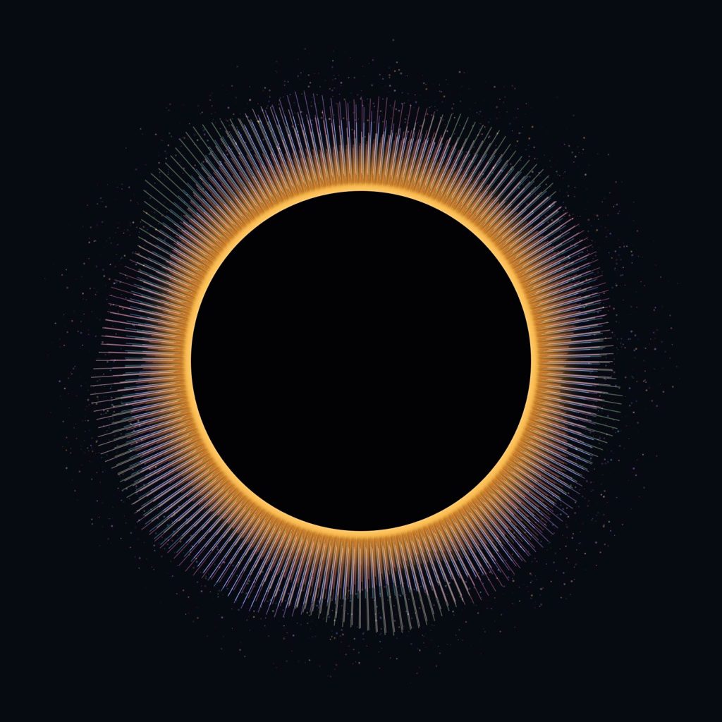
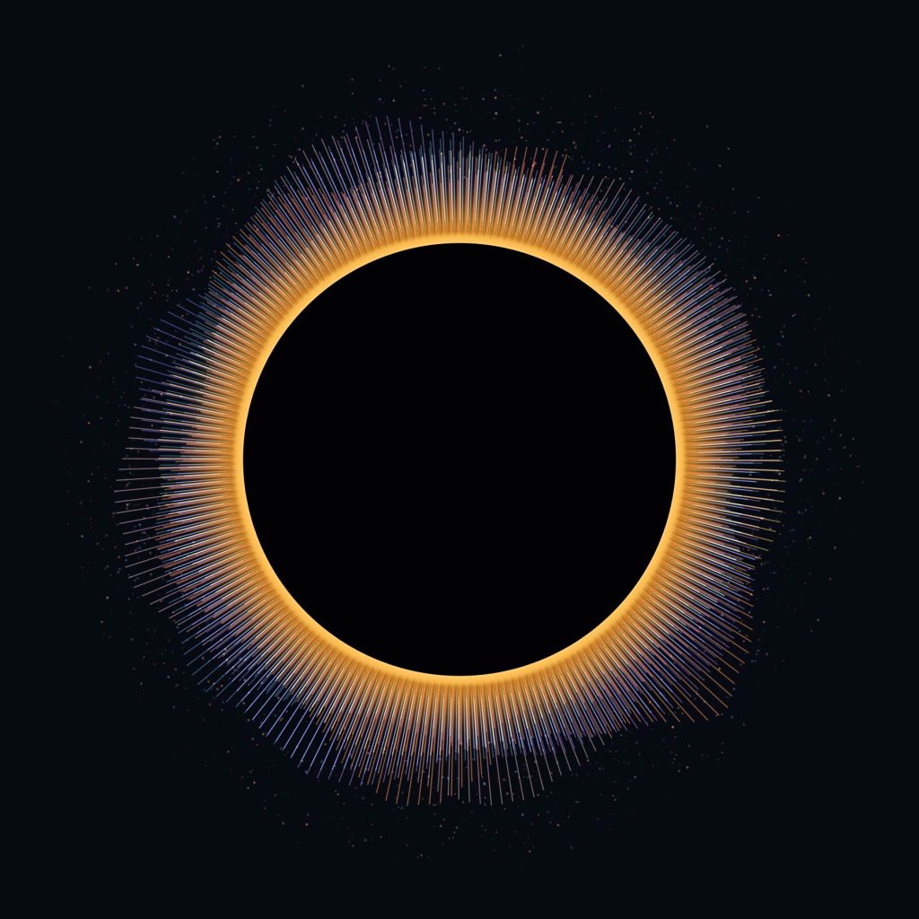
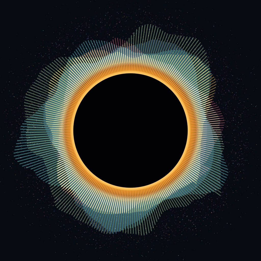
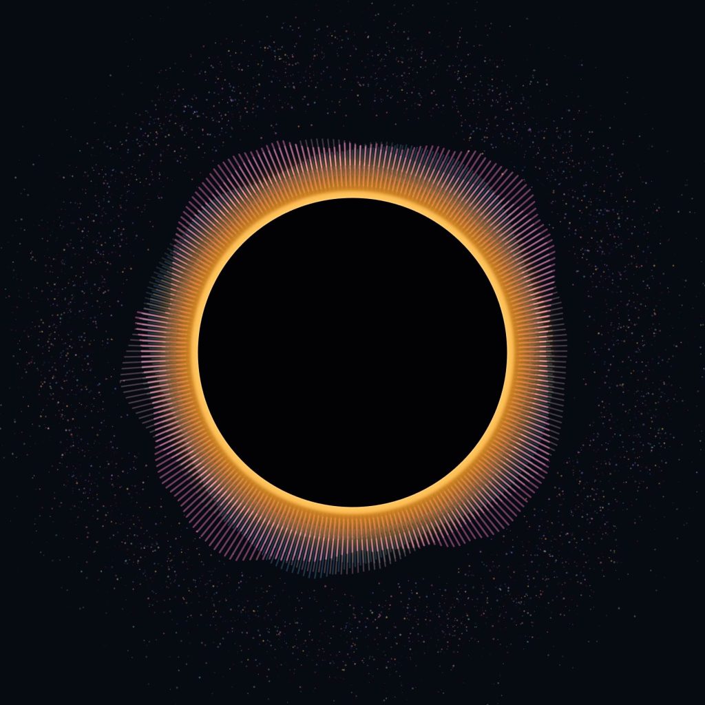
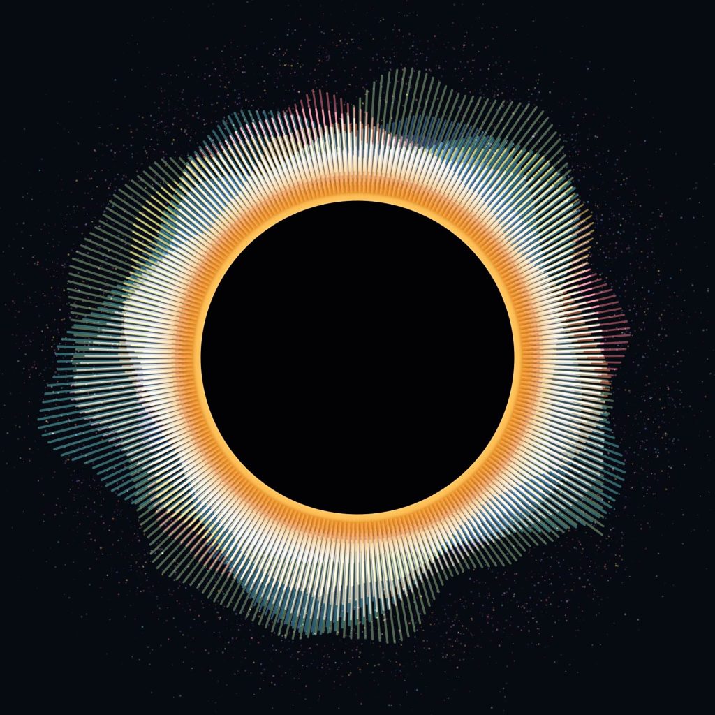
What if ten people watching an eclipse recorded their heart rates, and those heartbeats became the eclipse’s corona?
Rather than creating a conventional graph showing beats per minute over time, I wanted the data to become part of the artwork itself.
Ten people. Ten heart rates. One Eclipse.
The piece is being developed in Processing.
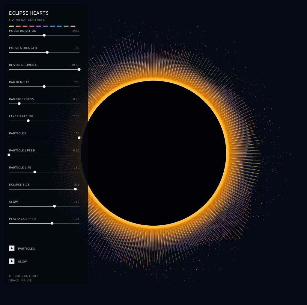
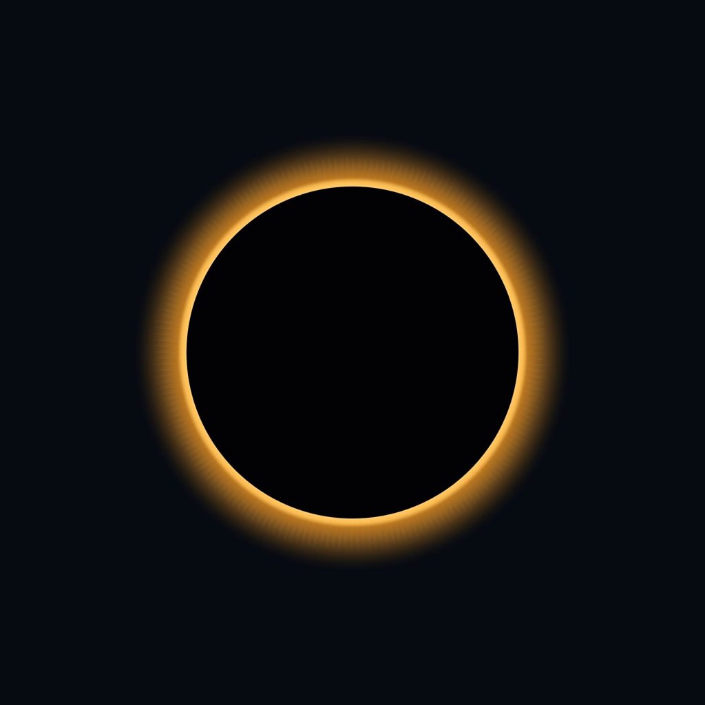
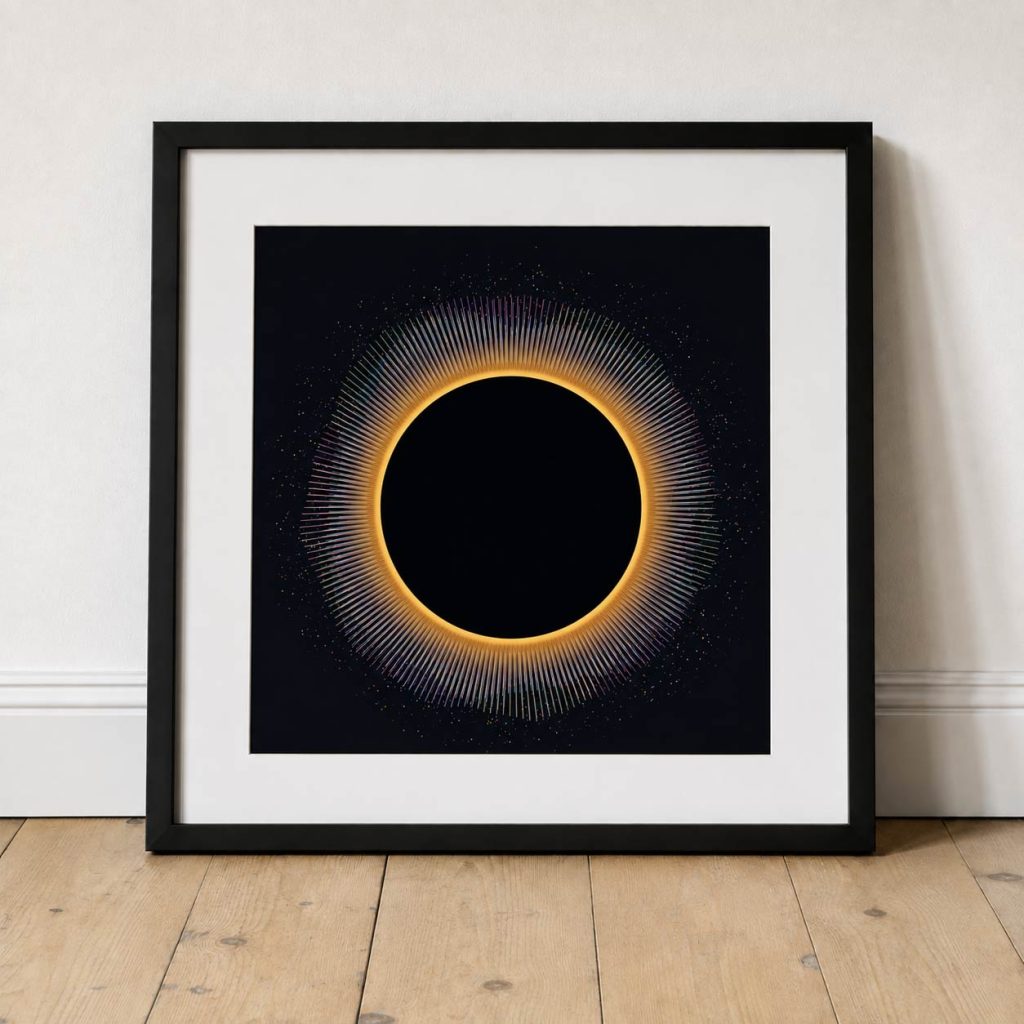
At the centre is a simple representation of the eclipse: a black disc surrounded by a thin, warm edge of light.
Behind it are ten separate circular systems.
Each person gets their own complete 360-degree layer made from hundreds of fine radial lines. Every layer has its own colour, pattern and heart rate, but they’re all positioned around exactly the same point.
So you don’t immediately see ten separate data visualisations.
You see one.
The layers overlap, interfere with each other and occasionally align, creating something resembling a colourful solar corona.
The important difference is that the corona is being generated by people.
Turning a heartbeat into movement
I didn’t want the heart-rate data to simply control the height of the lines.
That felt too much like an audio equaliser.
Instead, each heartbeat creates an event.
The radial lines slowly push away from the eclipse, reach their maximum extension and then ease back towards it.
I’ve deliberately exaggerated and slowed this movement. A literal visual representation of a heartbeat becomes incredibly frantic when ten people are running simultaneously.
The data determines when something happens, but the artwork determines how that event feels.
So each beat becomes more of a swell:
rest → expansion → peak → decay
At the peak of a pulse, fragments also begin to escape from the ends of the lines.
These become tiny particles travelling away from the centre before slowly disappearing.
I like the idea that the lines represent the immediate physical response, while the particles leave behind a temporary memory of what has already happened.
Stacked, not divided
One decision that became important quite early was how to represent the ten participants.
The obvious solution would be to divide the circle into ten sections, giving everyone a 36-degree slice.
But that would turn the artwork into a diagram.
Instead, all ten people occupy the entire circle.
Their layers are stacked.
Person one can pulse across all 360 degrees. So can person two, person three and everyone else.
Their heartbeats are also staggered, so the layers continually move in and out of phase with one another.
Every so often several beats might happen at almost the same moment and create a much larger burst.
Those moments aren’t specifically animated or programmed.
They’re coincidences in the data.
And that’s probably one of my favourite parts of the idea.
Compressing an eclipse into sixty seconds
I don’t want the final piece to run for the actual duration of the eclipse.
Instead, the recorded heart-rate data would be compressed into roughly one minute.
The beginning of the observation becomes the beginning of the animation. Maximum eclipse sits somewhere within that timeline, followed by the gradual return towards normality.
That gives the finished piece its own beginning, middle and end.
It also raises an interesting question.
Will anything actually happen at maximum eclipse?
It would be very easy to artificially make that moment enormous — more particles, longer lines, brighter colours.
But that would defeat the point.
If everyone’s heart rate increases as the eclipse approaches maximum, the artwork should naturally become more energetic.
If everyone’s heart rate remains relatively unchanged, then that’s what the artwork should show.
The interesting bit is finding out.
Building an instrument rather than a fixed animation
While developing it, I’ve also added a control panel to the Processing sketch.
I can adjust the pulse duration, strength, radial density, line thickness, particle speed, particle lifetime, eclipse size, glow, layer spacing and overall playback speed while the artwork is running.
This has become quite important.
There isn’t really a calculation that tells me a heartbeat should produce a line exactly 126 pixels long or that a particle should survive for precisely 140 frames.
Those are visual decisions.
The data provides the structure, but there’s still a process of designing how that data is interpreted.
Being able to move a slider and watch all ten systems respond immediately makes the Processing sketch feel less like a finished animation and more like an instrument for exploring the idea.
From a Pringles tube to Processing
That’s probably what I like most about this little project.
It started with something incredibly analogue.
A cardboard tube. A cereal box. A tiny hole. Sunlight projected onto a piece of card.
The same basic method of observing an eclipse that I remember from being younger.
Then there we were, years later, standing outside with our homemade viewers and a few people we’d only just met, all looking at the same event.
Now I’m taking that experience back to the computer and asking what else could have been recorded.
Not just what did the eclipse look like?
But:
What did it feel like to be there?
And could ten tiny streams of biological data turn that feeling into something we can see?
Sometimes an idea for a generative art project starts with data, a mathematical rule or something I’ve deliberately gone looking for.
This one started with an ornament sitting on my desk.
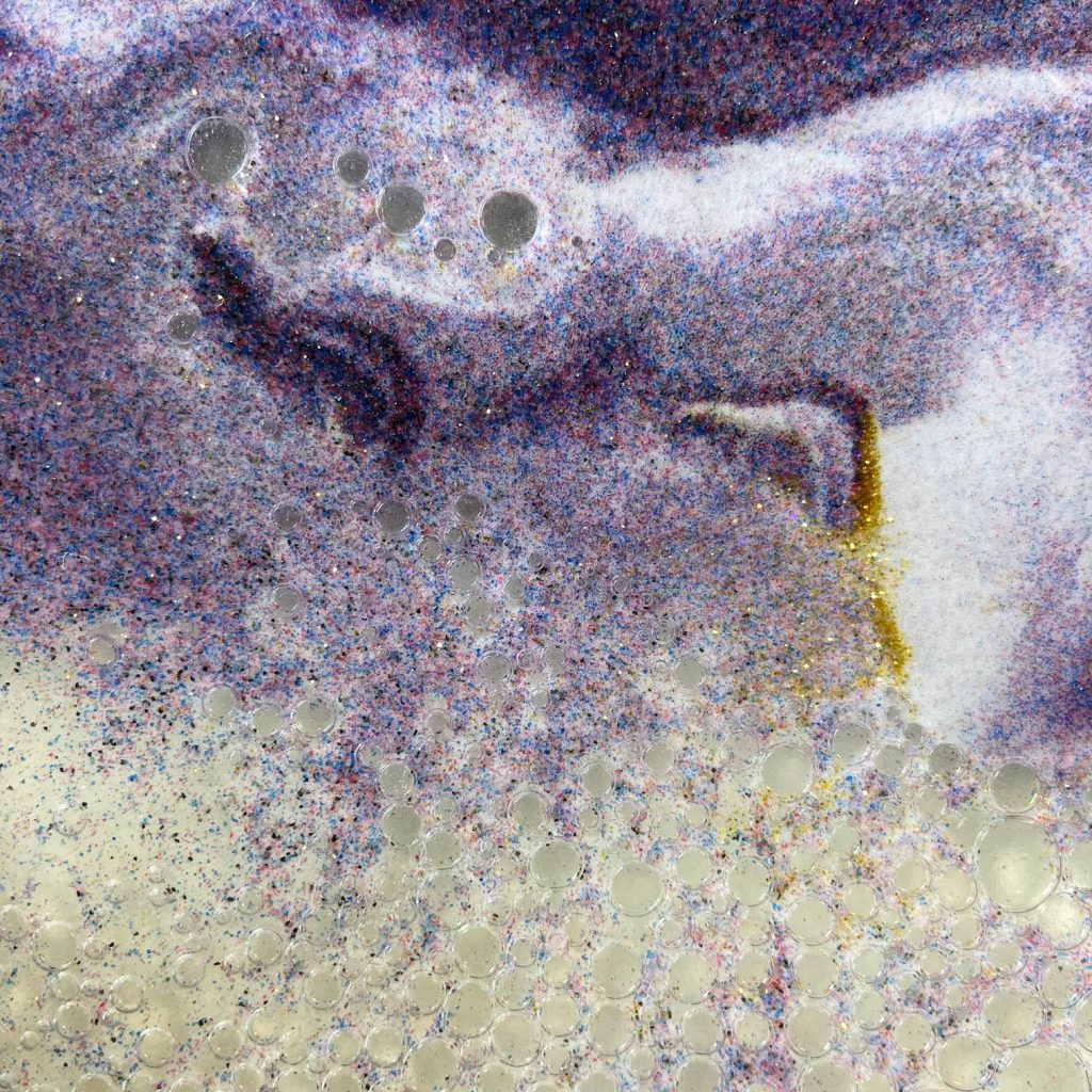
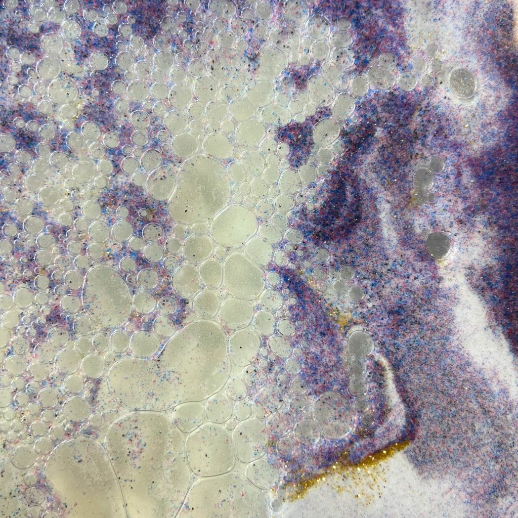
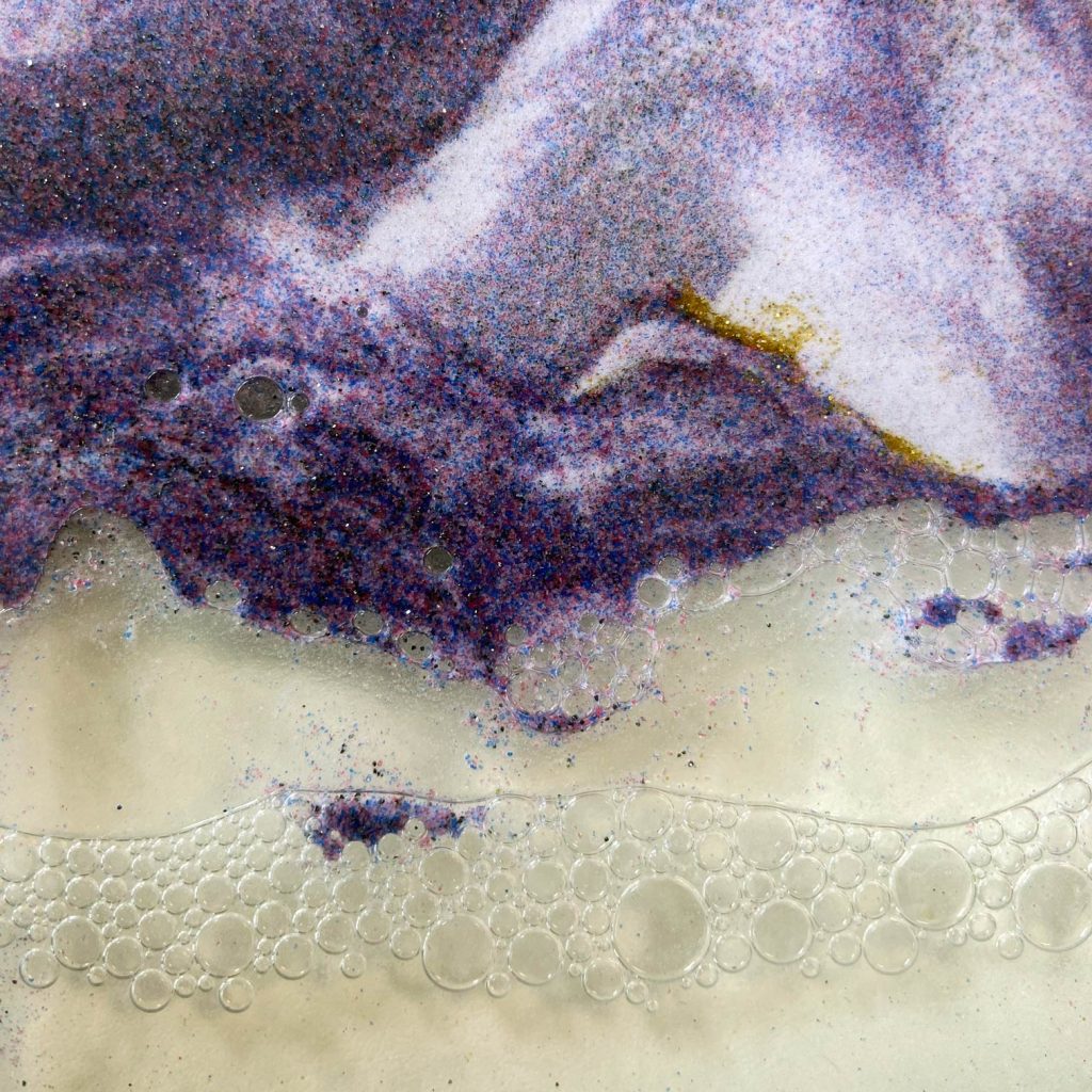
It’s one of those liquid motion ornaments filled with coloured sediment, oil and air. Turn it over and gravity takes care of the rest. The different materials slowly separate, collide and flow past one another, creating landscapes that exist for a few seconds before disappearing.
I’ve always found them strangely fascinating.
A little bit of 90s nostalgia
I remember seeing these sorts of things in gift shops while we were on holiday when I was much younger, particularly during the 1990s.
They’d be alongside lava lamps, plasma balls and all the other slightly odd things that seemed impossibly interesting at the time.
My dad always took a particular fancy to these liquid ornaments. I can remember stopping to look at them and watching the sand and oil slowly make their way from one side to the other.
There was something compelling about the fact that you didn’t really control what happened. You simply turned it over and watched.
Years later, I’ve somehow ended up with one sitting next to my computer.
And while watching it recently, I started wondering:
Could I recreate some of that behaviour with code?
Looking closer
Taking a few close-up photographs made the ornament considerably more interesting.
From a distance, you see flowing purple sediment.
Up close, there’s much more going on.
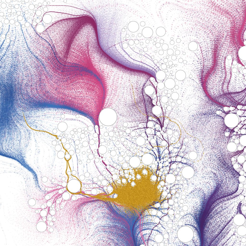
Tiny particles collect into dense areas before thinning out into clouds. Oil forms bubbles of wildly different sizes. Those bubbles gather into groups and channels. Sediment flows around them. Fine gold particles occasionally collect along boundaries, while elsewhere large areas remain almost completely empty.
It started to look less like a desk ornament and more like an abstract painting.
That became the starting point for the Processing experiment.
Building the system
I didn’t particularly want to reproduce the ornament literally. The aim was to identify some of its behaviours and use them as rules for generating something new.
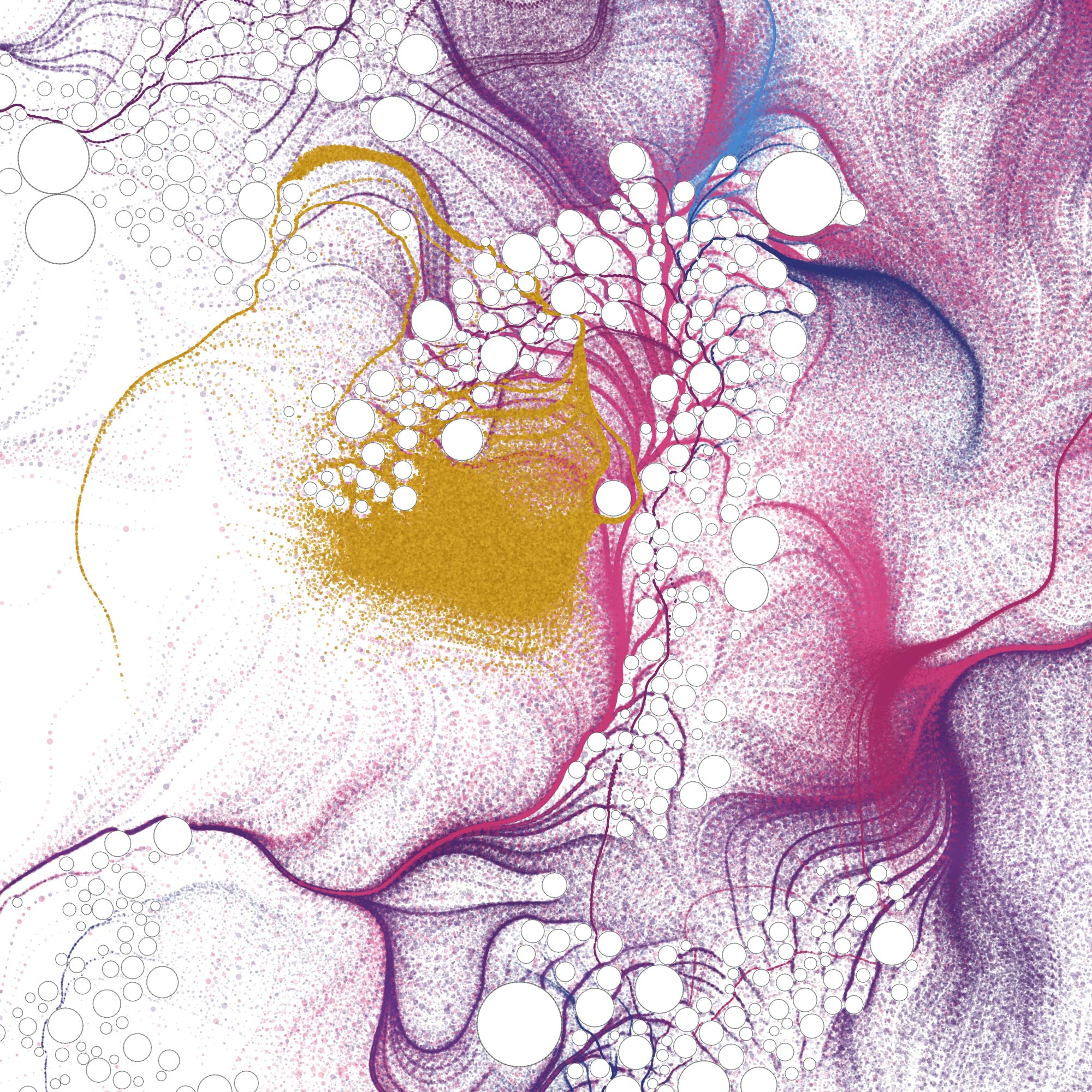
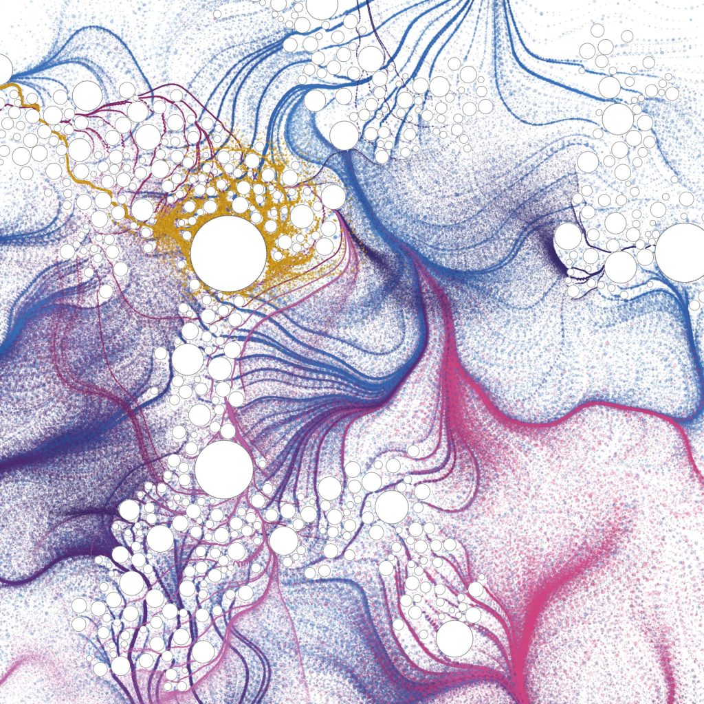
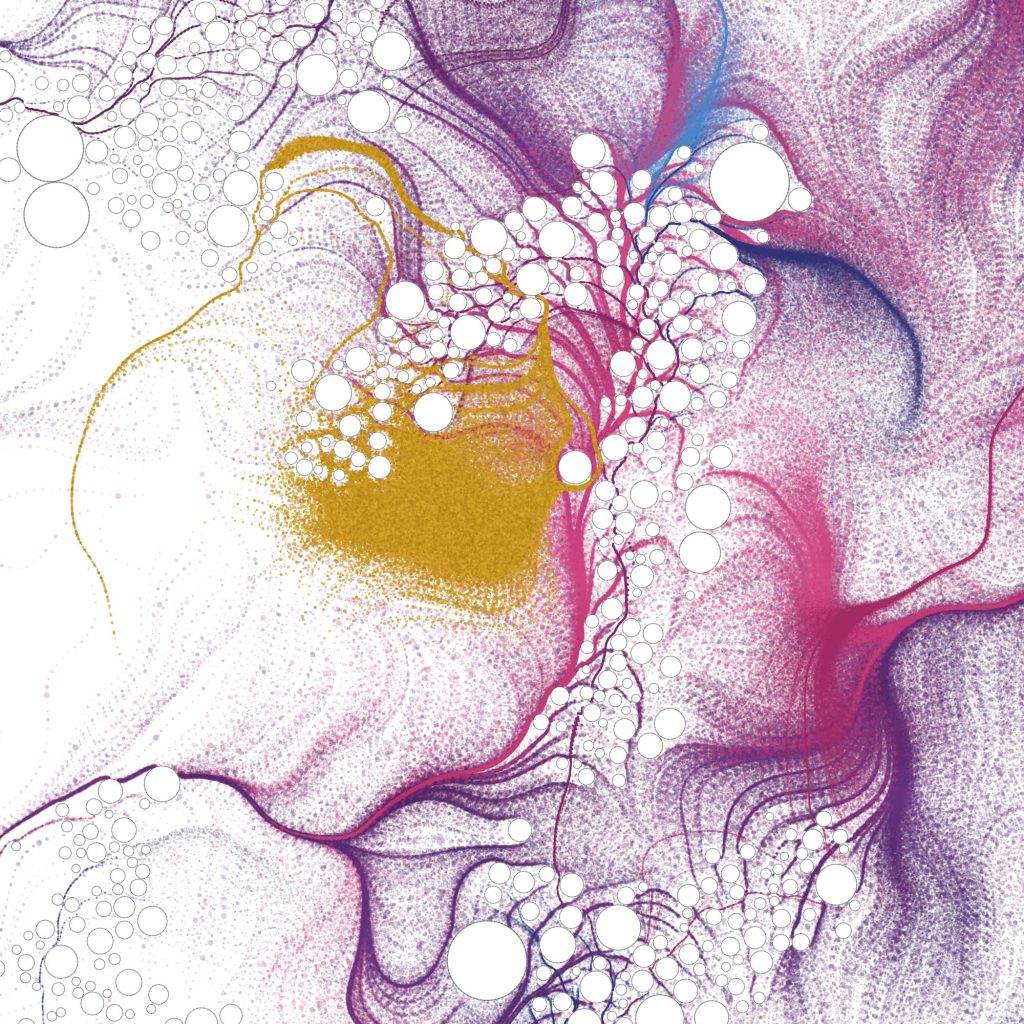
I started with a 1600 × 1600 pixel white canvas and a limited palette derived loosely from the ornament: blue, purple, magenta and a contrasting sediment-like gold.
Rather than drawing large solid shapes, the colour is made from thousands of tiny particles.
Each particle starts somewhere within a larger group and moves across the canvas according to a flow field.
A simplified version of the idea looks something like this:
float n = noise(
  x * flowScale,
  y * flowScale
);

float angle =
  n * TWO_PI * 2.9;

x += cos(angle) * speed;
y += sin(angle) * speed;
I’m using Perlin noise here because completely random movement quickly looks exactly that: random.
Noise gives neighbouring particles similar instructions. Instead of visual static, thousands of individual dots begin to form currents, folds, waves and larger structures.
That’s where the experiment became much more interesting.
Making bubbles into obstacles
Initially the bubbles were simply circles drawn over the finished artwork.
Visually it worked, but physically it didn’t make much sense.
Looking again at the real ornament, the bubbles are part of the system. Material has to move around them.
So the bubbles became obstacles within the simulation.
When a particle approaches a bubble, its normal direction is altered. An outward force stops it entering the circle while a tangential force encourages it to travel around the circumference.
Conceptually, it became something like:
float nx = dx / distance;
float ny = dy / distance;

float tx = -ny;
float ty = nx;

vx += tx * tangentForce;
vy += ty * tangentForce;

vx += nx * outwardForce;
vy += ny * outwardForce;
The result was unexpectedly effective.
Instead of bubbles merely appearing on top of the artwork, streams started dividing around them. Groups of bubbles produced channels. Pigment accumulated around their edges and then rejoined further downstream.
Suddenly the bubbles were helping to create the composition.
Gold behaves differently
The gold became another little experiment within the experiment.
I didn’t want it evenly distributed throughout the image. In the physical ornament it feels more like a sediment: something heavier that collects in particular places.
So the gold particles have their own behaviour.
They follow the same underlying flow, but respond more strongly to bubble boundaries and have a chance of being deposited when they get close to an edge.
if (edgeDistance < 8) {

  if (random(1) < 0.035) {
    deposited = true;
  }
}
It’s a tiny rule, but across thousands of particles it produces occasional concentrations and thin gold trails.
I particularly like that I don’t decide exactly where the gold appears.
The system does.
Controlled, but not designed
That’s probably my favourite aspect of this project.
I’m choosing the palette, particle density, noise scale, bubble sizes, forces and probabilities, but I’m not actually drawing the final composition.
Every regeneration produces a different result.
Some are balanced.
Some are chaotic.
Some contain huge empty areas.
Some become almost completely overwhelmed by colour and bubbles.
And occasionally one appears where everything happens to come together.
There’s something pleasingly similar about that process to turning over the original ornament and waiting to see what happens.
From simulation to artwork
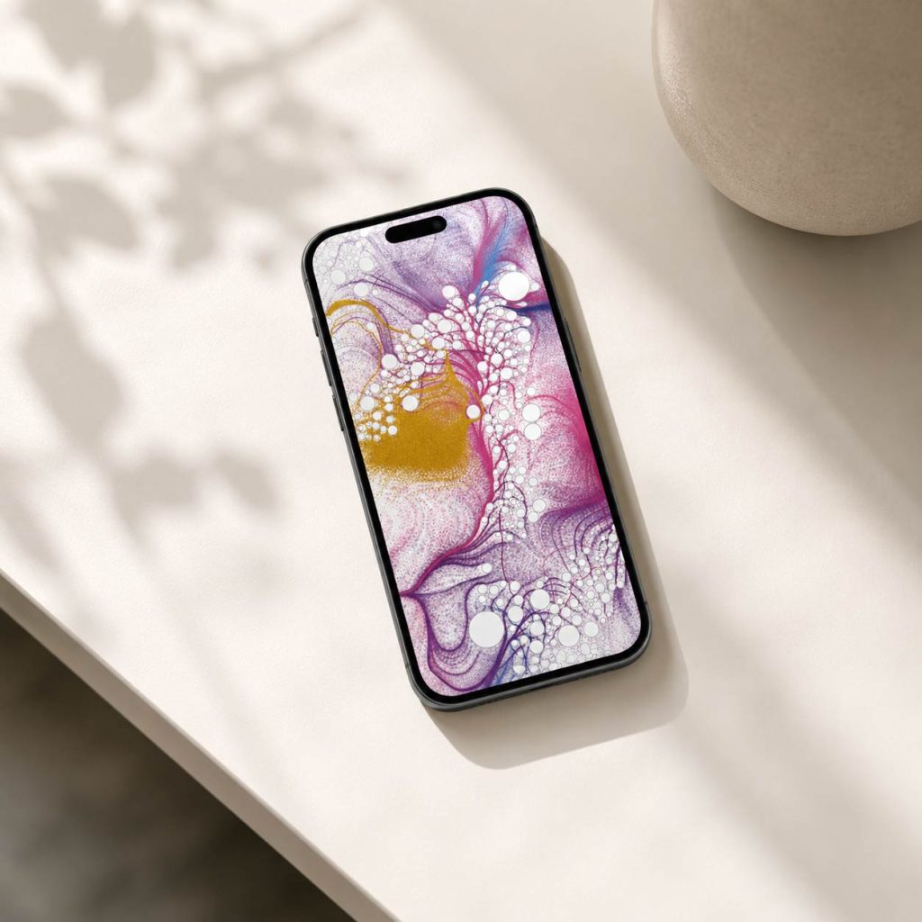
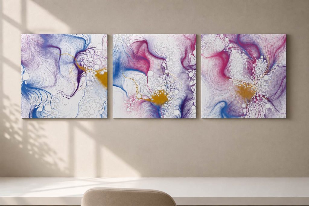
Once I started getting outputs I liked, I realised they worked surprisingly well away from the Processing window.
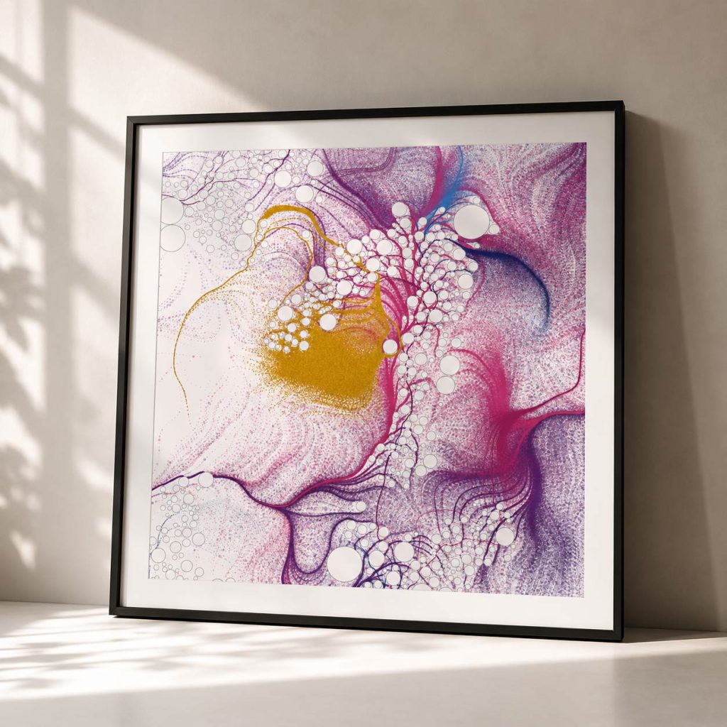
At 1600 × 1600 pixels they’re naturally suited to square digital artwork, but the detail also makes them interesting as prints.
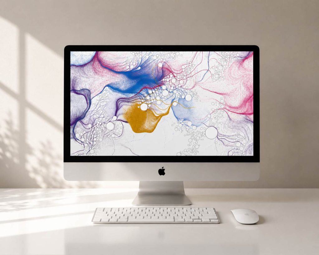
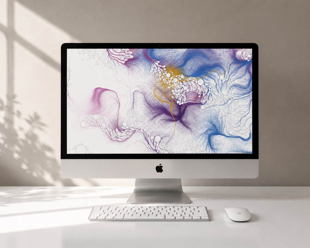
I’ve experimented with them as large square framed pieces, groups of three prints, desktop artwork and phone wallpapers. Cropping into the images also reveals smaller compositions that I hadn’t deliberately created.
That opens another interesting possibility: generating at a much larger resolution and treating the resulting image almost like a landscape, finding compositions within compositions.
The artwork could equally become animation. Instead of saving the final particle paths, the movement itself could become the work: pigment slowly flowing around bubbles, separating and collecting before eventually settling.
Back to the desk
What I like most is how circular the whole experiment feels.
A fairly simple ornament sitting beside my computer reminded me of being on holiday in the 90s and watching these things with my dad.
Thirty-odd years later, I’m looking at the same object and wondering how its behaviour can be translated into Perlin noise, particles, collision detection and Processing.
The finished images aren’t really simulations of oil and sediment.
They’re interpretations of it.
Gold, sediment, waves and oil — translated from something physical into a set of rules, then handed back to chance.
There’s something wonderfully low-tech about watching a solar eclipse through a cardboard box.
I remember being at school in the 80s and 90s and making simple pinhole viewers — cardboard boxes, a tiny hole and an image of the Sun projected safely onto the inside. No screens, no apps, no live streams. Just a little glowing circle of light and the slightly strange feeling that something unusual was happening above us.
With another solar eclipse arriving on Wednesday 12 August 2026, I wanted to revisit that memory, but through generative art.
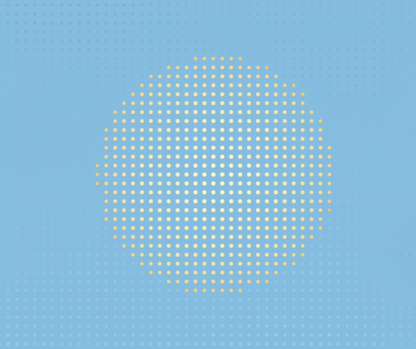
The entire sky is constructed from a grid of tiny dots. In the centre, brighter yellow and white dots form the Sun, while shades of sky blue create the surrounding atmosphere.
Rather than drawing recognisable clouds, slowly moving noise passes through the grid. It creates subtle areas of light and shade that drift across the image — more like changing atmospheric conditions than illustrated clouds.
The dot-matrix appearance is a little nod back to available technology back then. The image isn’t trying to reproduce the sky perfectly. It’s reducing it to light, dark and a grid of tiny marks.
Following the real eclipse
The project has two modes.
Simulate compresses the entire eclipse into a short animation, allowing me to experiment with the effect at any time.
Live is the more interesting one.
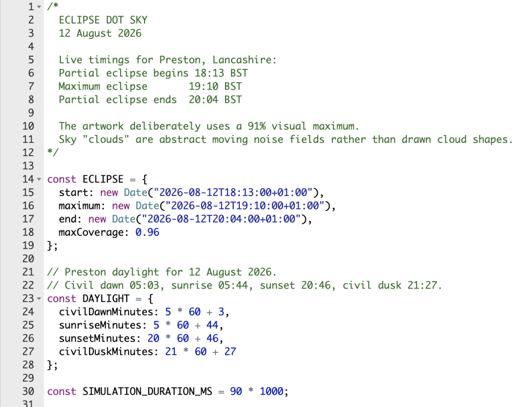
On 12 August, the artwork follows the actual time of day and the progression of the eclipse. The sky begins as a light blue around #87CEEB, gradually changes with the natural daylight, and becomes darker as more of the Sun is obscured.
As the Moon moves across the Sun, its dots are progressively swallowed by the darker grid. The surrounding sky responds at the same time, before gradually becoming lighter again as the Moon moves away.
Because the eclipse is happening towards the evening, the natural transition towards sunset is happening at the same time. The two systems overlap: the real day is getting darker while the eclipse temporarily makes it darker still.
Taking the cardboard version with us
The digital version won’t be our only viewer.
We’ll be heading to Moor Park in Preston with our pinhole box viewers to watch the real thing.
A free community viewing event starts at 5.45pm, with astronomers from the University of Lancashire and Preston and District Astronomical Society bringing specialist equipment and eclipse glasses so people can observe it safely.
It’s being billed as the UK’s deepest solar eclipse in over a decade, with the Moon covering up to 96% of the Sun in parts of the UK.
So while there will be plenty of sophisticated astronomical equipment pointing towards the sky, I quite like the idea that we’ll also be standing there with a cardboard box.
Some technology is difficult to improve upon.
And somewhere nearby, my devices will be doing essentially the same thing — turning the Sun into a collection of little dots and watching them disappear.
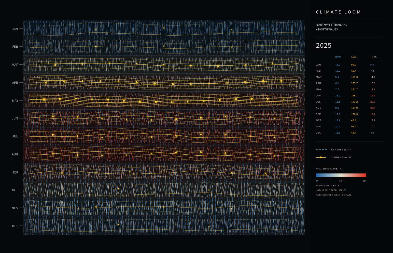
Weather is something we all experience, yet it’s often reduced to numbers on a chart or icons on a forecast. For this project I wanted to explore a different approach by translating decades of climate data from North West England and North Wales into an abstract woven composition.
Using Java and Processing, the artwork is generated from historical Met Office climate datasets covering rainfall, sunshine and maximum temperatures. Rather than plotting the information as a conventional graph, each data series influences a different visual characteristic, allowing the climate to emerge as a textile-like structure.
Rainfall is represented through dashed threads that build density and rhythm across the composition. Sunshine introduces bright yellow strands and small bead-like markers that punctuate the weave, creating moments of light amongst the darker fibres. Temperature is expressed as a flowing gradient, shifting from cool blues to warm reds, giving the piece an additional layer of movement and seasonal character.
One of the most striking patterns isn’t just that the summers are getting warmer, but that the warmth is lingering for longer, gradually stretching further into autumn and delaying the onset of winter.
One of the most enjoyable parts of the project was discovering how a simple woven structure could communicate such complex information. The result isn’t intended to be read as a chart. Instead, it encourages the viewer to experience the data first as an artwork before gradually recognising that every thread is responding to genuine climate records.
Developing the project also became an exercise in balancing aesthetics with information. Too much emphasis on the data and the composition lost its visual appeal; too much abstraction and the connection to the climate disappeared. Finding that middle ground became the focus of the design process.
The sketch is fully generative, meaning each composition is created programmatically while remaining rooted in historical weather observations. Features such as animated fibres, interactive colour modes and woven layering help transform static datasets into something that feels organic and alive.
This project continues my exploration of using code as a creative medium, where information becomes material rather than simply content. By treating climate data as texture, rhythm and structure instead of statistics, the work aims to reveal familiar weather patterns from an entirely different perspective.
Although this is an early iteration, there are plenty of directions to explore next. I’m interested in introducing more complex weaving behaviour, allowing threads to respond to long-term climatic trends, and experimenting with larger-format outputs where the fine details become even more immersive.
As with many of my Processing projects, the goal isn’t to create a digital chart or dashboard, but to build something that sits somewhere between data visualisation, generative art and printmaking—using code to uncover beauty hidden within everyday information.
Can you understand an artist by rebuilding their process?
Over the last few years I’ve been experimenting with Processing and Java to create generative artwork. Most projects have explored modern computing power, real-time animation and increasingly complex systems.
This project is different.
Rather than asking “What can today’s computers do?” I wanted to ask:
“What could have been achieved with the mathematical thinking available in the 1960s?”
That naturally led me to the pioneering work of Vera Molnár.
Looking backwards instead of forwards
Vera Molnár is recognised as one of the earliest artists to embrace computers as a creative partner. Long before generative art became fashionable, she was exploring systems, rules and controlled randomness.
What’s remarkable is that many of her ideas existed before she even had regular access to a computer.
She imagined what she called an “imaginary machine”—a conceptual computer capable of carrying out simple instructions repeatedly. When computers eventually became available, they simply became another tool for testing those ideas.
Looking through her work, it’s easy to become distracted by the finished images.
What interests me more is the thinking behind them.
This isn’t about copying
The intention isn’t to reproduce Vera Molnár’s artwork.
Instead, it’s an attempt to understand the constraints she worked within.
Today’s software makes almost everything effortless:
millions of calculations every second
unlimited colours
complex animation
advanced rendering
countless libraries
Removing those luxuries forces different decisions.
For this series I’ll deliberately restrict myself to:
Basic geometric shapes
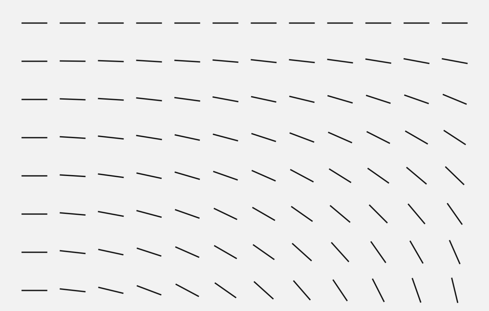
Straight lines
Simple transformations
Repetition
Small amounts of controlled randomness
Elementary mathematics
Black and white compositions
A3 portrait layouts
Every project will be written in Processing using Java.
Not because it’s historically accurate, but because it allows me to think algorithmically without unnecessary complexity.
Designing with limitations
One thing that becomes obvious very quickly is that limitations are surprisingly creative.
Instead of asking:
“What should I draw?”
the question becomes
“What simple rule should I write?”
A square becomes interesting once it’s repeated.
A line becomes interesting once it’s rotated.
A grid becomes interesting once every element breaks the rules slightly.
Tiny mathematical changes produce surprisingly rich compositions.
Thinking like an early computer
Modern generative artists often build systems with noise functions, particle engines, physics simulations and GPU shaders.
For this project I’m intentionally avoiding most of that.
Instead I’ll explore ideas that feel closer to the computational mindset of the 1960s:
Regular grids
Rotation
Translation
Scaling
Sequential plotting
Iteration
Random number generation
Permutation
Probability
Simple geometric relationships
Almost every image should be explainable in a few lines of mathematics.
A study rather than a tribute
I’m treating this as a research project.
Each artwork will begin with a question.
What happens if every square rotates by one degree more than its neighbour?
What if a perfect grid slowly loses its precision?
How much randomness is enough before order disappears?
Those questions feel far more interesting than chasing a particular visual style.
Hopefully, by rebuilding these ideas from first principles, I’ll gain a deeper appreciation of why Vera Molnár’s work remains so influential today.
The series
Over the coming weeks I’ll be creating a collection of A3 portrait artworks, each exploring a single mathematical idea.
Every piece will be generated entirely in Processing using Java and deliberately limited to the simplest possible visual language.
No textures.
No gradients.
No effects.
Just mathematics, repetition and controlled variation.
Sometimes the simplest rules produce the richest results.
That’s a lesson Vera Molnár understood more than sixty years ago—and one that’s still worth exploring today.
Using Java, live microphone input and three-dimensional forms to create a visual response to bird song.
I wanted to explore how bird calls could be translated into something visual using code.
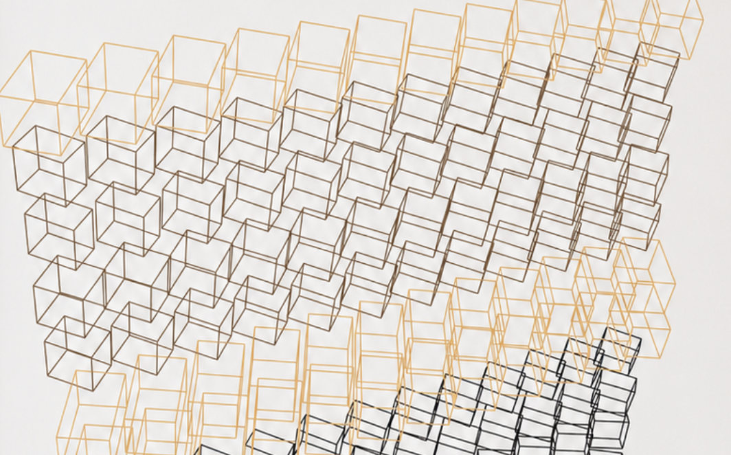
The finished Processing sketch listens through the computer’s microphone, analyses the incoming frequencies and uses them to control a grid of transparent 3D boxes. As the sounds change, the depth, rotation and colour of the boxes change with them.
The idea
The starting point was a simple question: what might a bird call look like?
I did not want to draw the bird itself or display the sound as a conventional waveform. Instead, I wanted the audio to control a collection of geometric forms.
I chose transparent keyline boxes because they could respond in several ways without becoming too visually heavy. Each box can change its depth, position, rotation and colour, allowing the grid to develop into a constantly changing three-dimensional structure.
The inspiration
Bird calls contain a surprising amount of variation. Some are short and sharp, while others are slower, lower or more repetitive.
I wanted to use these differences as data rather than trying to recreate the sound literally. The code establishes a set of visual rules, but the bird calls determine what happens within them.
This creates a balance between a controlled system and the unpredictable nature of a live recording.
The process
The project was created in Processing using Java and the Processing Sound library.
The sketch accesses the computer’s default microphone and listens to the surrounding environment in real time. It separates the incoming sound into low, middle and high-frequency ranges before applying those values to the grid.
Middle frequencies control much of the general activity.
Higher frequencies respond to sharper calls and details.
Overall volume controls the strength of the reaction.
Frequency levels also influence the keyline colours.
The audio values are smoothed before they reach the visual system. Without this, every small change in the microphone signal would make the boxes jump too abruptly.
The microphone sensitivity is set for normal recording levels and can be adjusted while the sketch is running. The code also measures the general background noise, helping the visual response remain useful in different environments.
Development
Stage one: using recorded audio
The first version used a saved audio file.
This was helpful during development because I could replay the same sound while adjusting the frequency ranges and testing how the boxes responded.
It confirmed that the basic idea worked, but every result was tied to the same recording.
Stage two: using a live microphone
I replaced the audio file with live input from the computer’s microphone.
This made the project feel much more immediate. The visual structure now responds to whatever is happening around it at that particular moment.
A quiet environment creates a restrained arrangement of boxes. Bird calls produce sharper movements and changes in colour, while voices, music and other background sounds create entirely different results.
Stage three: refining the boxes
During development, I experimented with solid shapes and smaller blocks placed inside the main boxes.
These versions became visually heavy and distracted from the overlapping structure. I returned to transparent cuboids drawn entirely with coloured keylines.
Because the boxes have no filled surfaces, their edges remain visible through one another. This creates a more complex sense of depth while keeping the individual forms simple.
Stage four: tuning the response
One of the most difficult parts was finding the right microphone sensitivity.
If the response was too low, quieter calls produced very little movement. If it was too high, normal background noise caused the whole grid to react constantly.
I added adjustable sensitivity and background-noise detection so the sketch could respond more naturally in different recording conditions.
The outcome
The finished project is a live visual interpretation of bird calls and the surrounding soundscape.
Every result is created from the same grid and the same set of rules, but the composition changes depending on what the microphone hears.
The structure can also be rotated using the mouse, making it possible to explore the generated forms from different angles. The animation can be paused when an interesting arrangement appears.
What I learned
This project showed me that audio does not need to be represented as a waveform.
By dividing the microphone input into frequency ranges, I could use a single sound source to control several visual properties at once. Depth, rotation, movement and colour can all respond differently while remaining connected to the same recording.
I also found that simpler forms created the strongest results. Removing the solid surfaces made the overlapping lines and three-dimensional structure much easier to see.
Most importantly, the project demonstrated how code can translate something temporary, such as a bird call, into a visual experience.
What’s next?
I would like to test the project with different bird species and compare the visual results.
Each species has its own rhythm, pitch and pattern of calls, so it would be interesting to see whether these differences create recognisably different structures.
I would also like to experiment with recordings made in different habitats and at different times of day. A woodland at dawn should produce a very different response from a garden, wetland or urban environment.
Another possibility would be to improve the frequency detection so the sketch can react more precisely to individual calls while ignoring unrelated background noise.
Final thoughts
This began as an experiment in making bird song visible through code.
Java provides the rules, the microphone supplies the data and the surrounding sounds create the changing composition. Although the visual system remains consistent, the result is never quite the same twice.
I like that the project does not attempt to illustrate a bird or reproduce its call literally. Instead, it creates a visual response to the rhythm, frequency and energy of the sound.
Using real bird observations to create evolving digital flocks in Processing (Java).
Every year, thousands of bird sightings are submitted by birdwatchers across the UK. They usually end up as lists of species, dates and locations. They’re invaluable for conservation, but I wondered what they might look like if the data could move.
This project explores that idea by transforming bird sighting records into a living murmuration.
Rather than plotting observations on a map, every record becomes an individual bird within a simulation. As more sightings are added, the flock begins to organise itself using simple behavioural rules inspired by nature. Over time, scattered points become flowing shapes that continuously form and dissolve across the screen.
The result sits somewhere between data visualisation, simulation and generative art.
The Idea
The project takes recent bird sighting data and uses it as the starting point for a flocking simulation built in Processing.
Each observation creates a bird within the system. From there, the birds respond to one another using the classic flocking behaviours:
Separation – avoiding collisions with nearby birds.
Alignment – matching the direction of neighbouring birds.
Cohesion – moving towards the local flock.
To prevent the movement feeling too mechanical, Perlin noise is introduced to create subtle environmental forces. The flock constantly shifts, stretches and reforms in ways that feel closer to watching real starlings overhead.
The original data simply starts the conversation. The artwork takes over from there.
From Data to Movement
One aspect I particularly enjoyed was avoiding a literal representation of the data.
There are no maps, charts or graphs.
Instead, the information becomes behaviour.
A busy day of sightings naturally produces a larger, denser flock, while quieter datasets create more open formations. Different species could eventually influence colour, speed or movement characteristics, allowing each dataset to generate its own personality without ever needing labels or axes.
Building the Simulation
The project was written in Java using Processing.
Alongside the flocking algorithm, I added a number of features to make the artwork feel more alive:
Procedurally generated Perlin noise flow.
Species-based colour palettes.
Motion trails showing the history of each bird.
Pause and restart controls.
High-resolution image export.
Randomised initial formations.
One idea i’ve introduced is adding a peregrine falcon into the simulation. At random intervals it would pass through the flock, forcing the birds to scatter before gradually reforming into a new murmuration.
Why I Like This Project
I’ve always enjoyed projects that blur the boundary between science and art.
The underlying algorithms are relatively simple, but when hundreds of individual agents interact together, surprisingly natural behaviour emerges. Watching order appear from a collection of independent birds feels remarkably similar to observing a real murmuration.
It’s also a reminder that data doesn’t always need to be presented analytically. Sometimes the most engaging way to understand information is to experience it.
What’s Next?
There are plenty of directions I’d like to take this further:
Live bird sighting feeds updating the flock in real time.
Species-specific behaviours and movement styles.
Environmental influences such as wind or weather.
3D murmurations that viewers can rotate and explore.
Large-format print series generated from moments within the simulation.
Like many of my Processing experiments, this is less about producing a finished piece and more about discovering what happens when simple rules interact over time.
Sometimes the most interesting results are the ones you never explicitly programmed.