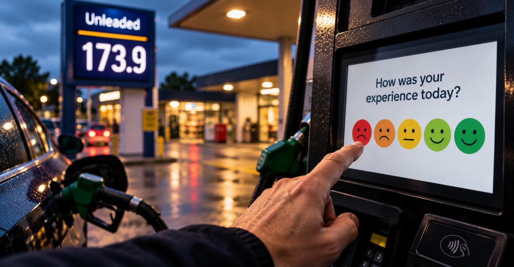
I filled my car up this morning and paid the highest price for petrol I can remember paying. Not exactly a great start to the day, but everything else about the experience was completely normal.
I used pay at pump, filled the car, paid and was about to leave when a row of faces appeared on the screen asking how I felt about my experience.
I normally ignore these surveys, but this time I was very close to pressing the unhappy face. It had nothing to do with the pump, though. The pump worked, the payment worked and there was no queue. I was annoyed because I’d just seen how much it had cost me to fill the car.
It got me thinking about what that little survey is actually measuring.
Presumably all those button presses end up somewhere. Maybe there’s a dashboard showing customer satisfaction across different petrol stations, different days or different times of day. If enough people answer, it probably produces some quite convincing-looking data.
But what happens when petrol prices suddenly increase?
If the number of unhappy faces goes up at the same time, has the experience actually got worse? Or are people just more annoyed about how much they’ve paid?
There are probably dozens of things influencing that response which have very little to do with the thing being measured. Someone might be late for work, stuck in traffic, having a bad morning or irritated that filling their car has just cost considerably more than it did a few weeks ago.
Pay at pump makes it even more interesting because there isn’t much of a customer experience in the traditional sense. I did almost everything myself. I filled the car, operated the terminal and paid without speaking to anyone. The petrol station provided a working pump and payment system, but beyond that there wasn’t much to judge.
Yet I’m still being asked how satisfied I am.
The problem isn’t necessarily the data itself. If more people press the unhappy face one week, then more people pressed the unhappy face. That’s a perfectly valid measurement.
It’s the meaning we attach to it that becomes questionable.
Imagine looking at a dashboard and seeing customer satisfaction drop from 82% to 69%. You might start looking for problems with the payment process, staff, queues or the condition of the forecourt.
Now imagine putting average petrol prices on the same graph and seeing them rise sharply at exactly the same time.
It doesn’t prove that price caused the drop, but it would certainly make you think twice before deciding the customer experience needed fixing.
And this goes well beyond petrol stations.
We collect an enormous amount of data because it’s easy to collect. Website engagement, conversion rates, satisfaction scores, and countless other metrics get turned into percentages and graphs. Once they’re sitting on a dashboard with a red or green arrow next to them, they start to feel very authoritative.
But a precise number doesn’t necessarily mean we’ve precisely measured the thing we care about.
Sometimes the most useful question isn’t why a metric went up or down.
It’s whether we’re actually measuring what we think we’re measuring.
Leave a Reply